|
|
||
7 JAN '13 |
40
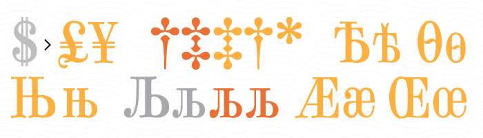
£¥€ †‡*× Æ挜 | |
30 DEC '12 |
39
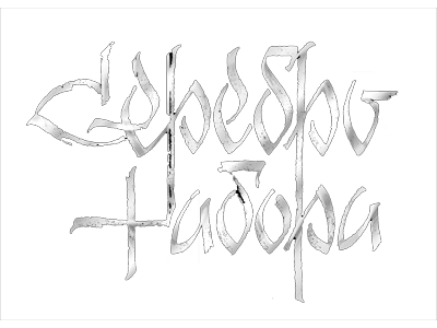
Today we have in our Western type tradition a lack of six areas in a row: – XIX-th century fonts, almost excluded from use in practice by more simple, strict, featureless XX-th century fonts. – Oriental fonts, imitating traditional Chinese and Japanese brush calligraphy. – Græco-Roman fonts. Particularly, the Ancient Greek ones. – Compact narrow fonts, so usual in XIX-th century and almost lost in the second half of the XX-th century. – Calligraphic fonts (not the narrow point nib, as in XIX-th century, but more expressive, usually performed with flat brush or wide nib pen), with its acme falls on the middle of XX-th century, up to the 70-s. The popularity of font Lobster by Pablo Impallari (Argentina) nowadays is a first footstep to the hand-written scripts in modern design. – XX-th century fonts, created in pre-computer era. Many among them were digitized — though with some modernization sometimes. Still, many of them now lost in time, especially not the common text faces but rare display ones. But we still need them — in particular, when we made a republication of old edition in its classical appearance; for the recreation of atmosphere of the middle of XX-th century, when needed; for the expanding of variety of display and text fonts available nowadays, gaining its former abundance. | |
25 DEC '12 |
38
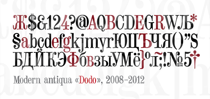
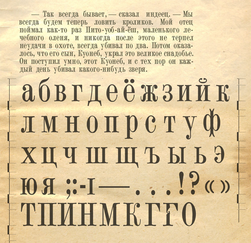
Modern antiqua (scotch, victorian) «Dodo», 2008–2012. Other modern antiqua typefaces: Bodoni, Didot, Vladimir Yefimov's Didona, ITC Didi, Walbaum, Computer Modern, Ambroise, Moderno FB, ITC Fenice, ITC Zapf Book, ITC Bodoni, Adobe New Caledonia. Other scotch modern are: Obyknovennaya Novaya, Modern No. 20 (2000) by Edward Benguiat, and Scotch Modern (2008) by Nick Shinn. | |
18 NOV '12 |
37
 A type designers conference “Serebro nabora 2012” in memory of Vladimir Yefimov is over today. It was a real feast of friends and best Russian type designers. | |
7 NOV '12 |
36
The main and usual issue when editing Bézier curves in vector graphics software (and font editors, in particular) is the pixel hunting. Artist must point the massive cursor with the even more massive mouse or pen precisely over these pesky control points and handles, usually 3×3 pixels, a thousand times over. That's funny game, but what if we have our control points and handles a little bit larger? Now they overshadows the glyphs we working on? Hold Shift to show them and release it to hide them again. An active area for control point is larger than its visible size in normal state. When cursor hovers that area, control point gets increased to provide the necessary visual feedback. If control points are too close, so their active areas overlap — the one of them selected whose center is slightly closer to the cursor. So we have 1:1 pixel precision while working with handy 10:10 pixels tolerances. | |
6 NOV '12 |
35
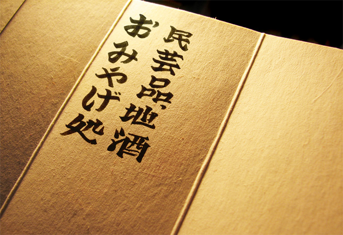
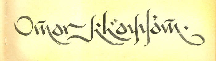
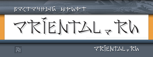
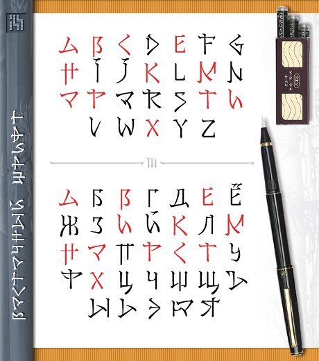
Technically, Japanese and Chinese calligraphy are not harder to perform than our, European one. Their difficulty for us is in impossibility to quickly perceive the usus — an experience of letterform nuances, gained for many years. What shapes are possible, and what are not. Not because there are some rules how to write them, but because they are never written that way. This experience man gets from birth to death, just by being inside the visual environment, seeing dozens of inscriptions each day and noticing their peculiarities, consciously or not. As well Japanese or Chinese people can not guess Cyrillic scripts (Latin letters are much easier for them because they see them from birth, like we do). Moreover, likewise the one who are not interested in details of type design for his own language, will write letters in a readable way, for sure, but he will not be able to follow their proper typographic style. | |
1 NOV '12 |
34

| |
31 OCT '12 |
33
| |
31 OCT '12 |
32

| |
3 OCT '12 |
31
| |
 | ||
|
|
|||

|
|||

|
|||

|
|||