|
|
||||||||||||
|
||||||||||||
12 SEP '23 |
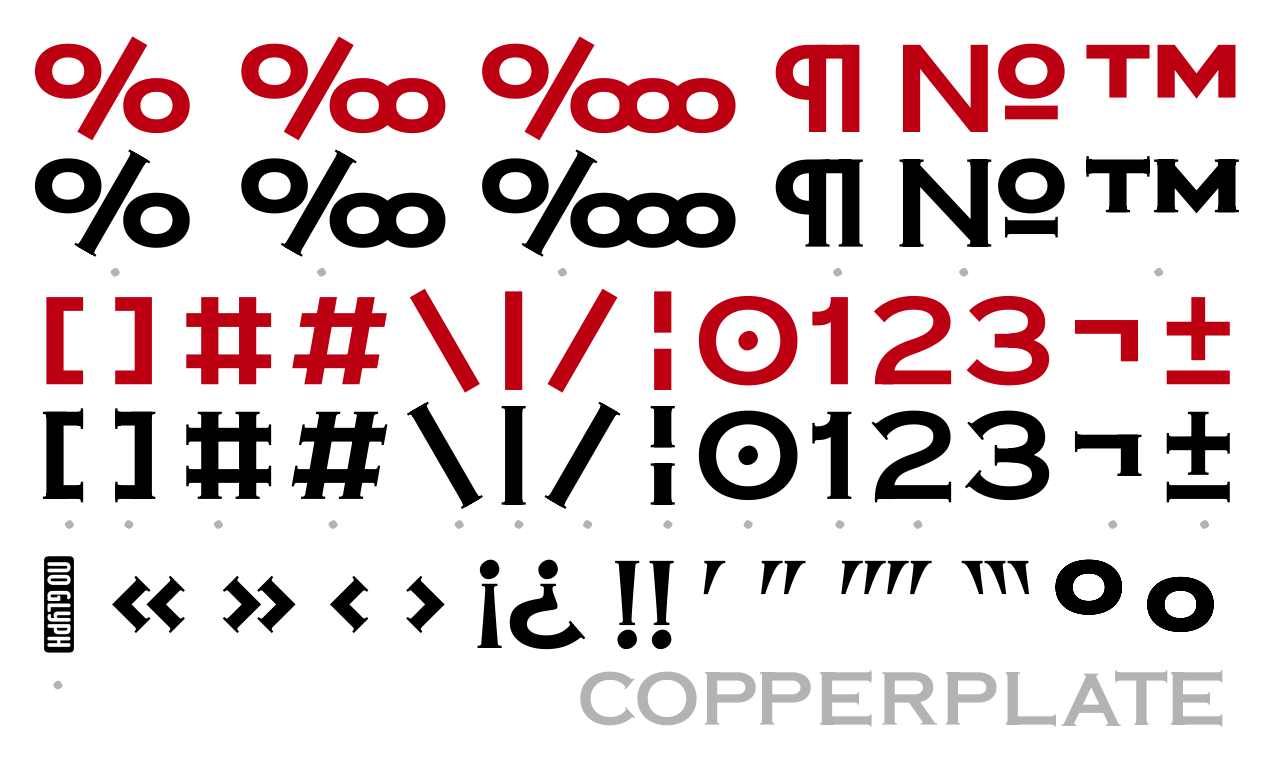
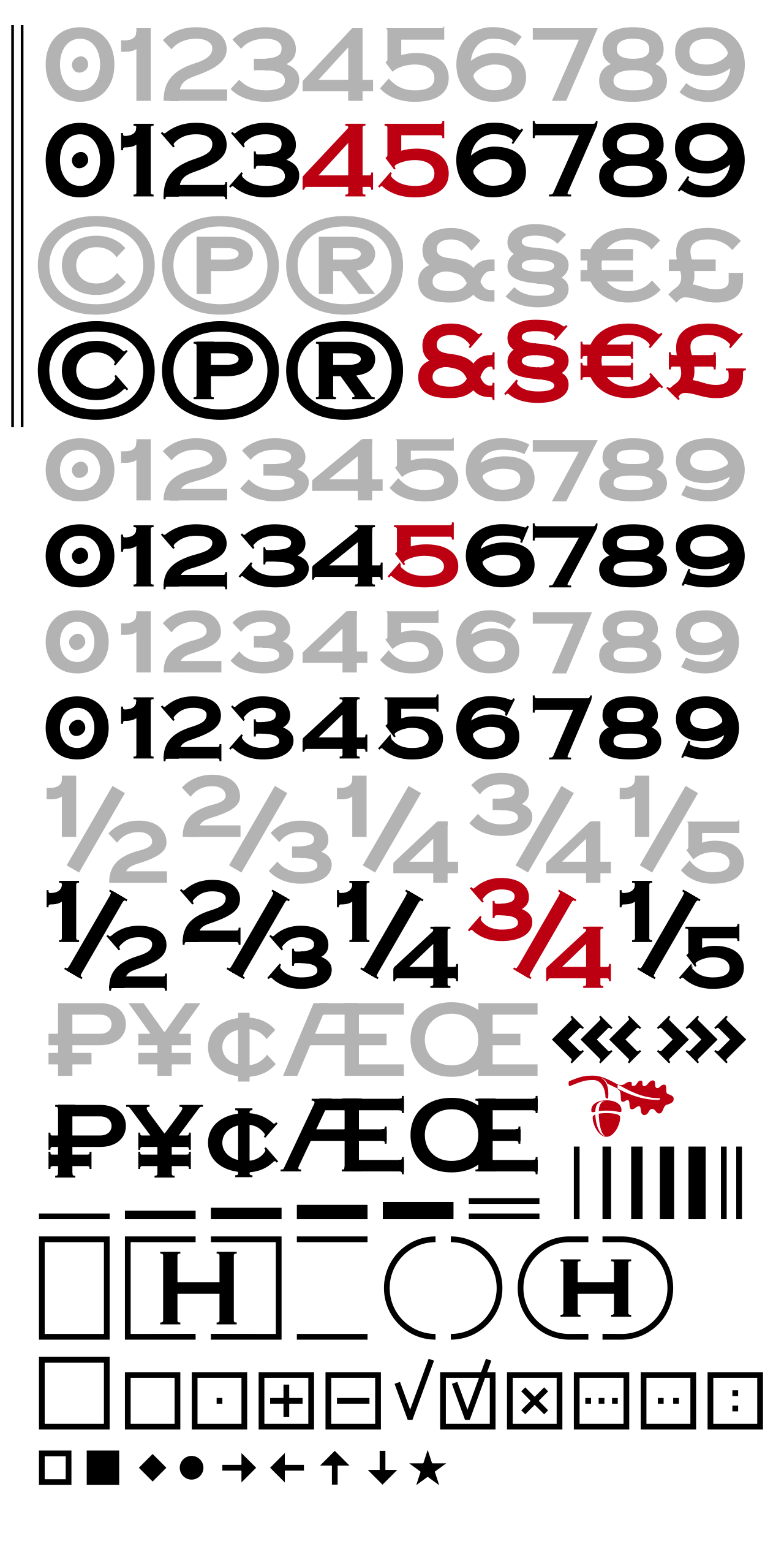
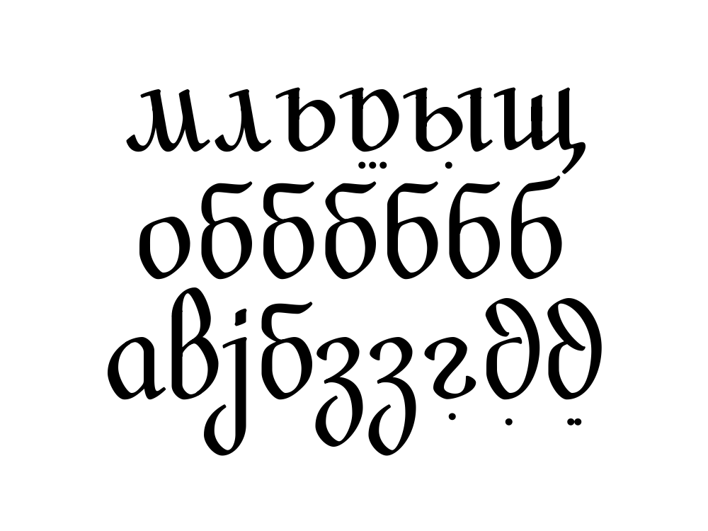
196
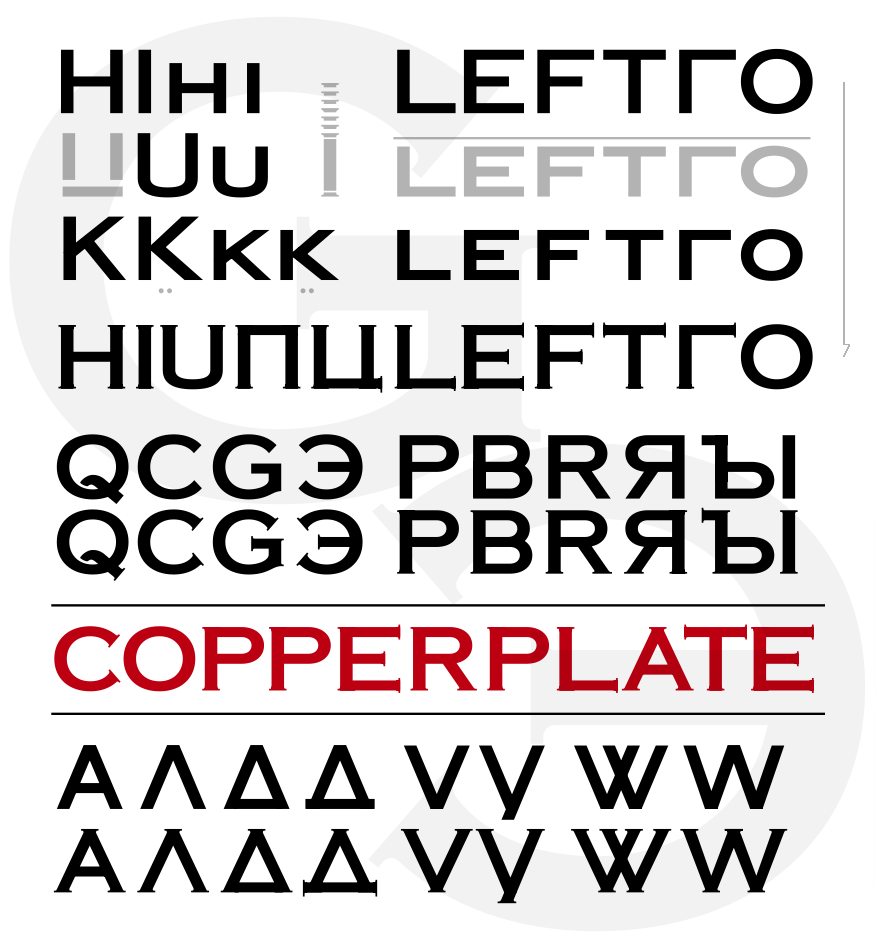
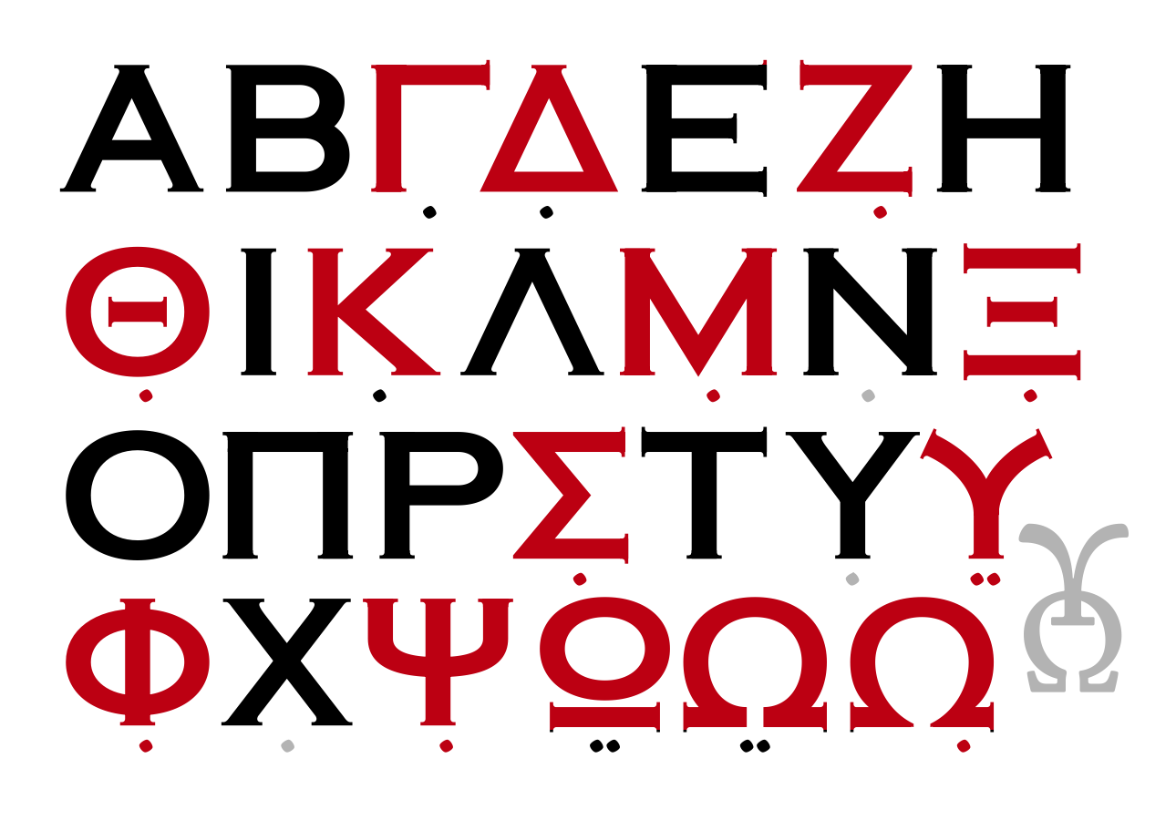
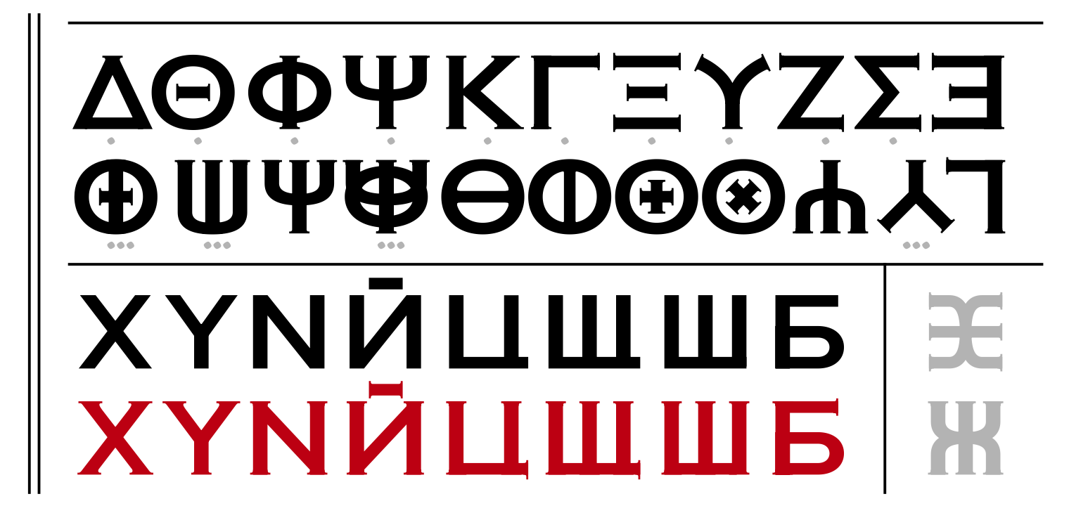
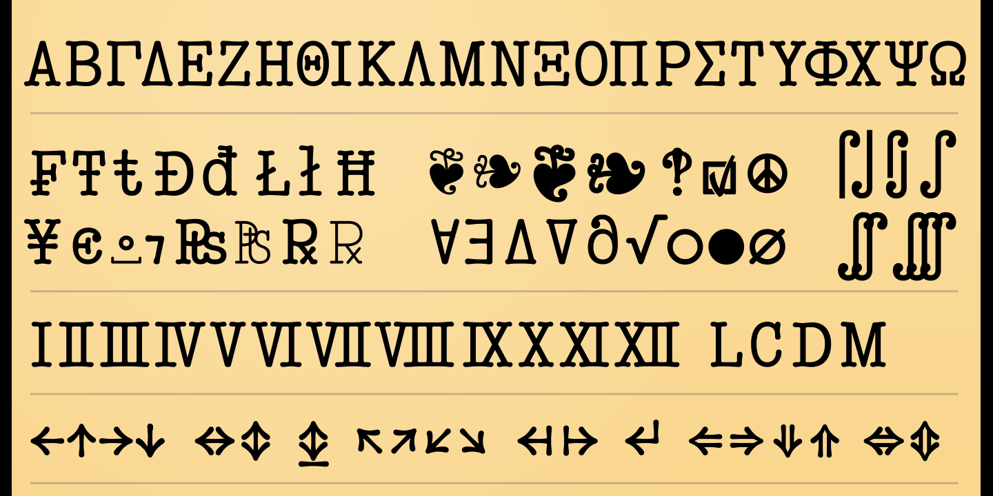
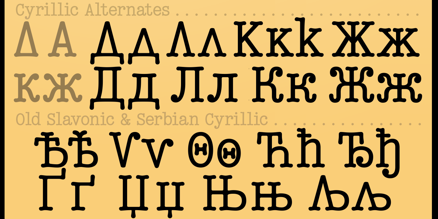
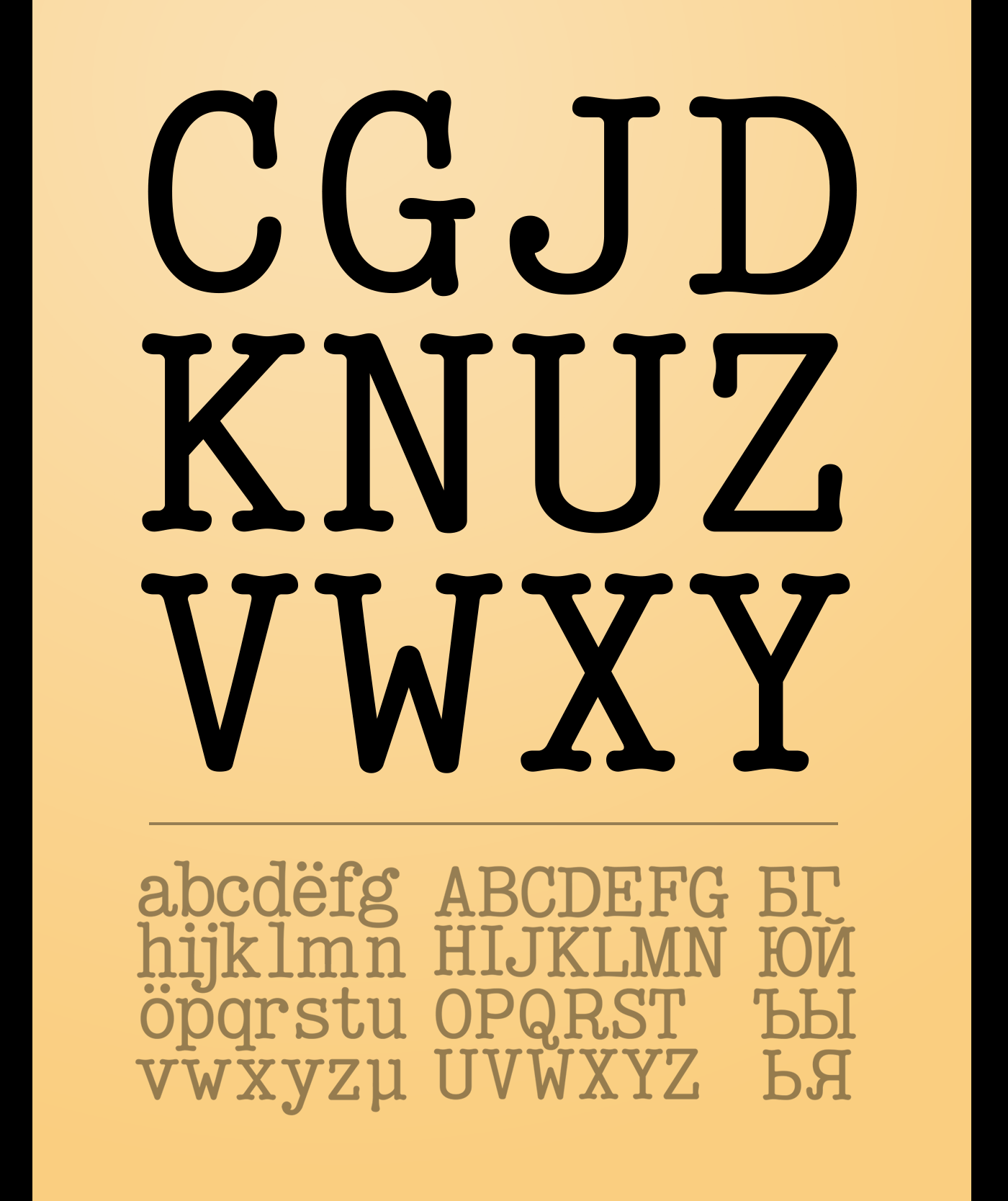
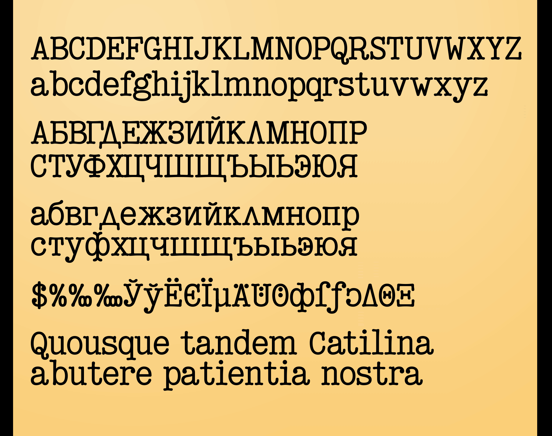
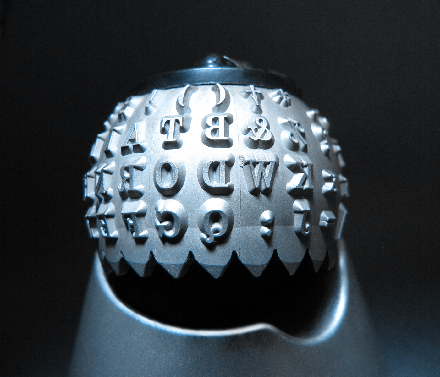
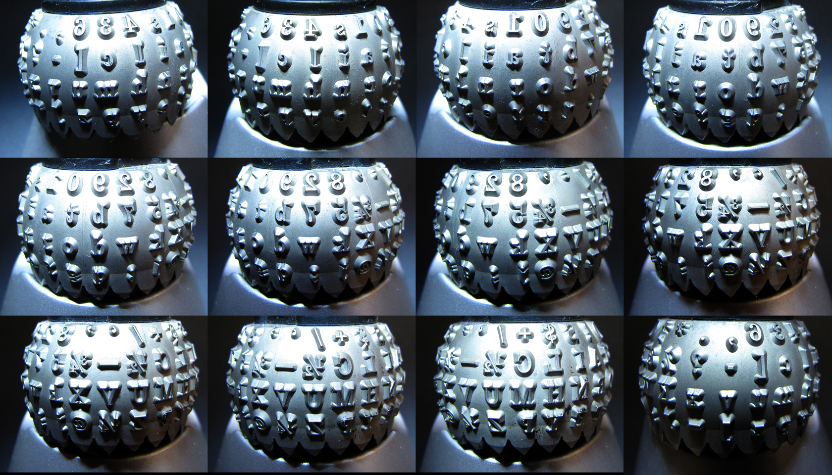
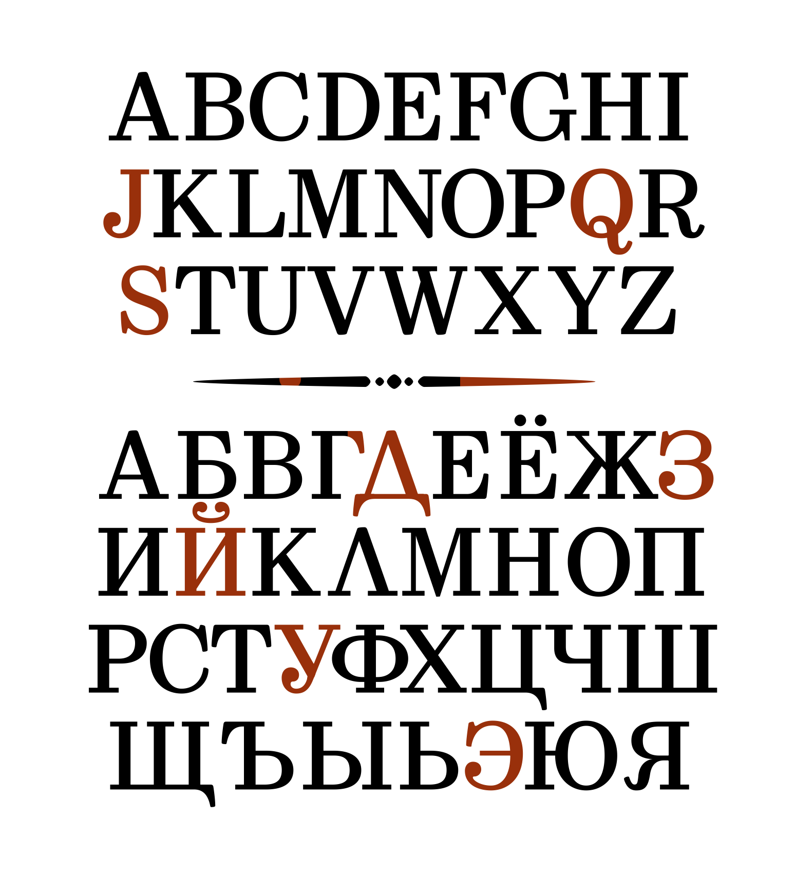
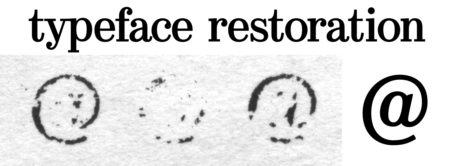
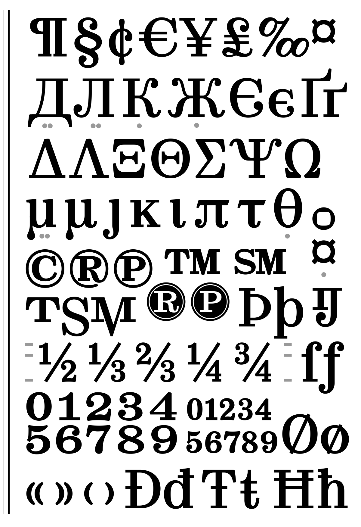
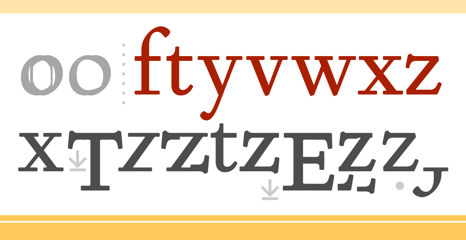
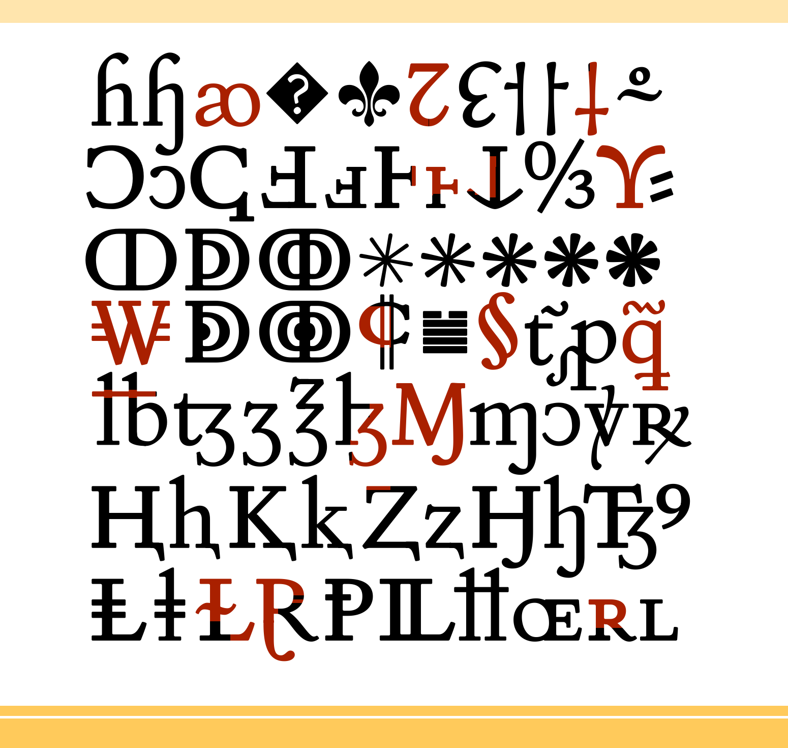
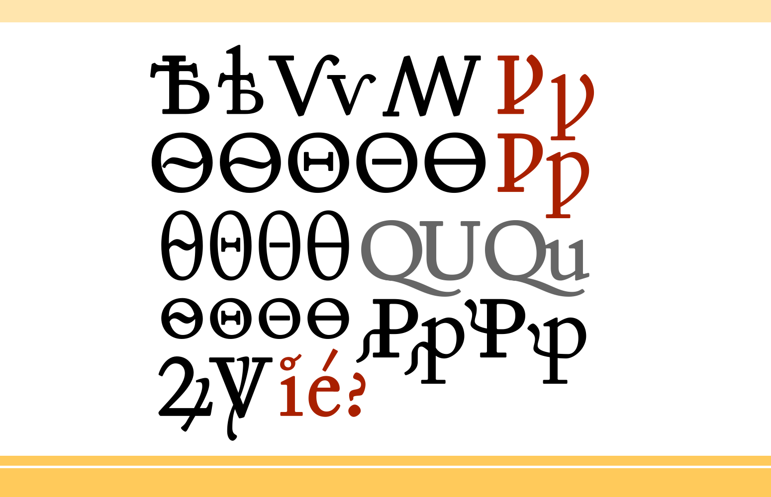
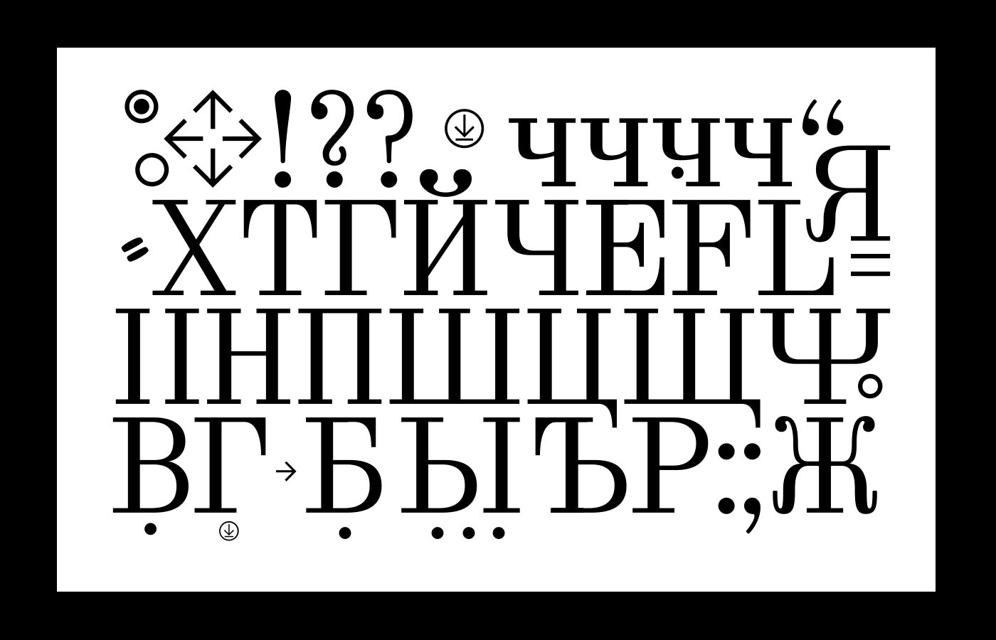
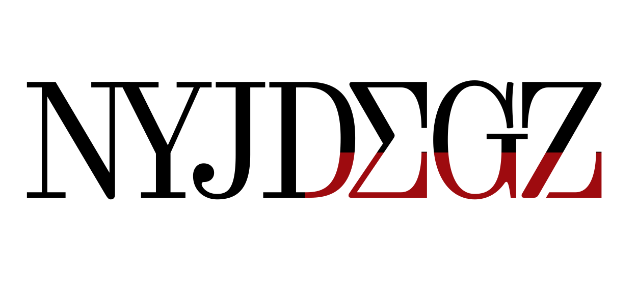
Selectric Copperplate (Copperplate Gothic)after the original sketches of Copperplate Gothic
| |||||||||||
30 JUN '23 |
195
Ergonomic pens & pencils designs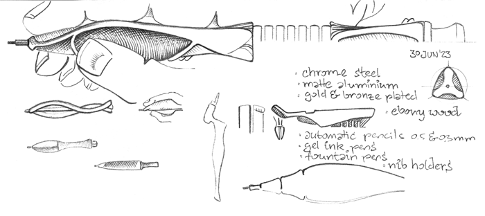 The key principle is ergonomy, where grip follows our fingers' natural positions. | |||||||||||
11 APR '22 |
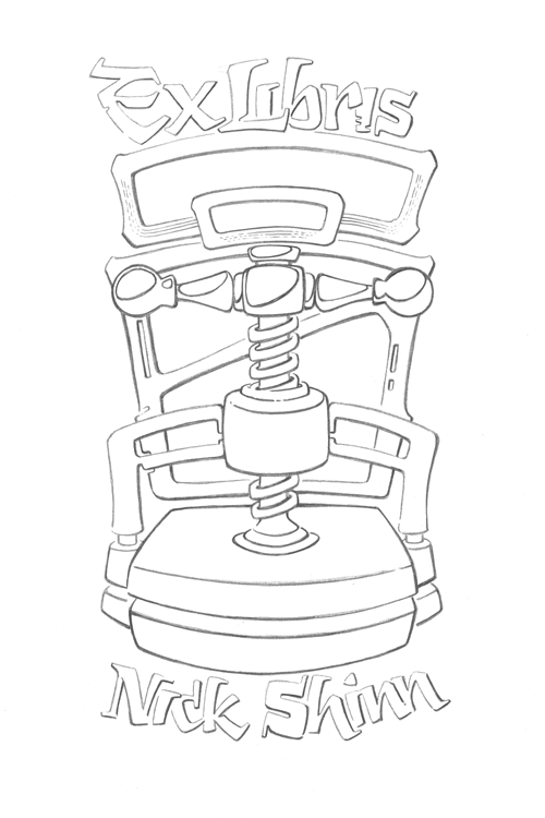
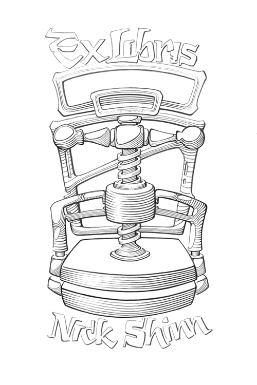
193
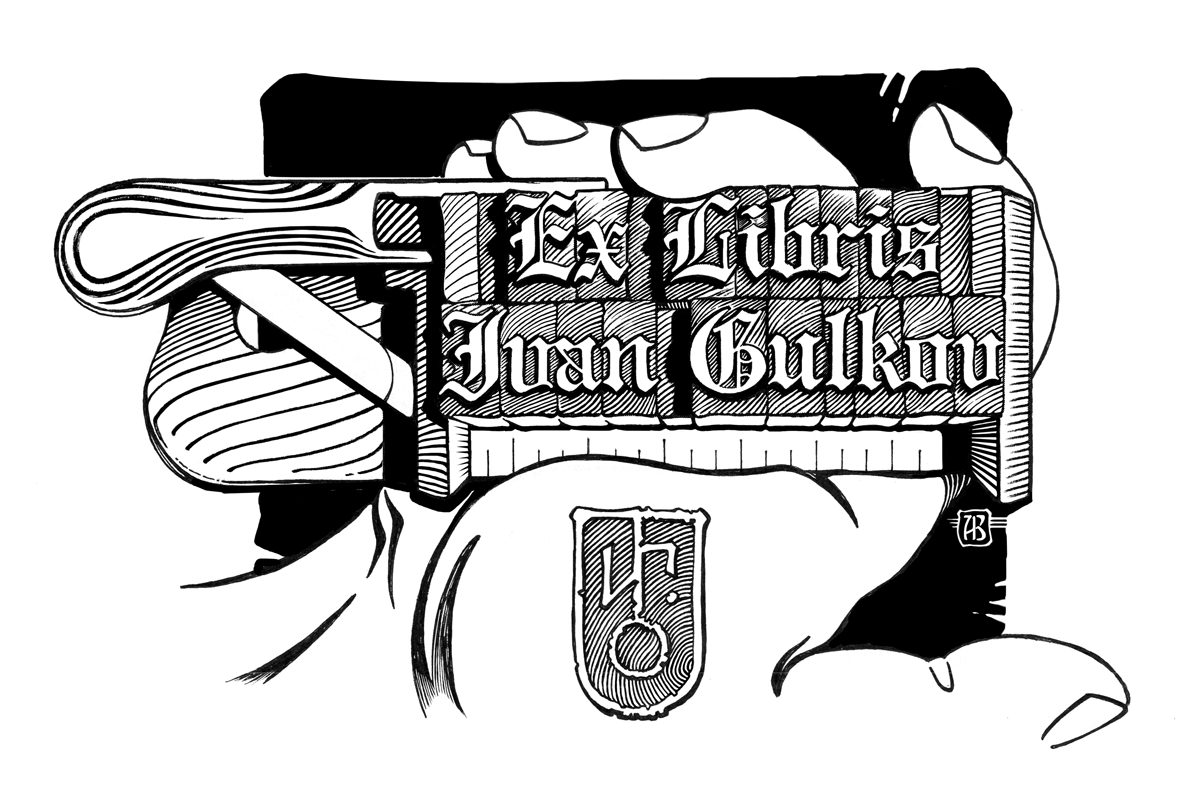
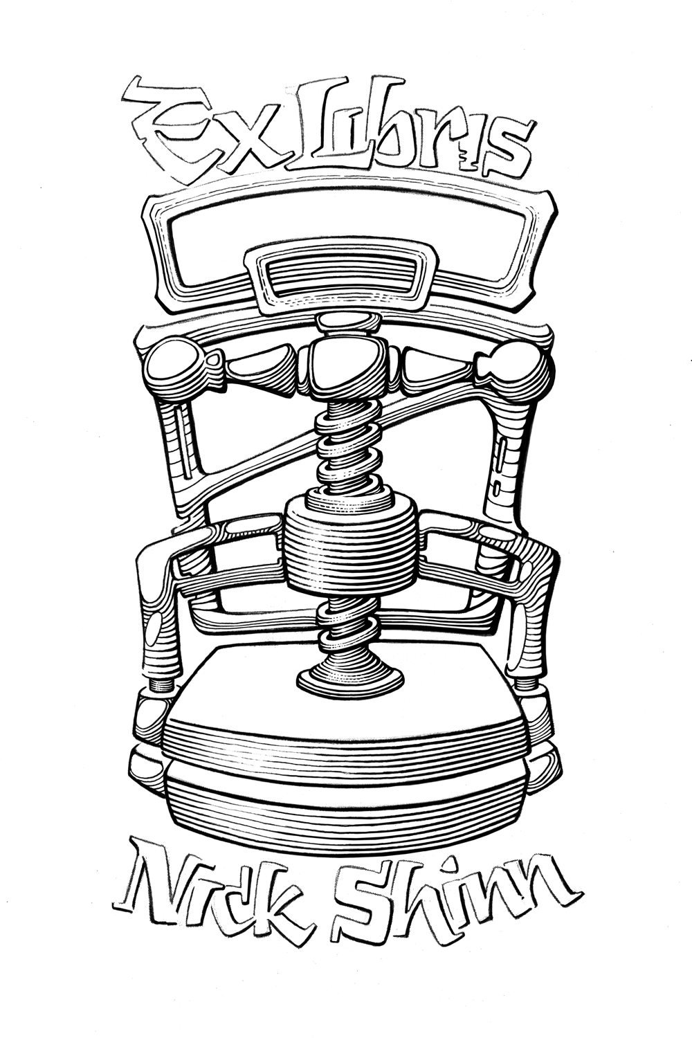
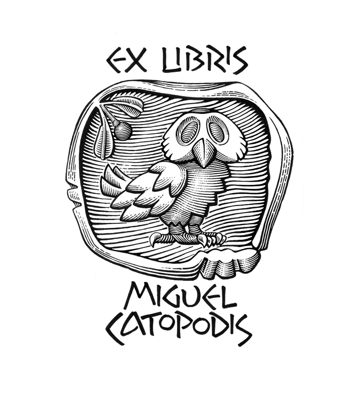
Ex libris sketchfor Dr. Type, Bob Trogman | |||||||||||
14 FEB '22 |
192
Roman AntiquaCapitalis QuadrataThis morning I actually started at last this my old project, delayed for many years... and immediately found somethig exceptionally unusual and even wonderful (for us who worked with incunables & paleotypes, where are so many variations of the same letter; and who practiced calligraphy & lettering): all different letters there look the same; and even more — they repeat the same elements, to achieve the overall consistency, exactly as we doing while drawing our digital fonts. Ancient Romans! Pencil restoration and graphical study after a full-scale rubbing from Trajan's column (which is the most scientifically precise way to transfer the actual geometry of the original letters, compared to any photos) made in 1970 by Edward Catich. NB> The inscription was stonecut apparently after using stencils, cut after calligraphy, and using the same elements; whereupon downscaled for using at lower lines while keeping the same shapes. Thus: normograph plus pantograph. Note that Trajan's Column was erected 106-113 AD, and people already invented and used then these techniques, we knew as a part of our life in the 20-th century before digital fonts. 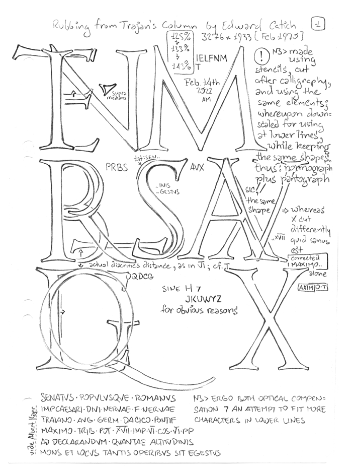 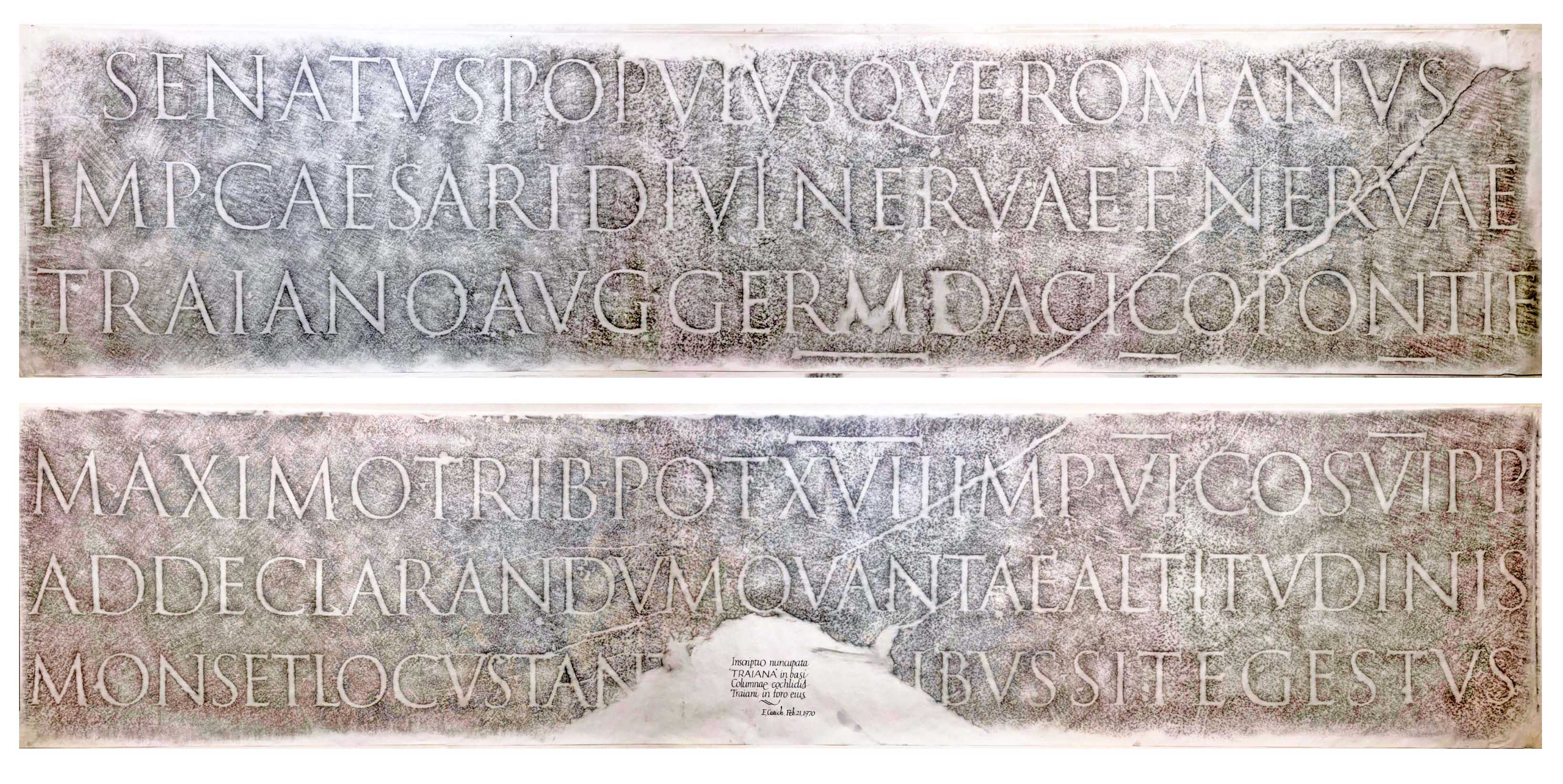 [ Via ] SENATVS POPVLVSQVE ROMANVS The Senate and the People of Rome to the Emperor, Caesar Nerva, 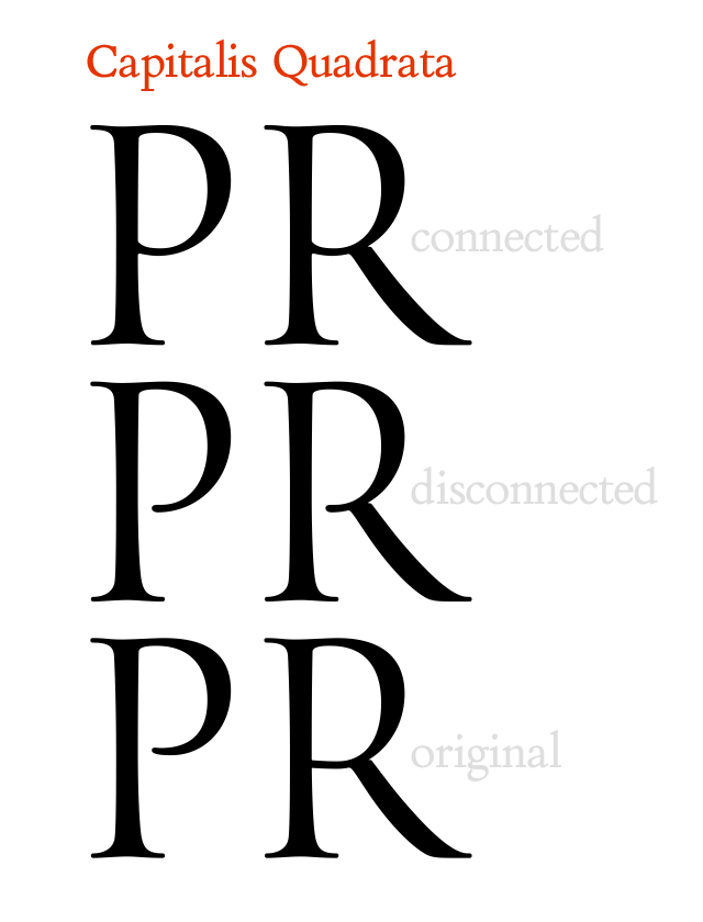 Found there even larger additional fragments (not all letters, but it's much better), and traced some of them this time. 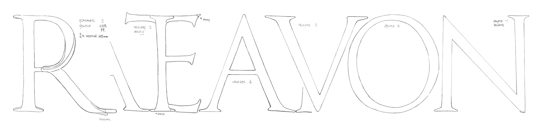   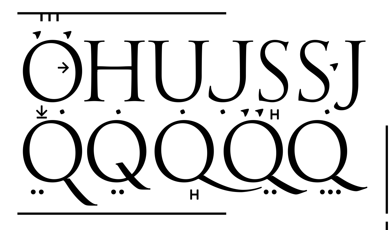 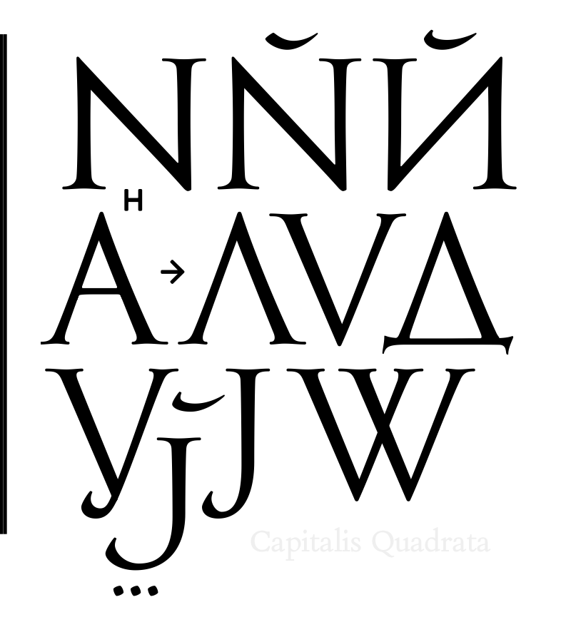 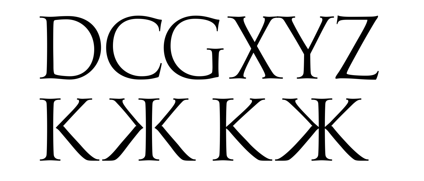 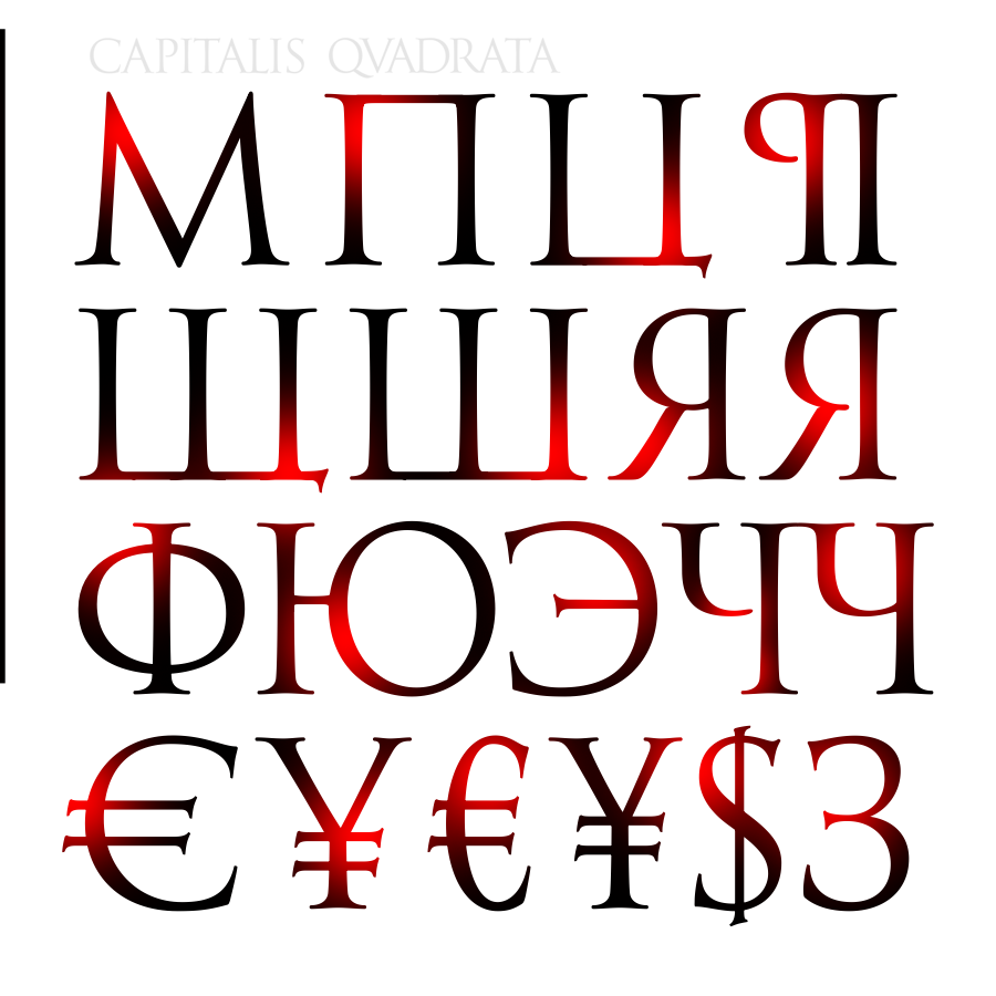 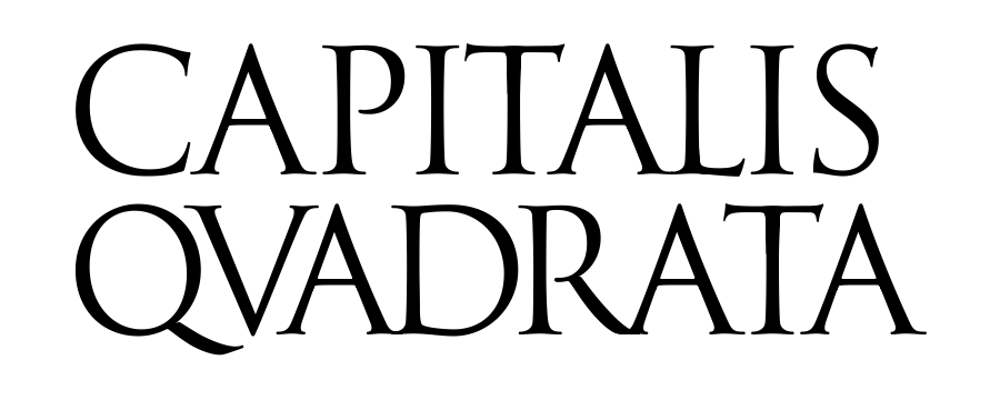 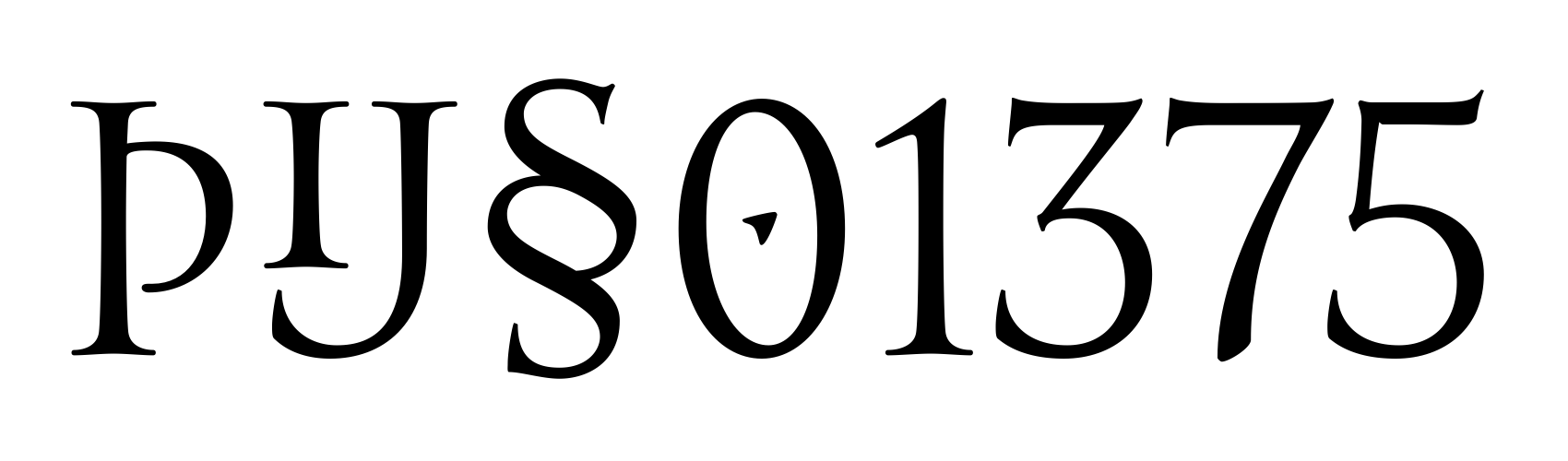  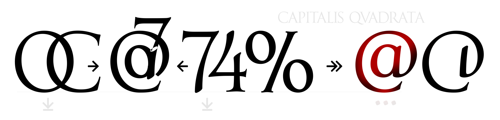 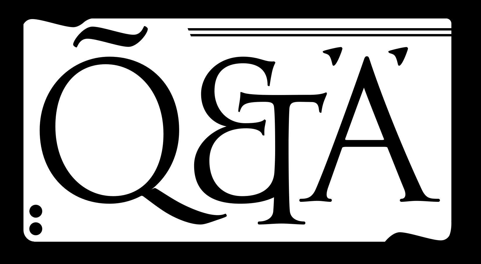 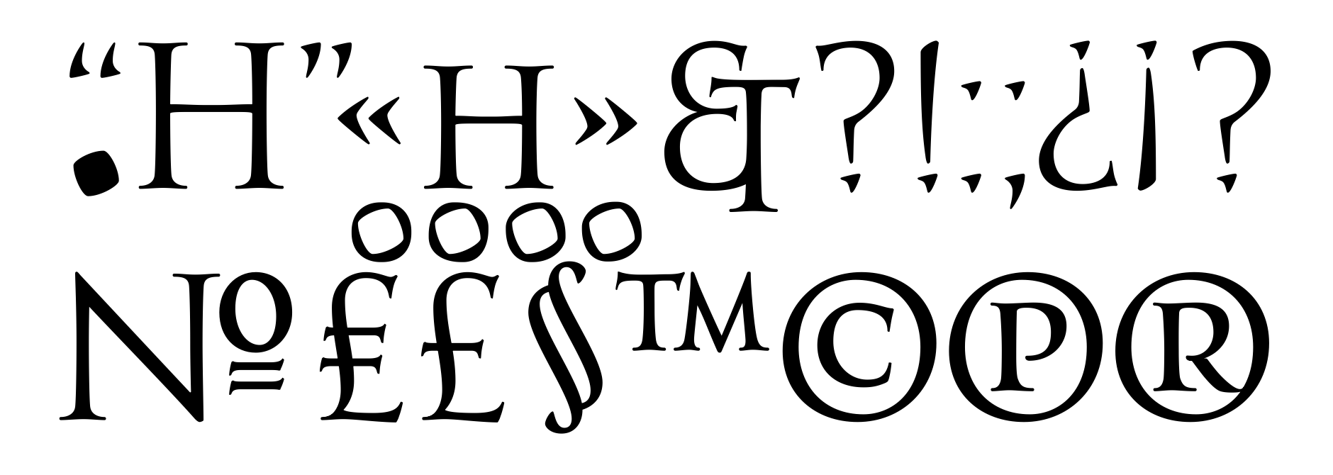 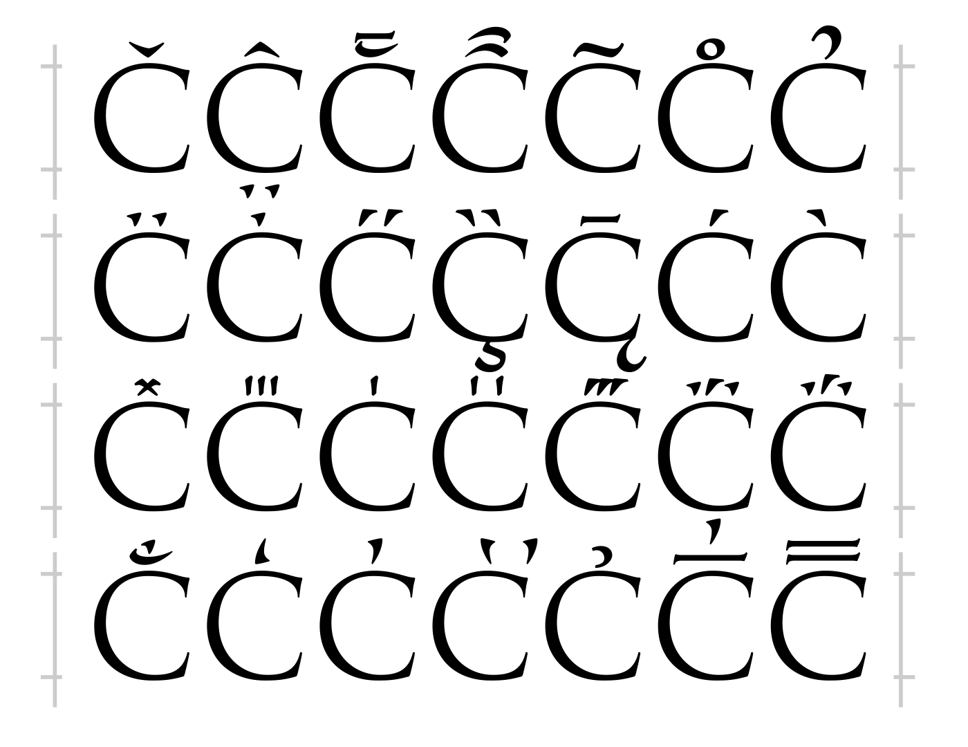  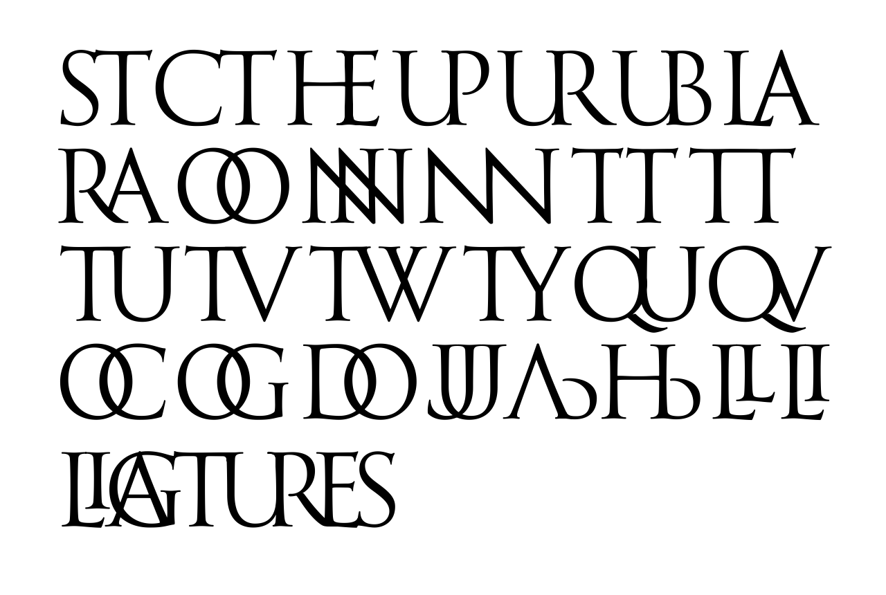 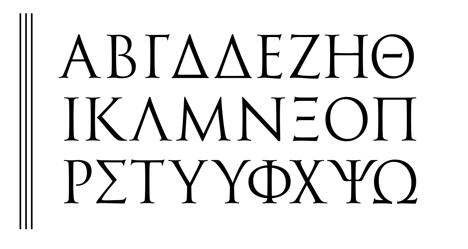 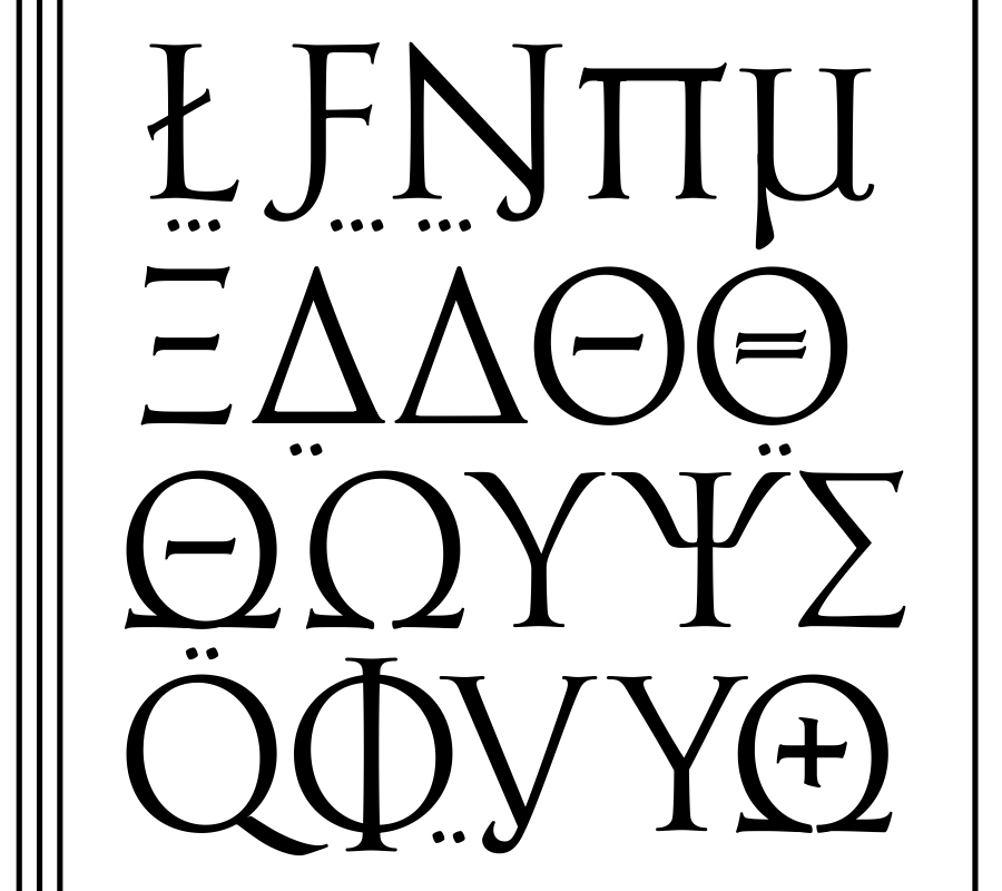 | |||||||||||
5 OCT '21 |
187
Pravdathe main Soviet newspaper's logo font | |||||||||||
14 Jun '21 |
188
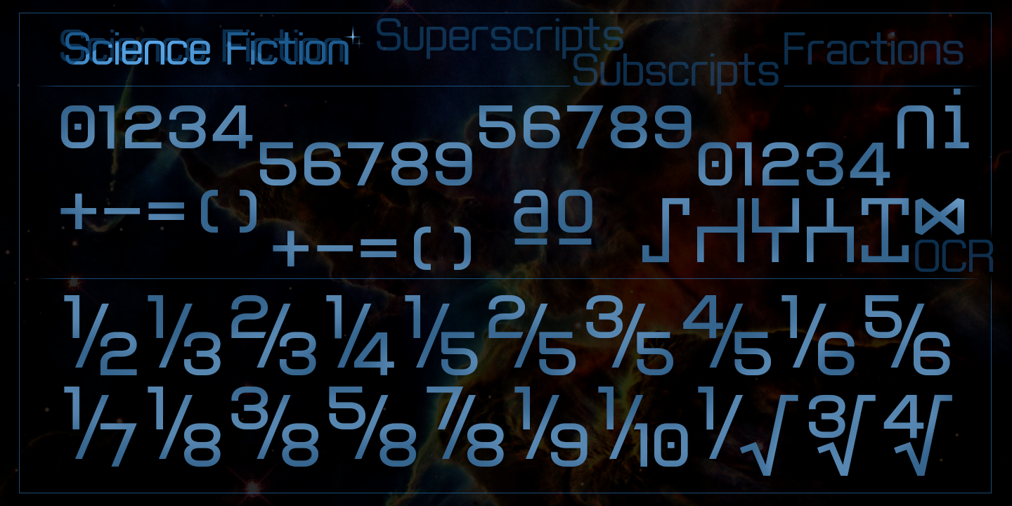
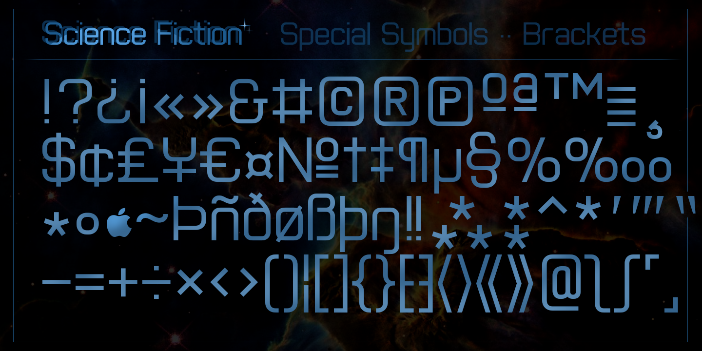
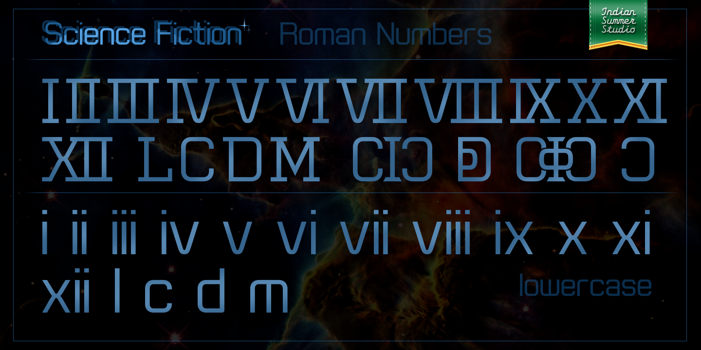
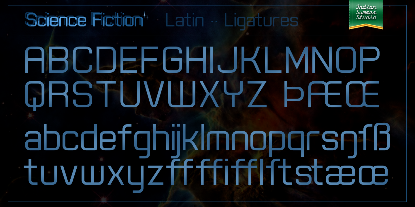
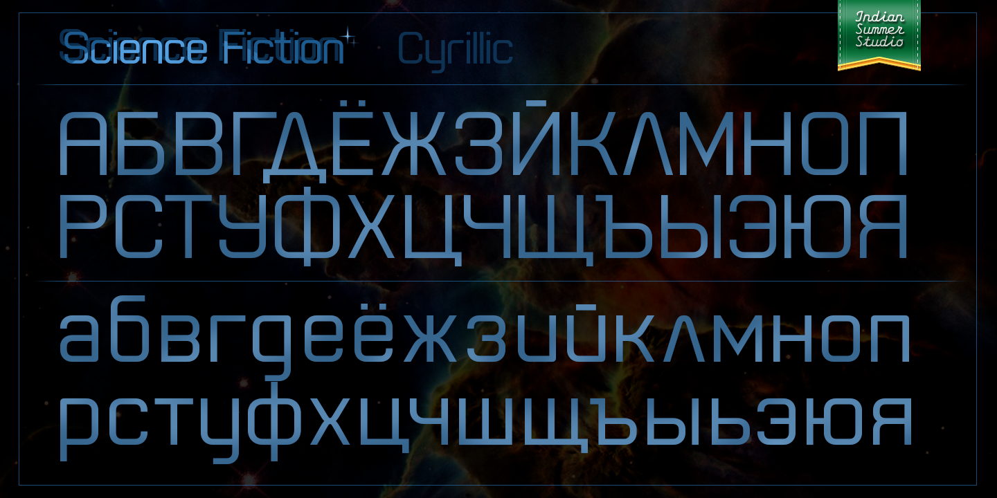
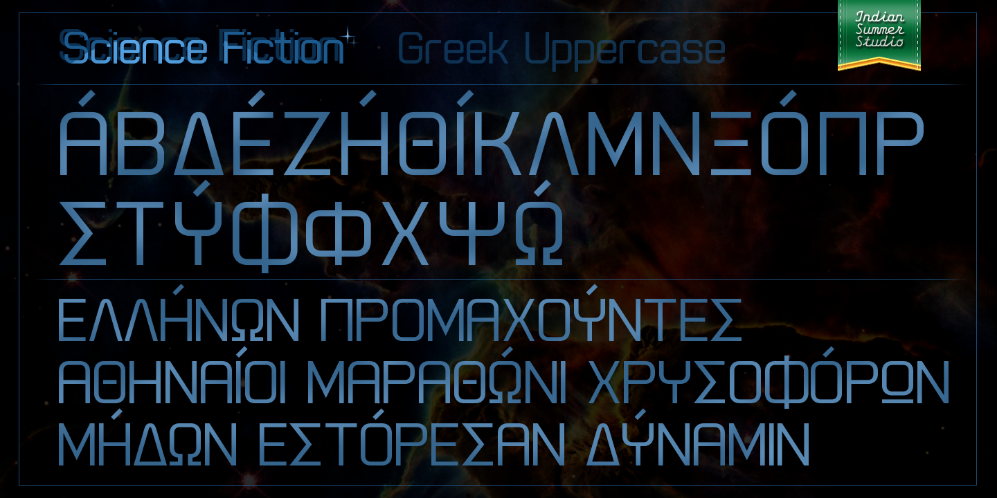
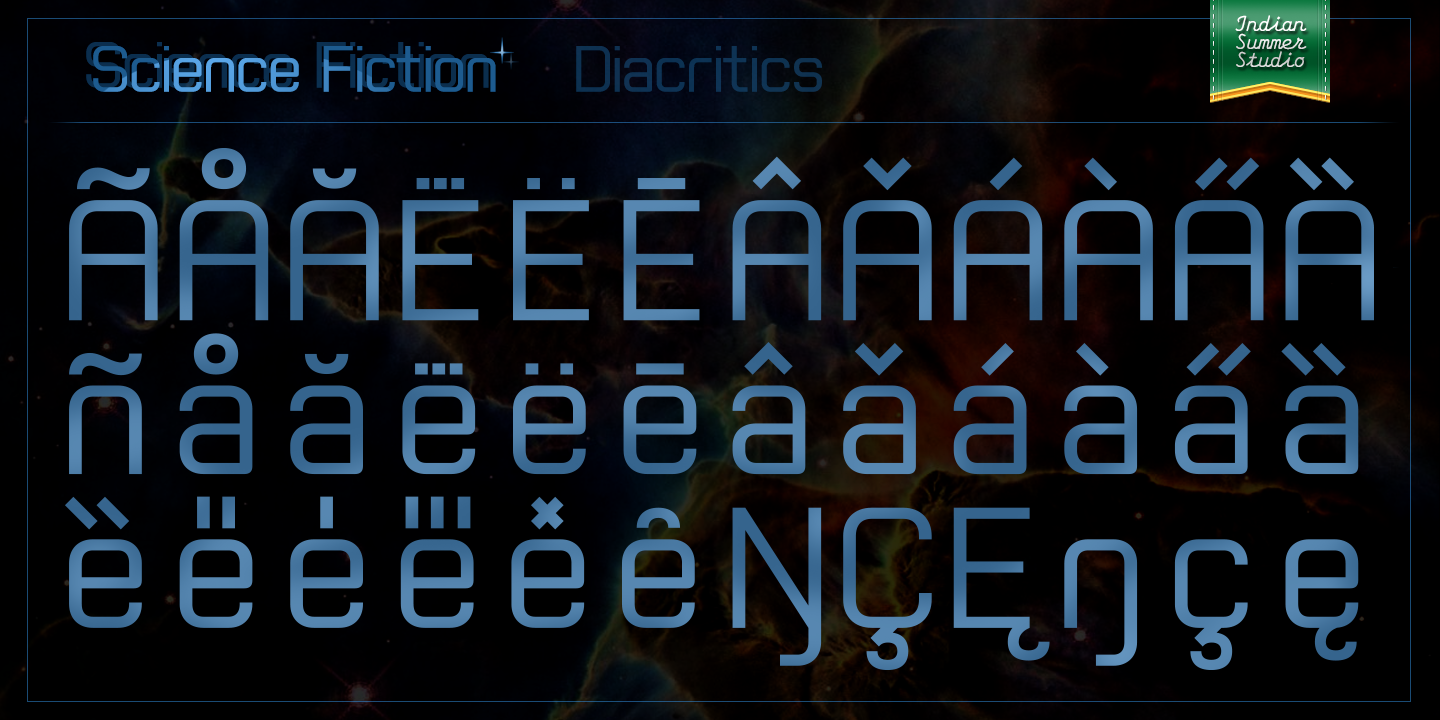
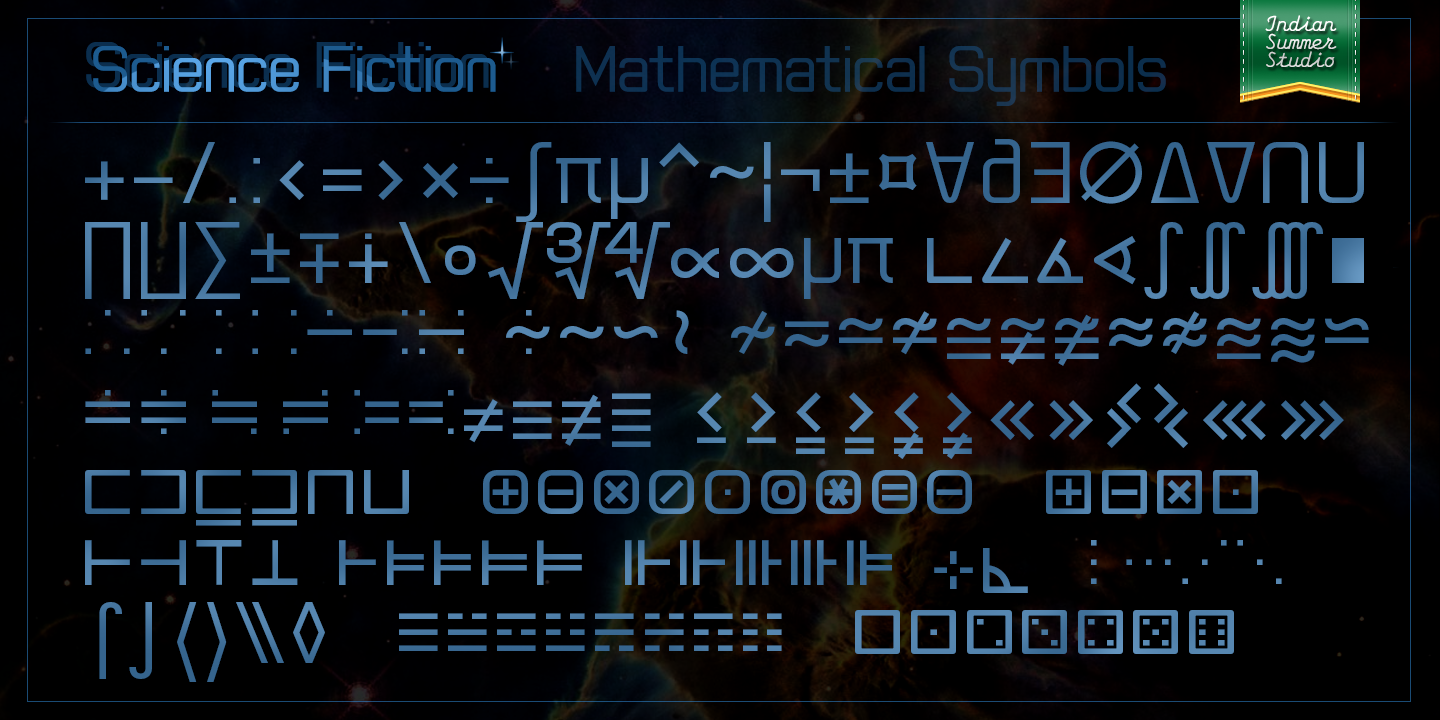
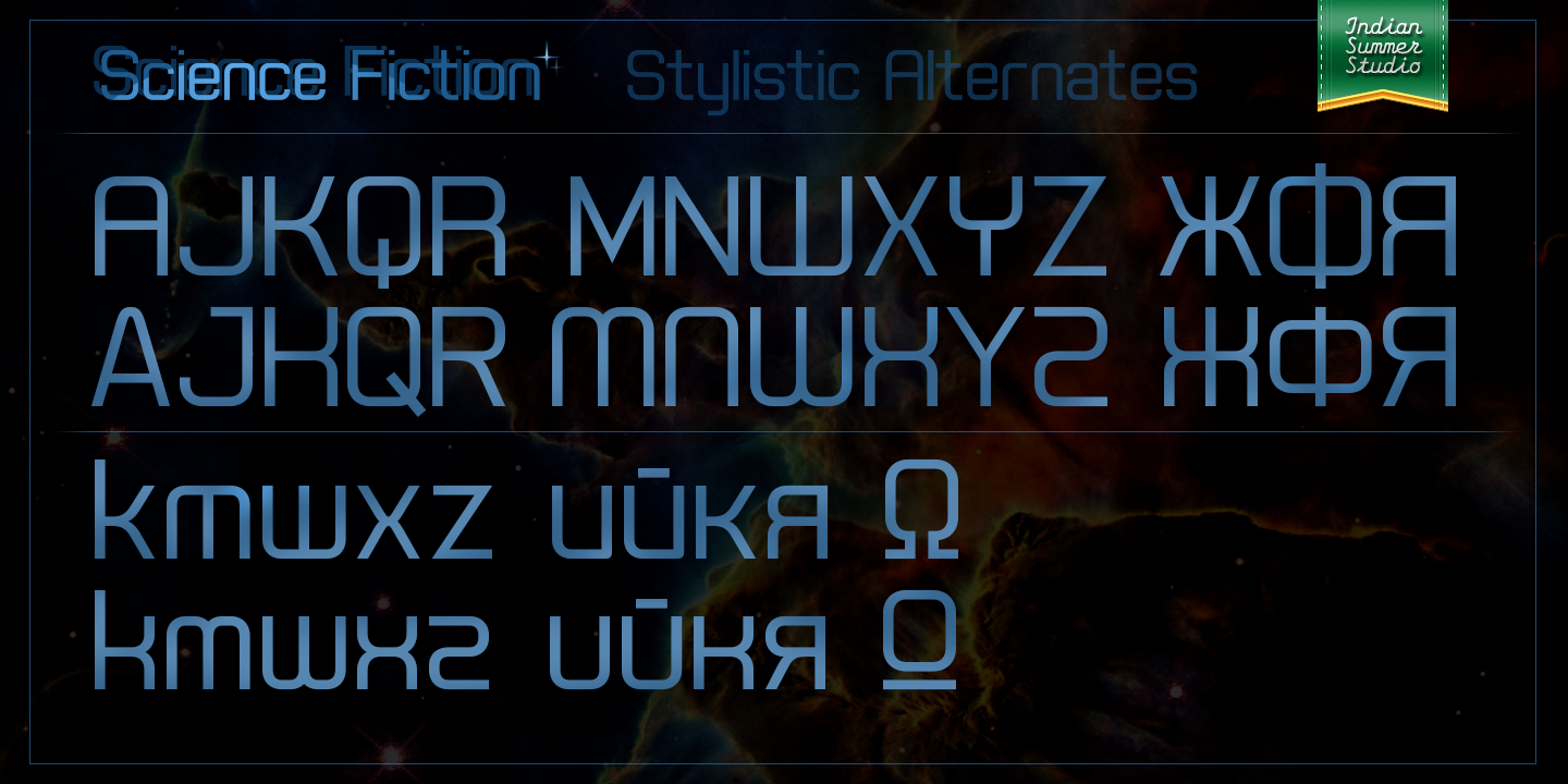
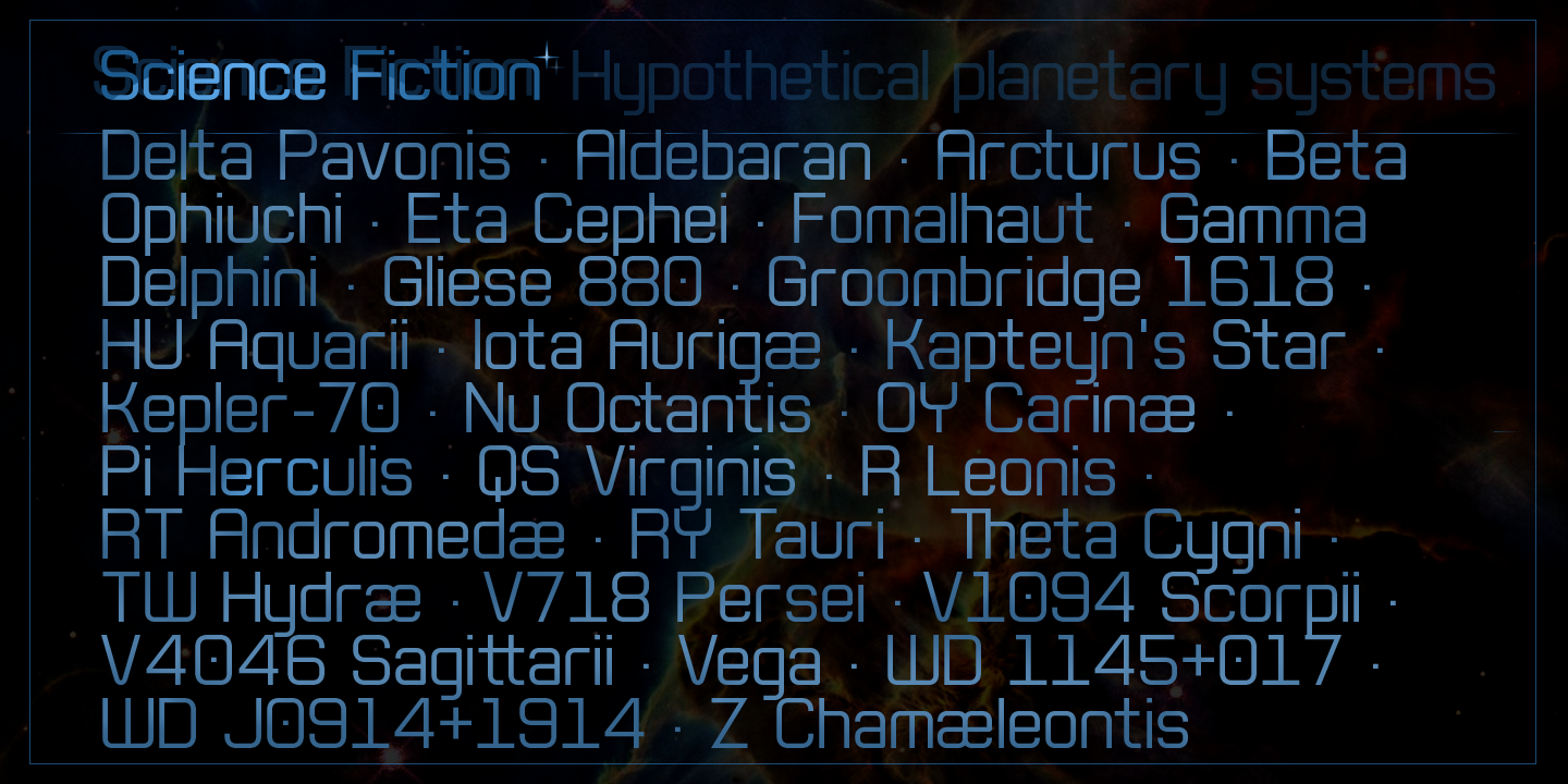
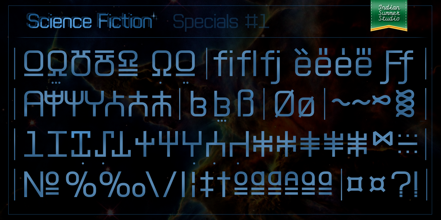
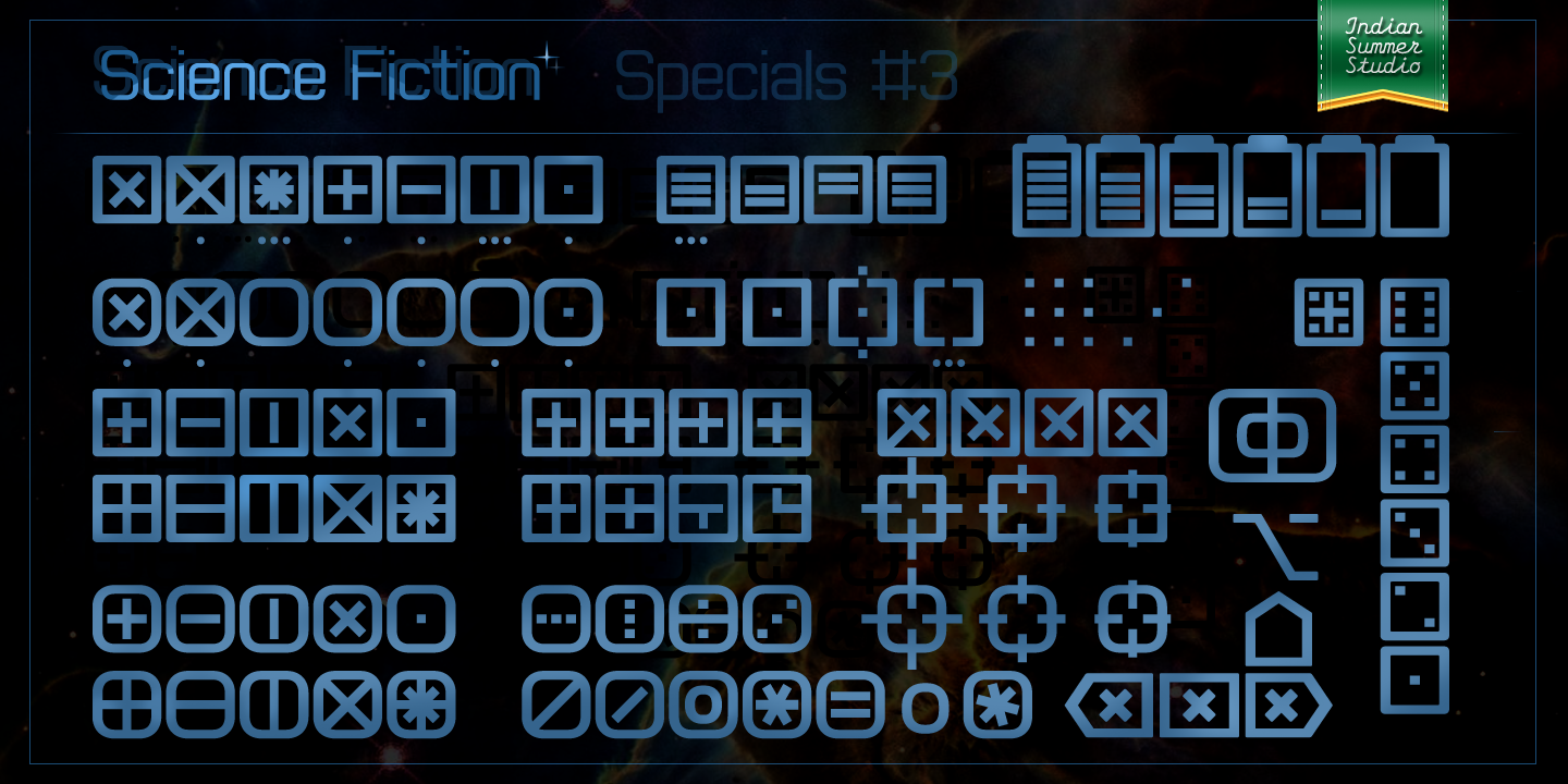
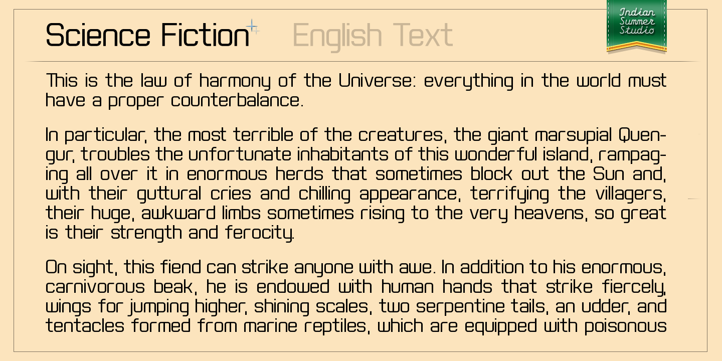
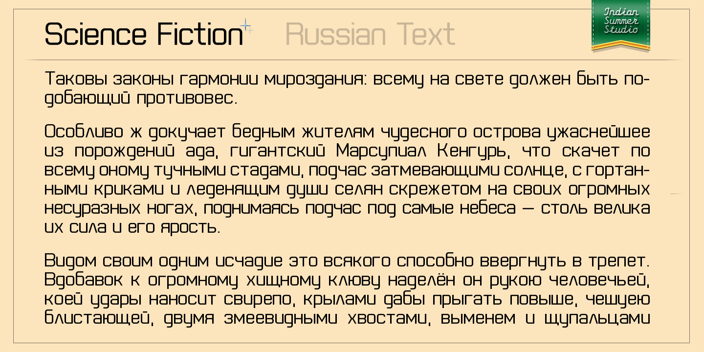
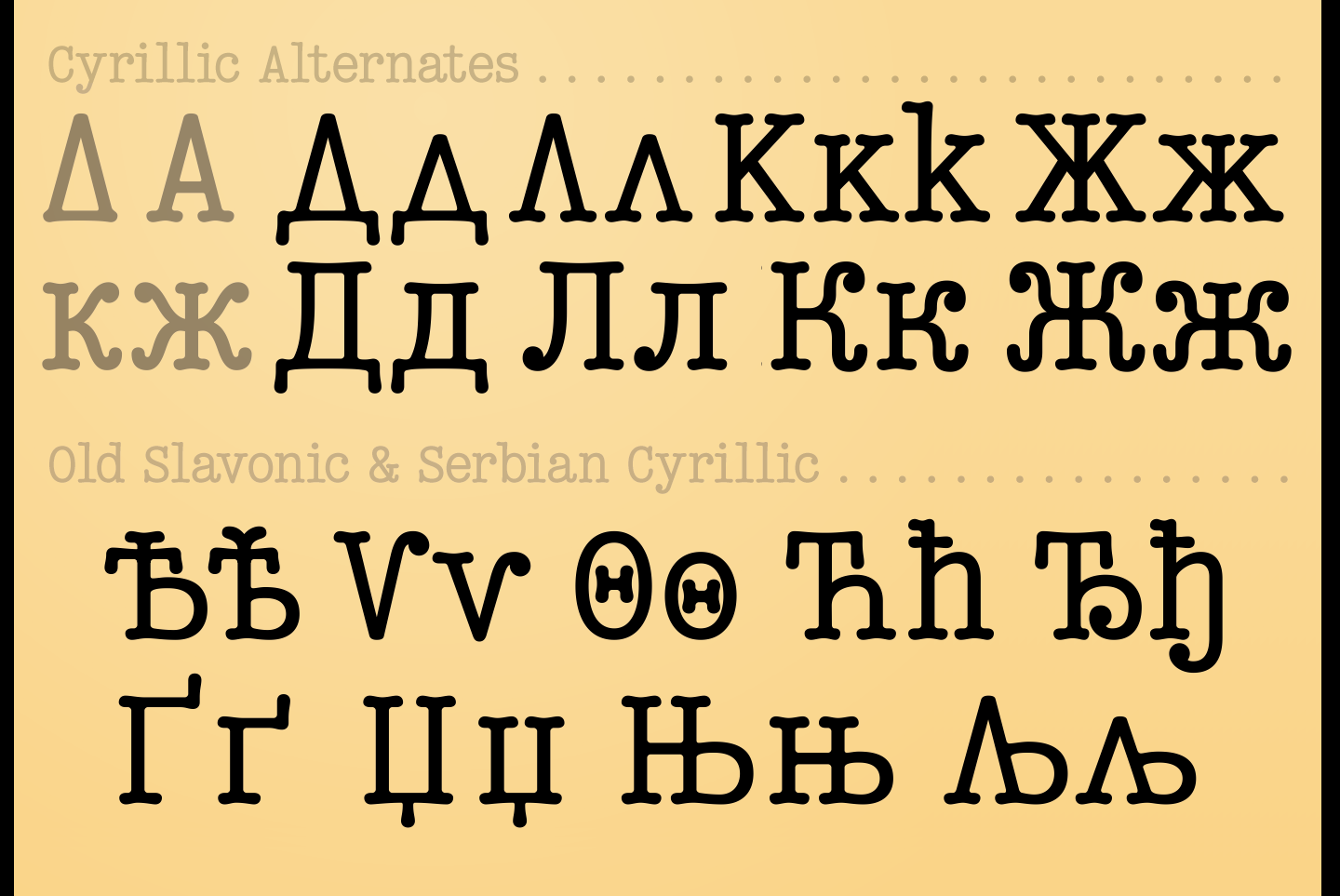
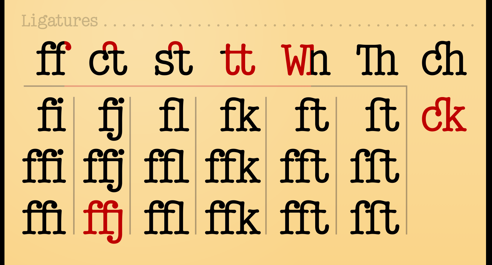
Science FictionLatin + Cyrillic + Greek (UC) 900+ glyphs 1 May – 12 Jun 2021 Science Fiction at FontSpring — 50% off until Aug '21 Geometric sans-serif with clean, ordered, hi-tech, futuristic feeling. For texts, titles, interfaces, logos, technical inscriptions, everything. 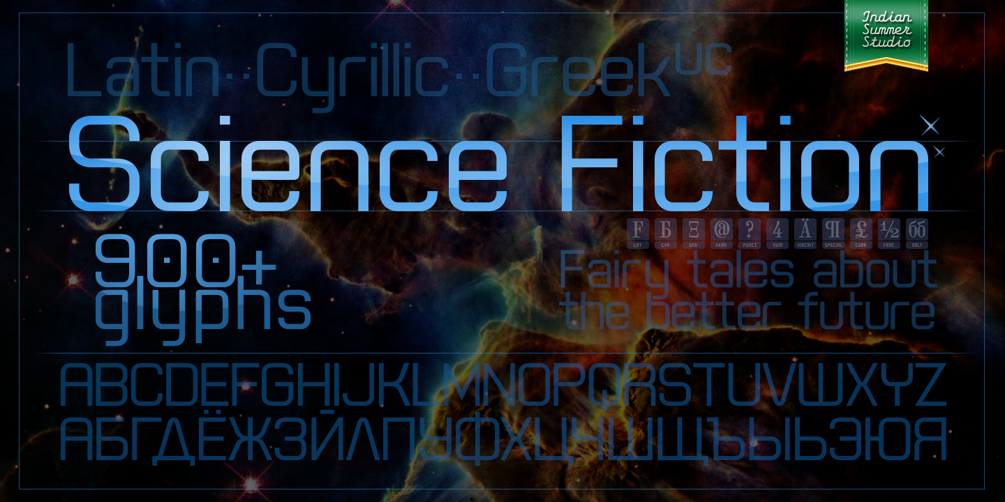 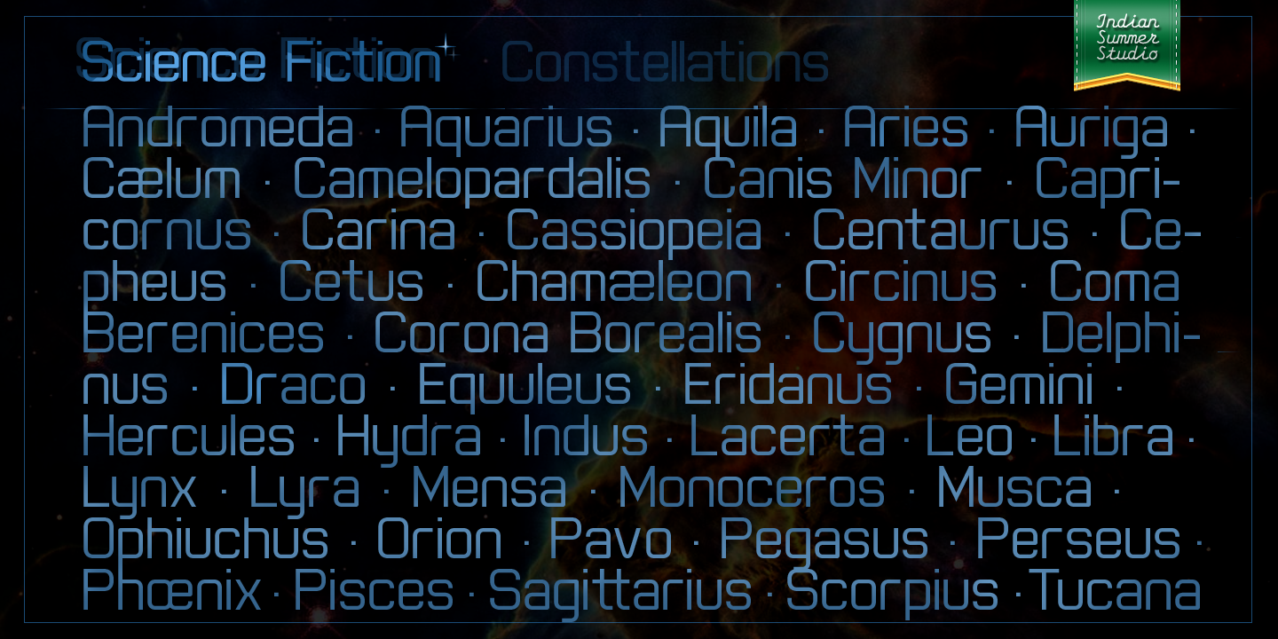 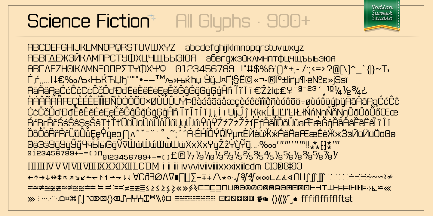 | |||||||||||
2 FEB '20 |
187
Bellefair Cyrillicby Nick Shinn
Google Fonts: Bellefair 90+ Cyrillic glyphs: Russian, Serbian, etc. 28 Jan – 2 Feb 2020 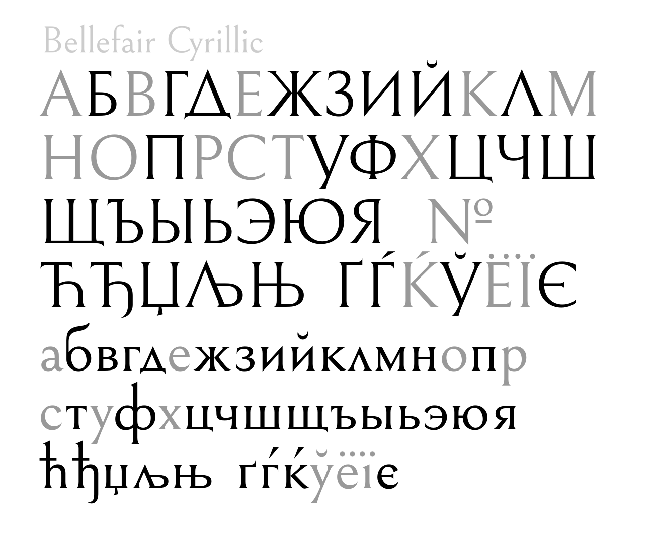 | |||||||||||
15 OCT '20 |
186
 | |||||||||||
28 NOV '20 |
185
| |||||||||||
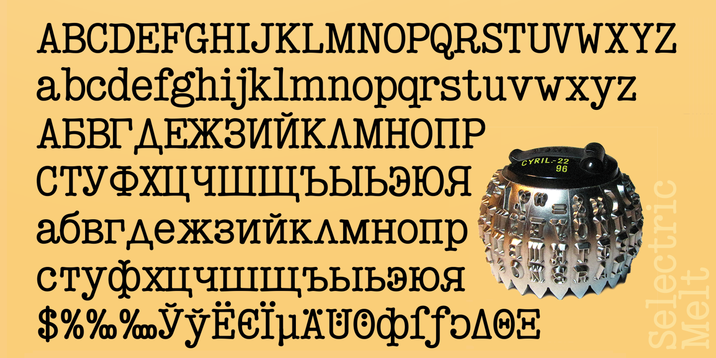
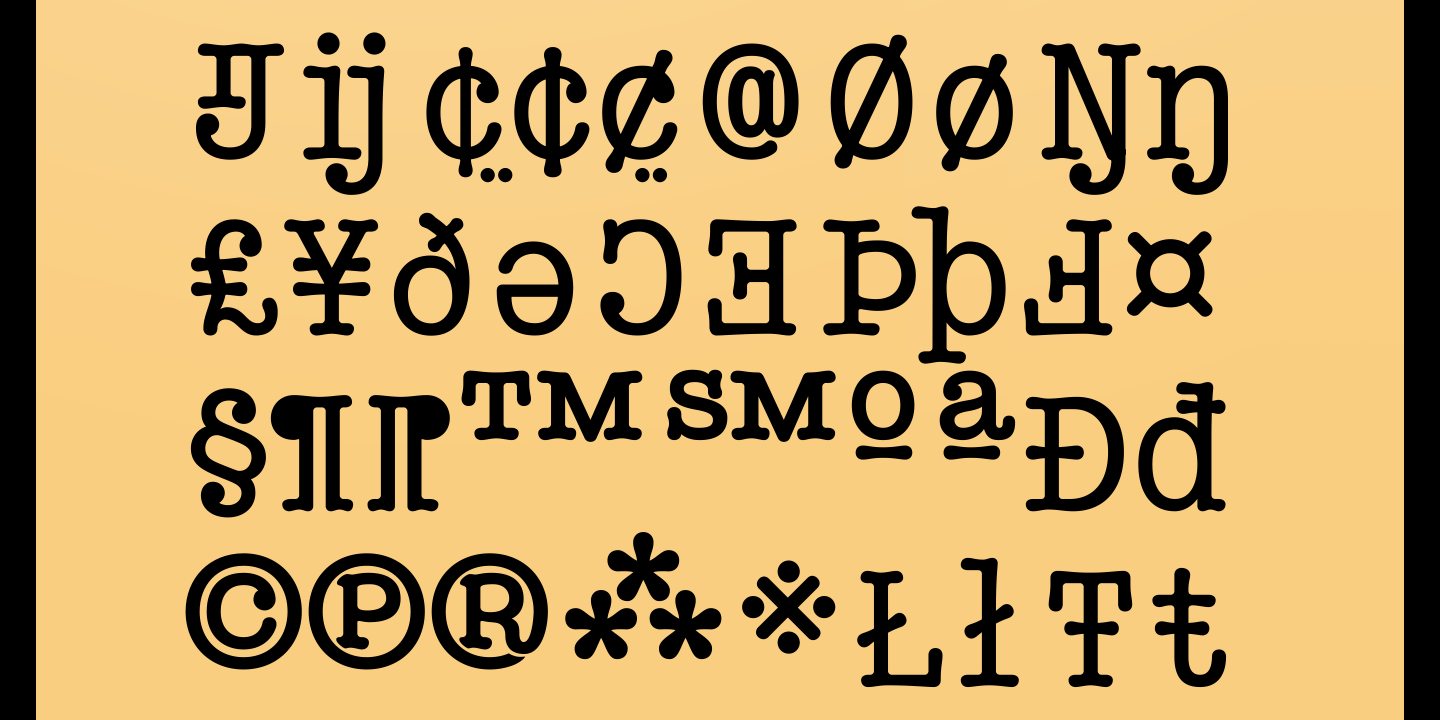
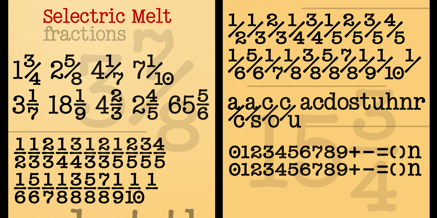
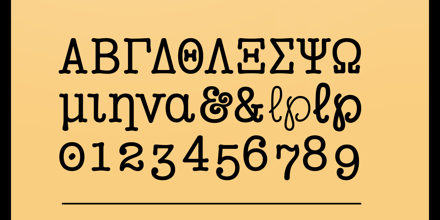
27 Nov '20 |
184
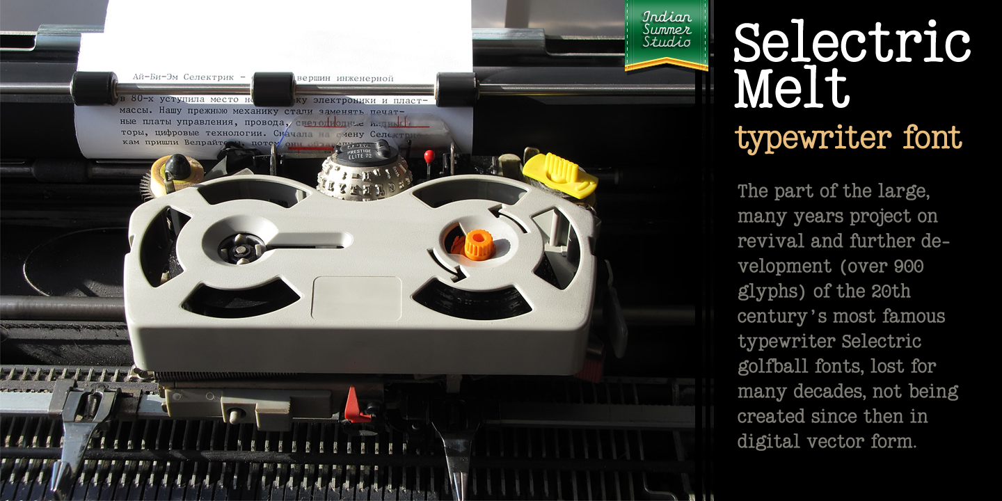
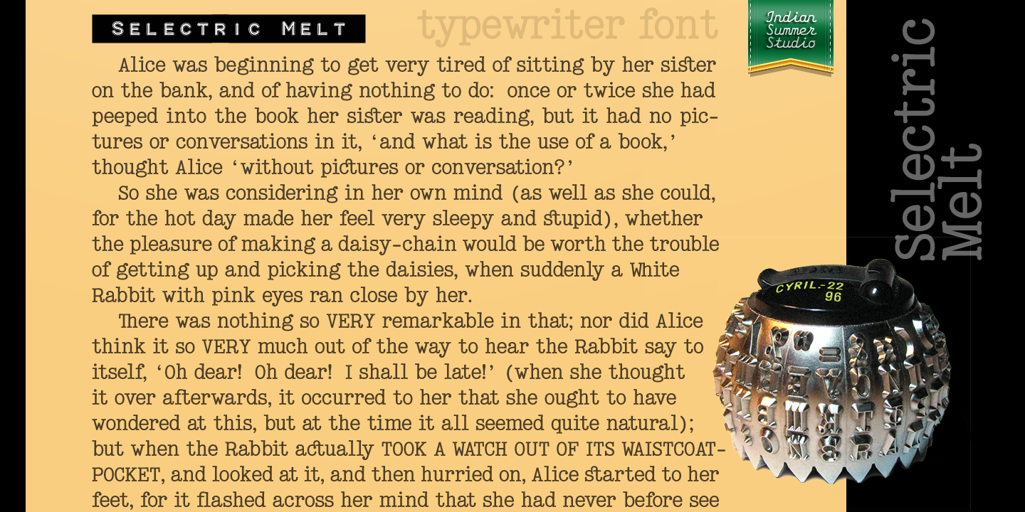
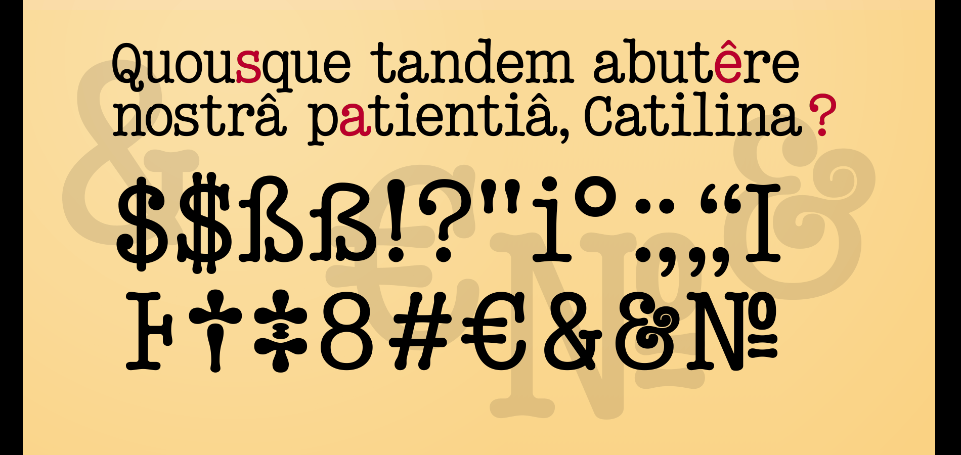
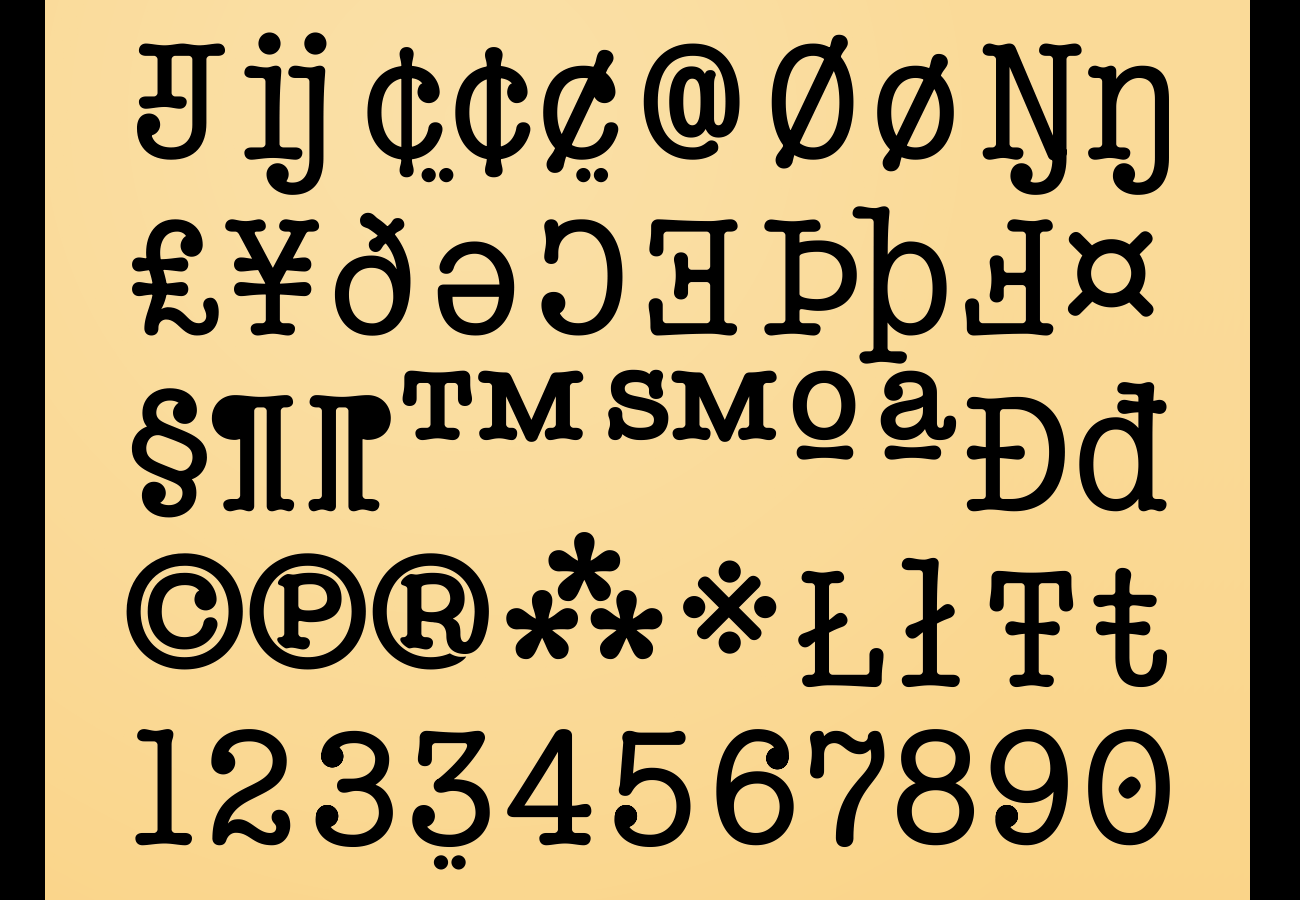
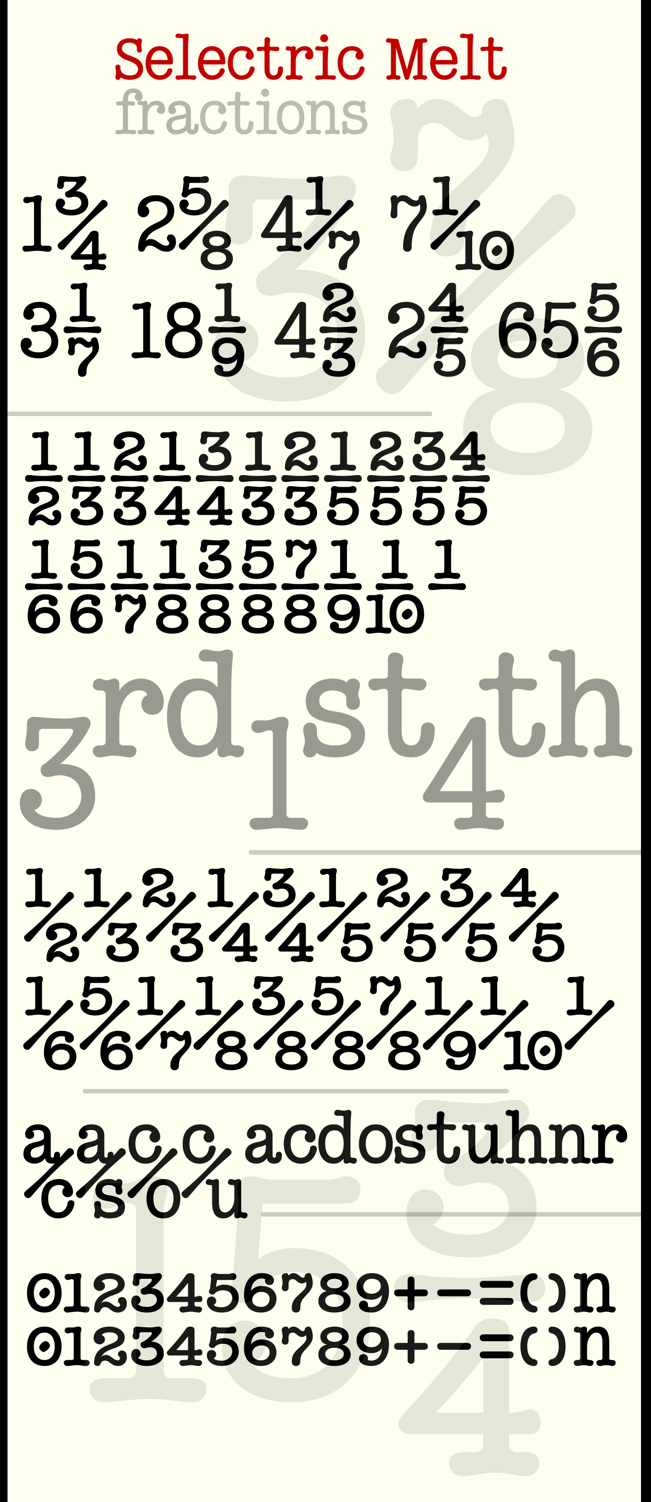
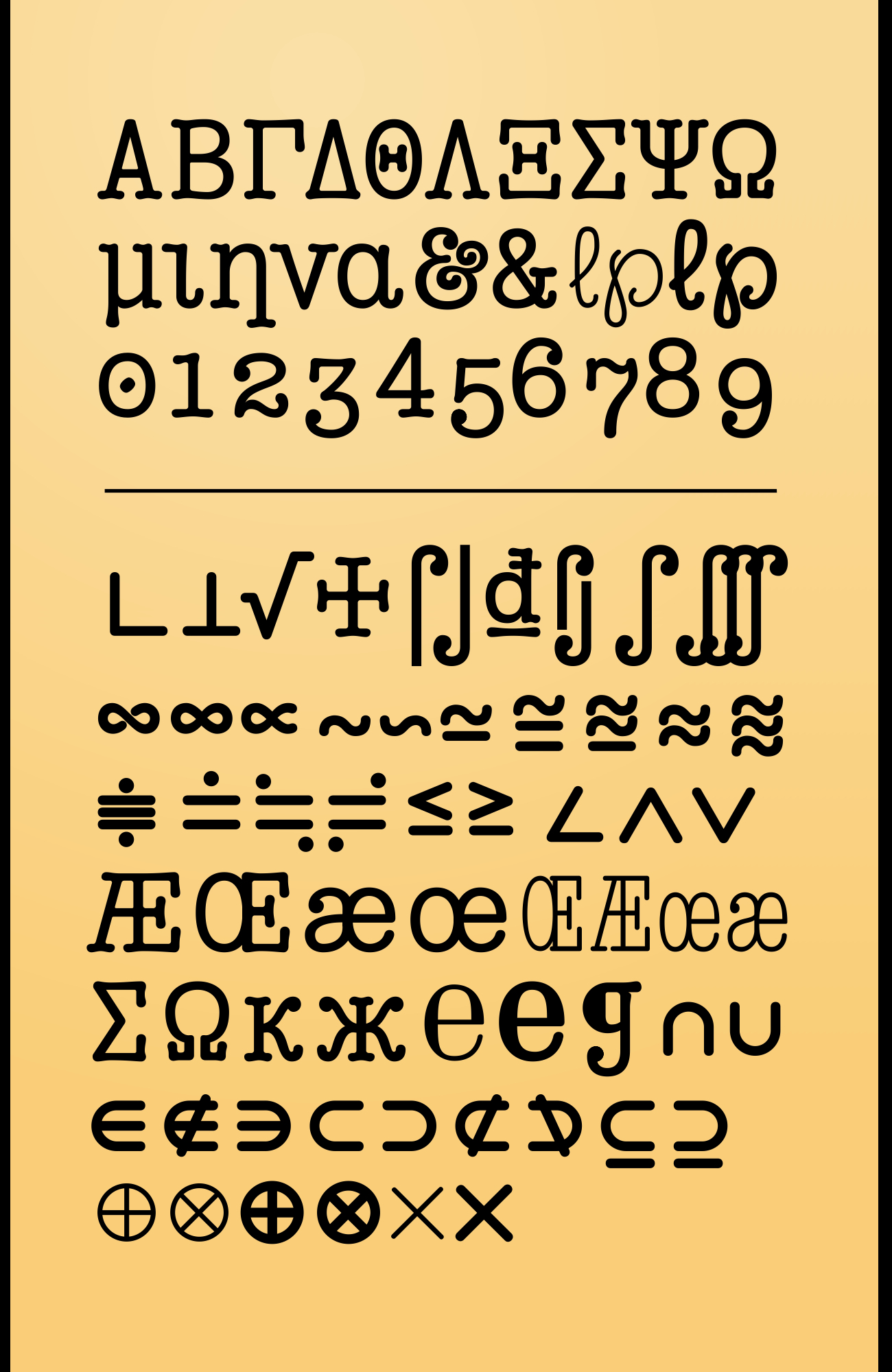
Selectric Melttypewriter font
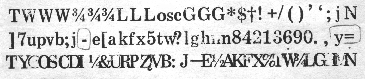
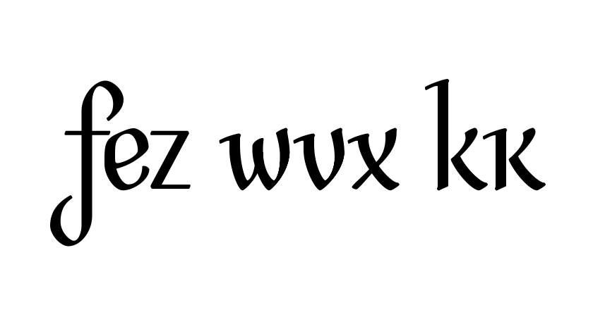
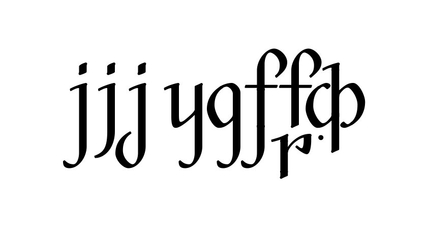
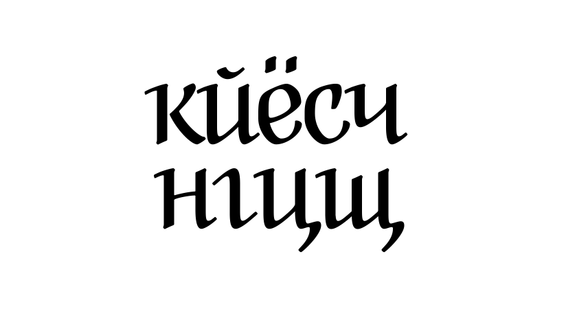
Latin + Cyrillic (incl. Serbian) + Greek (UC) 900+ glyphs 19 Jul – 19 Aug 2020 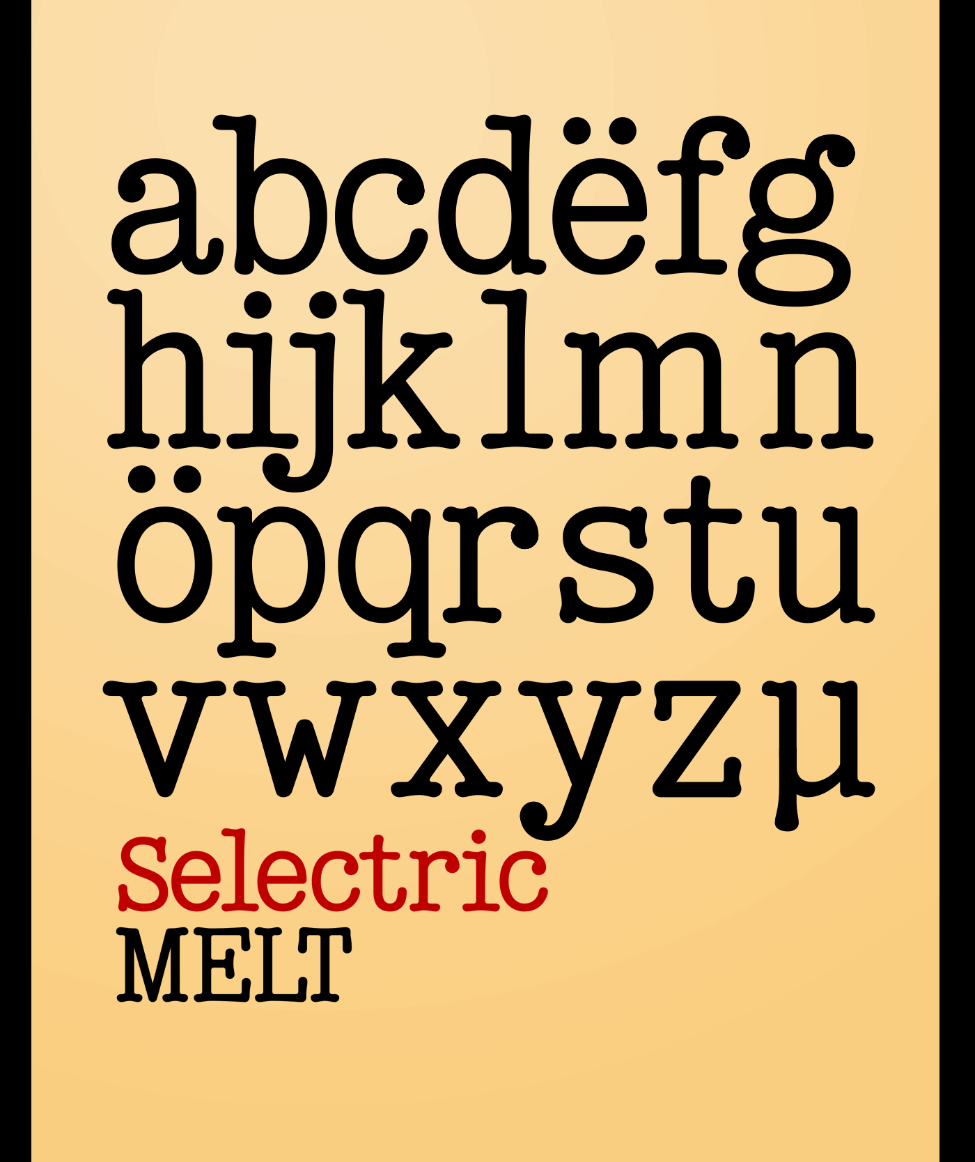 A classical 20-th century's (1900s to 1980s) typewriter font for both text and large display usage, titles, signage... A new thicker version of Selectric (2016), as if typed using not a thin carbon ribbon but a coarse fabric one. Both are available on a different models of Selectrics, and I even have a Selectric I with the both options: carriage units interchangeable by experienced engineers. Made after rare enough samples of the same style used during 1980s in the USSR. Based on the actual letter proportions of the original typewriter Selectric (2016) (Cyrillic ball). This time not monospaced as before, but proportional. The single known so far previous typewriter vector typeface with this 'ink blotting' effect (similarly expanded serifs) as in Dodo (2008) (PDF) is ITC American Typewriter (1974; by Joel Kaden and Tony Stan) and all its hand drawn analogs from 1980s (and perhaps before). Which, in turn, is strikingly resembling ATF Bulletin Typewriter's (1925, 1933; by Morris Fuller Benton) overall proportions, geometry, and even had some natural ink expands in its paper sample (but not by design, as I see it). Also see «Bulletin Typewriter, 1925» in "American Metal Typefaces of the Twentieth Century" by Mac McGrew. 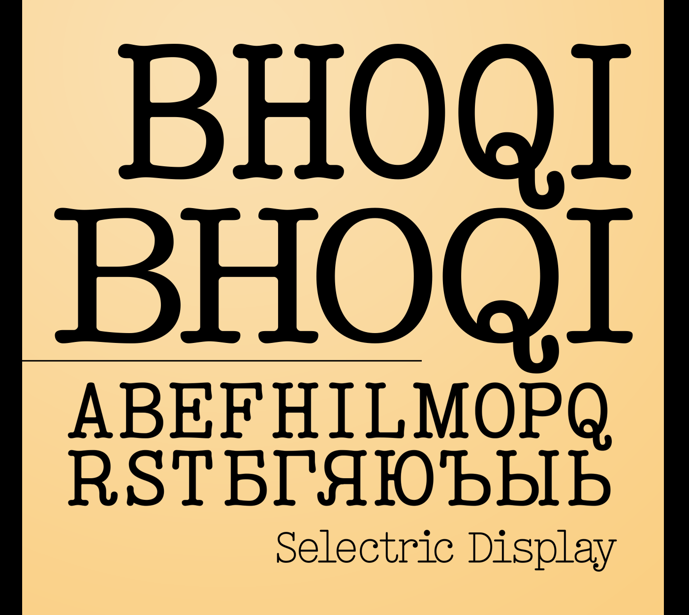 | |||||||||||
28 MAR '20 |
182
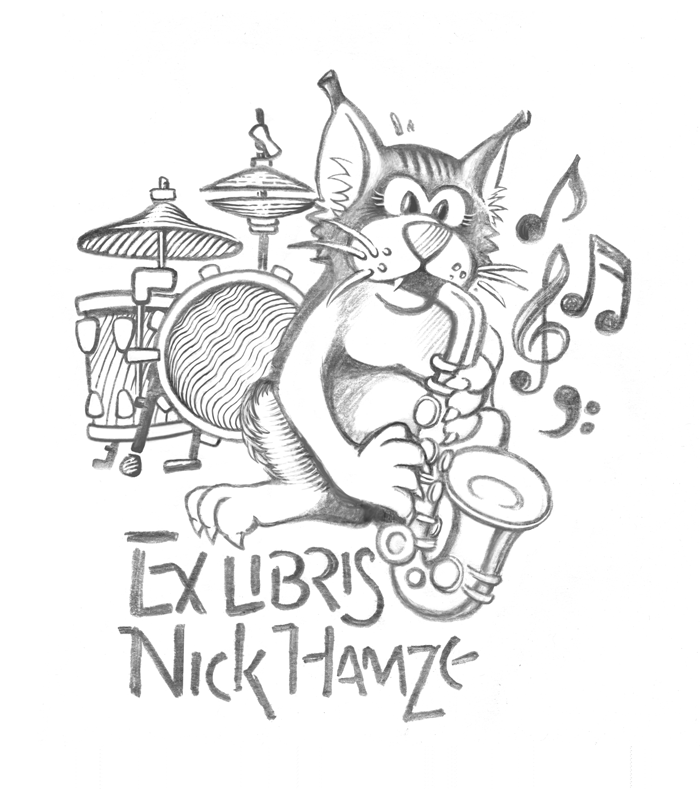
Cat with saxophone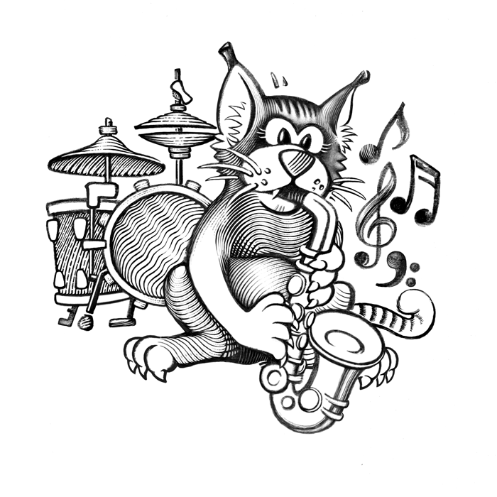
25, 28 Mar 2020 | |||||||||||
16 Dec '19 |
178
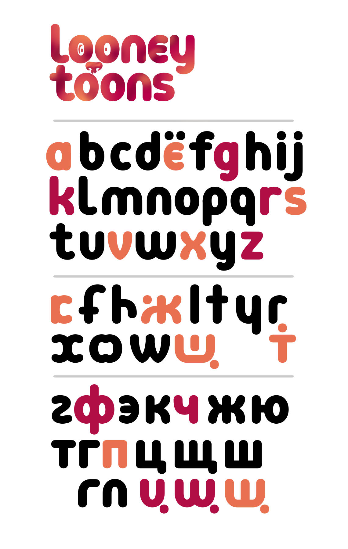
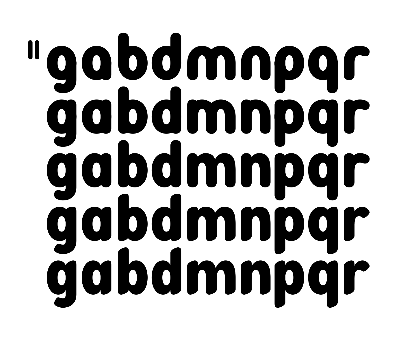
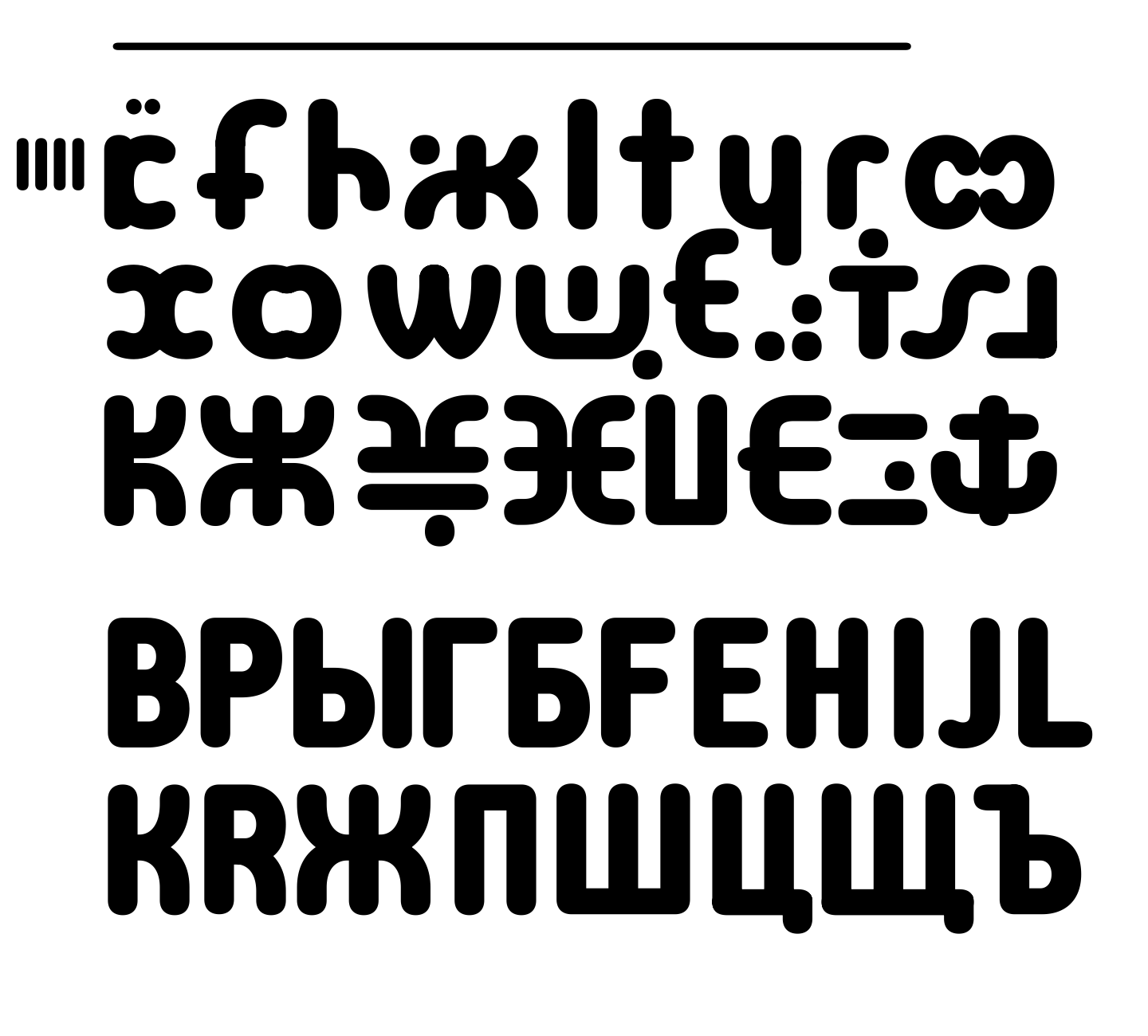
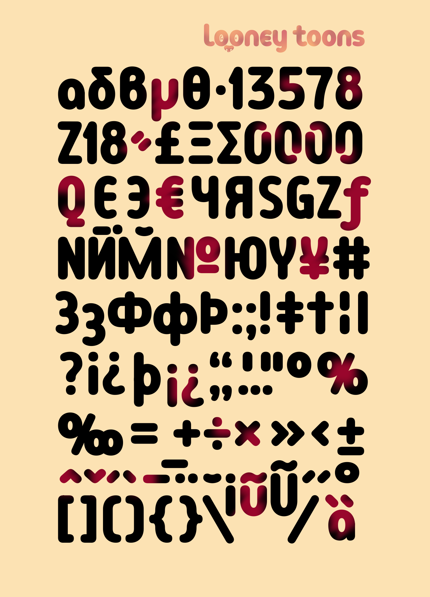
Looney ToonsCartoon display font 4–16 Dec 2019 500+ glyphs Latin + Cyrillic + Greek  Made entirely after Ekke Wolf's Greek 'rho' letter's idea in Runde Wien: — Damn, it's funnier than every Disney's mouse, duck and everything. — The source letter for a whole special typeface — with own funny happy mood. — As I see, it's the decent respected well-mannered sans. And this 'rho' is the source for the completely different looney toon display type. Just found it around this brilliant oval. 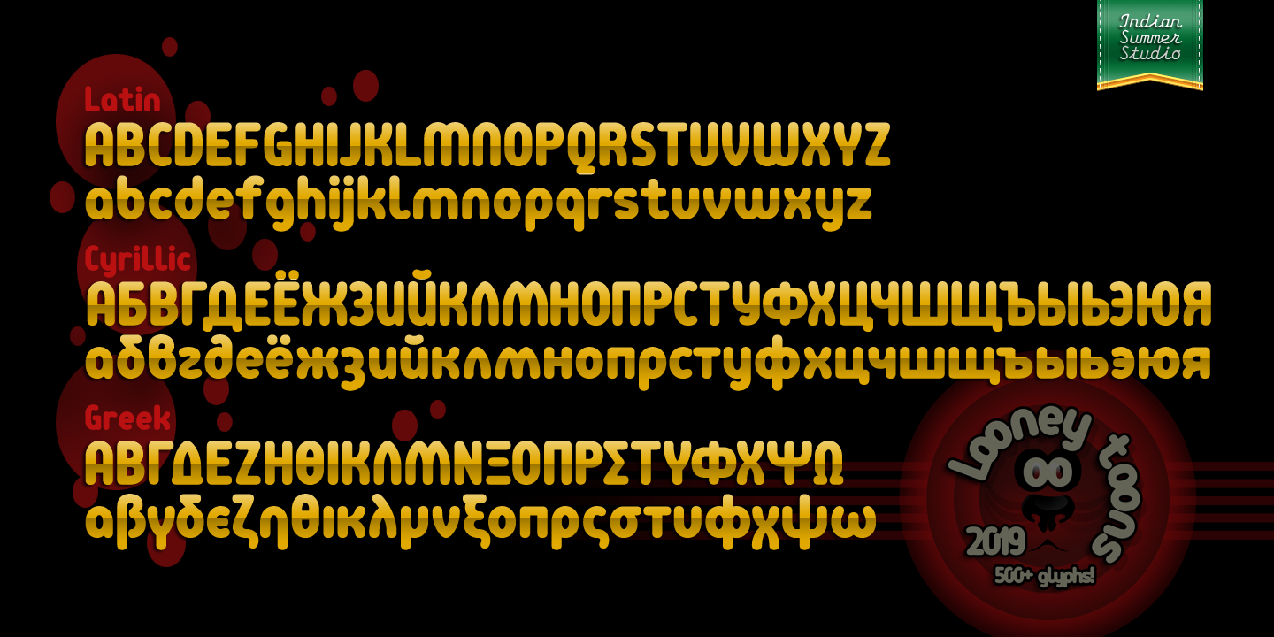 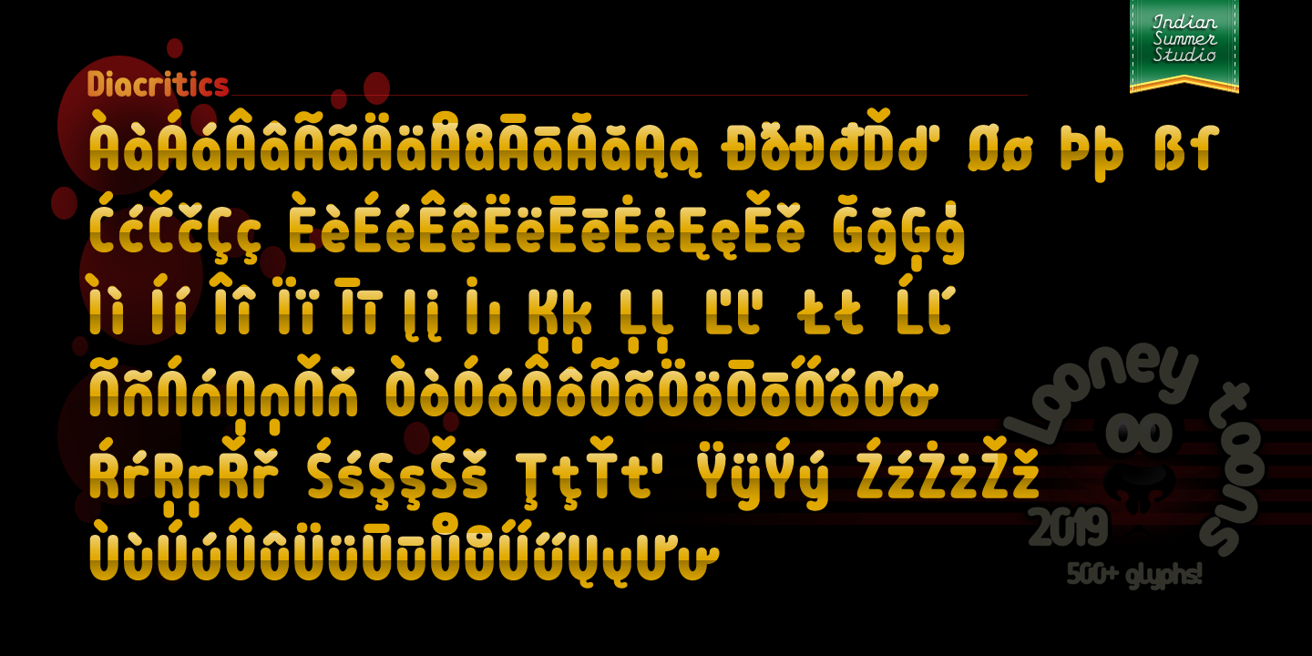 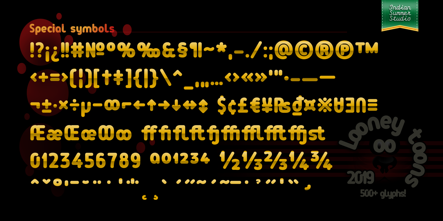 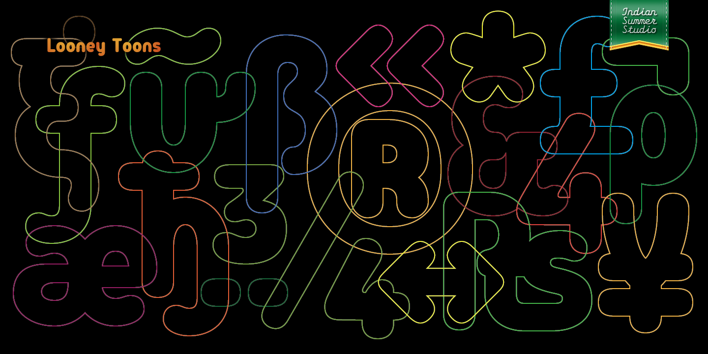 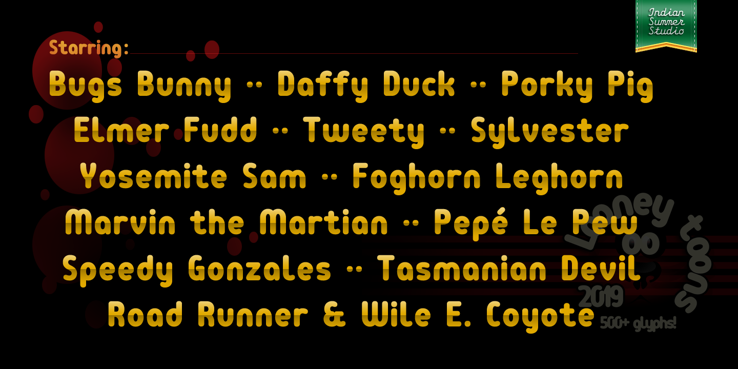 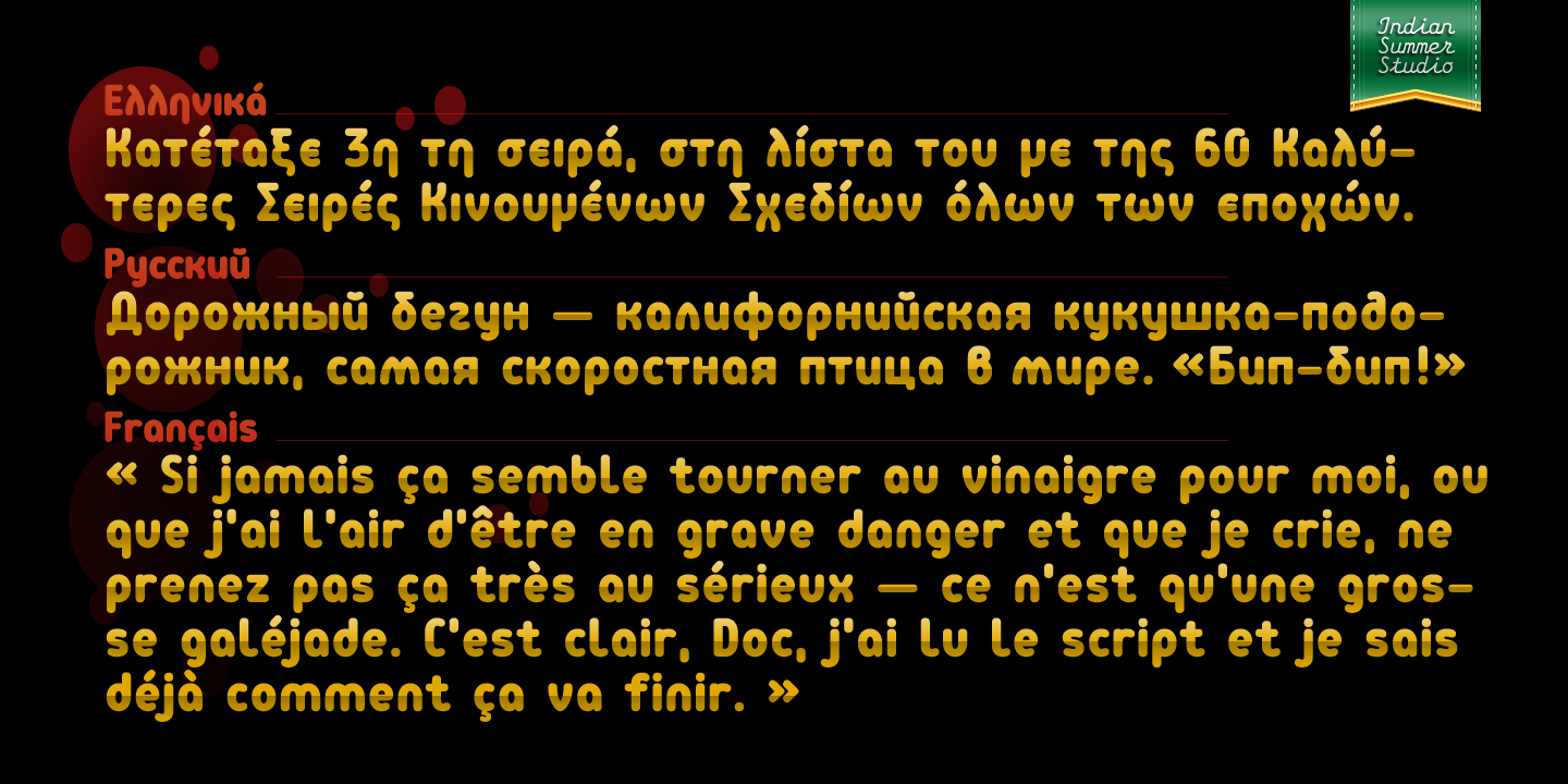 | |||||||||||
27 Nov '19 |
177
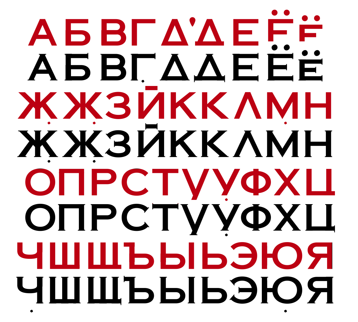
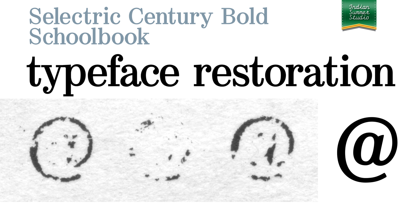
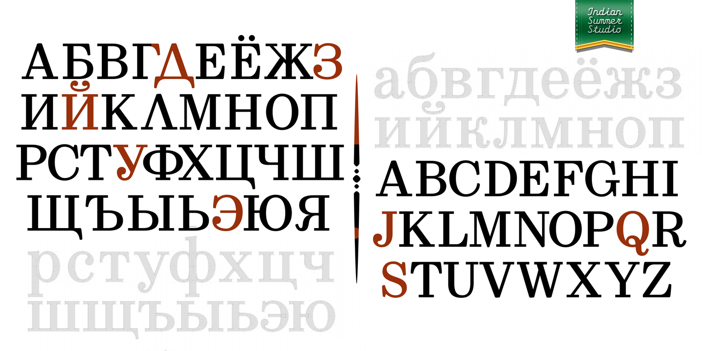
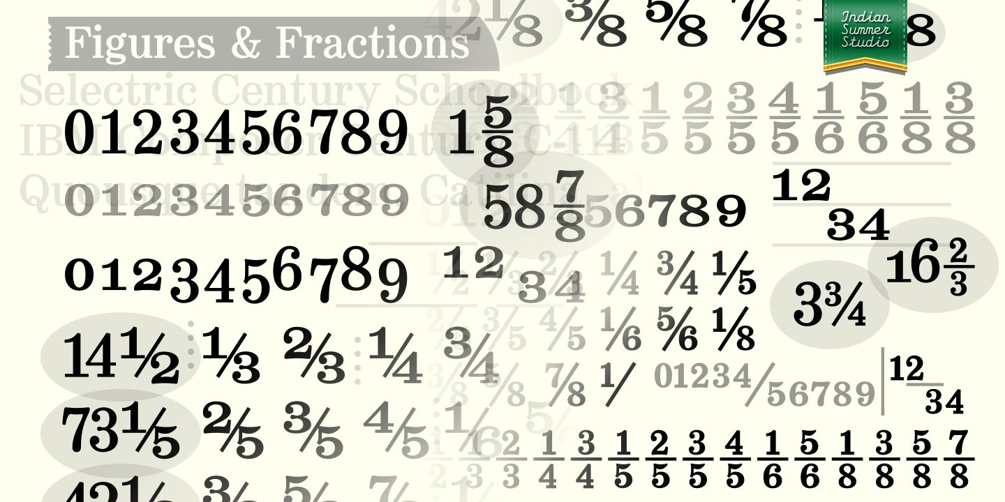
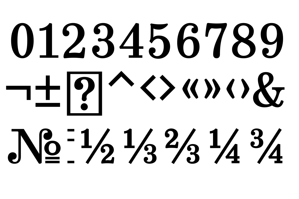
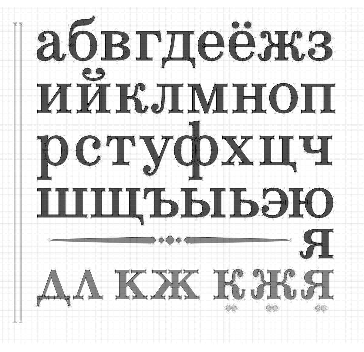
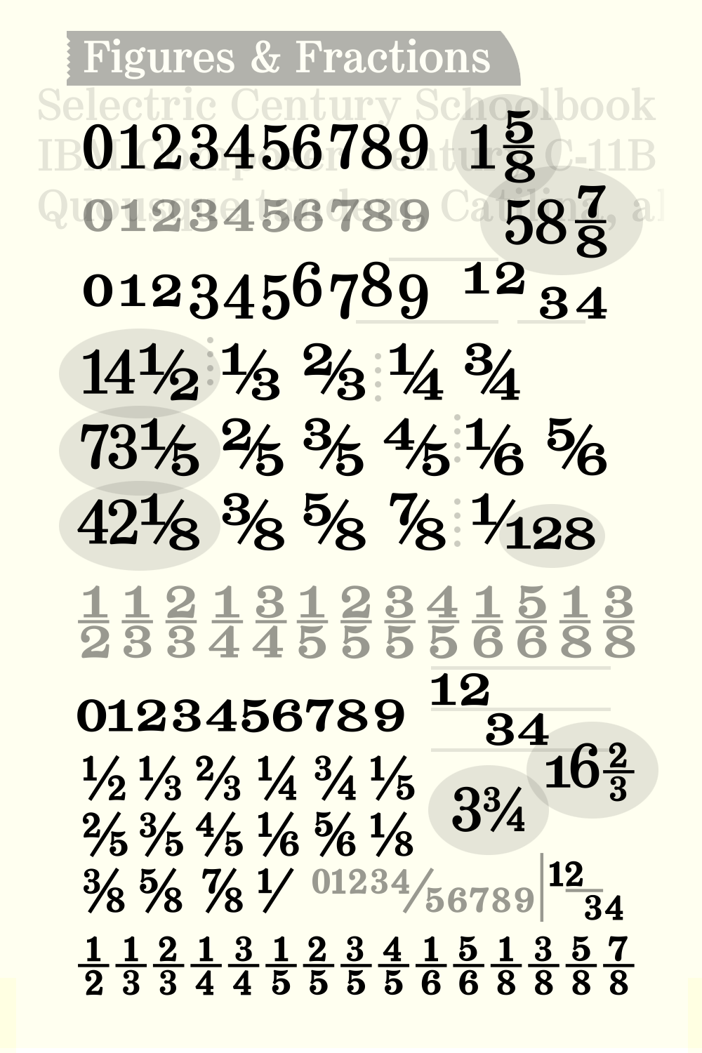
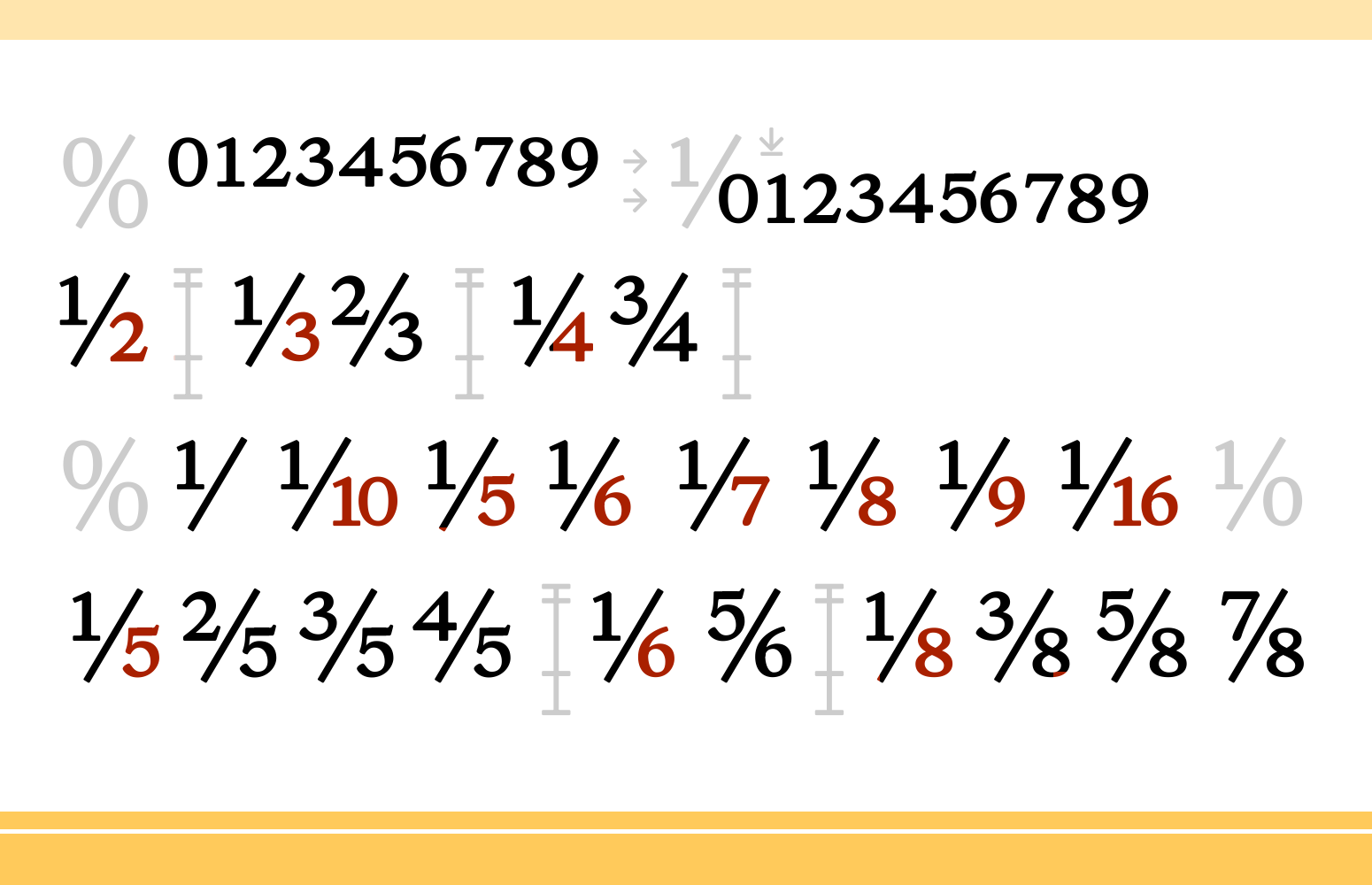
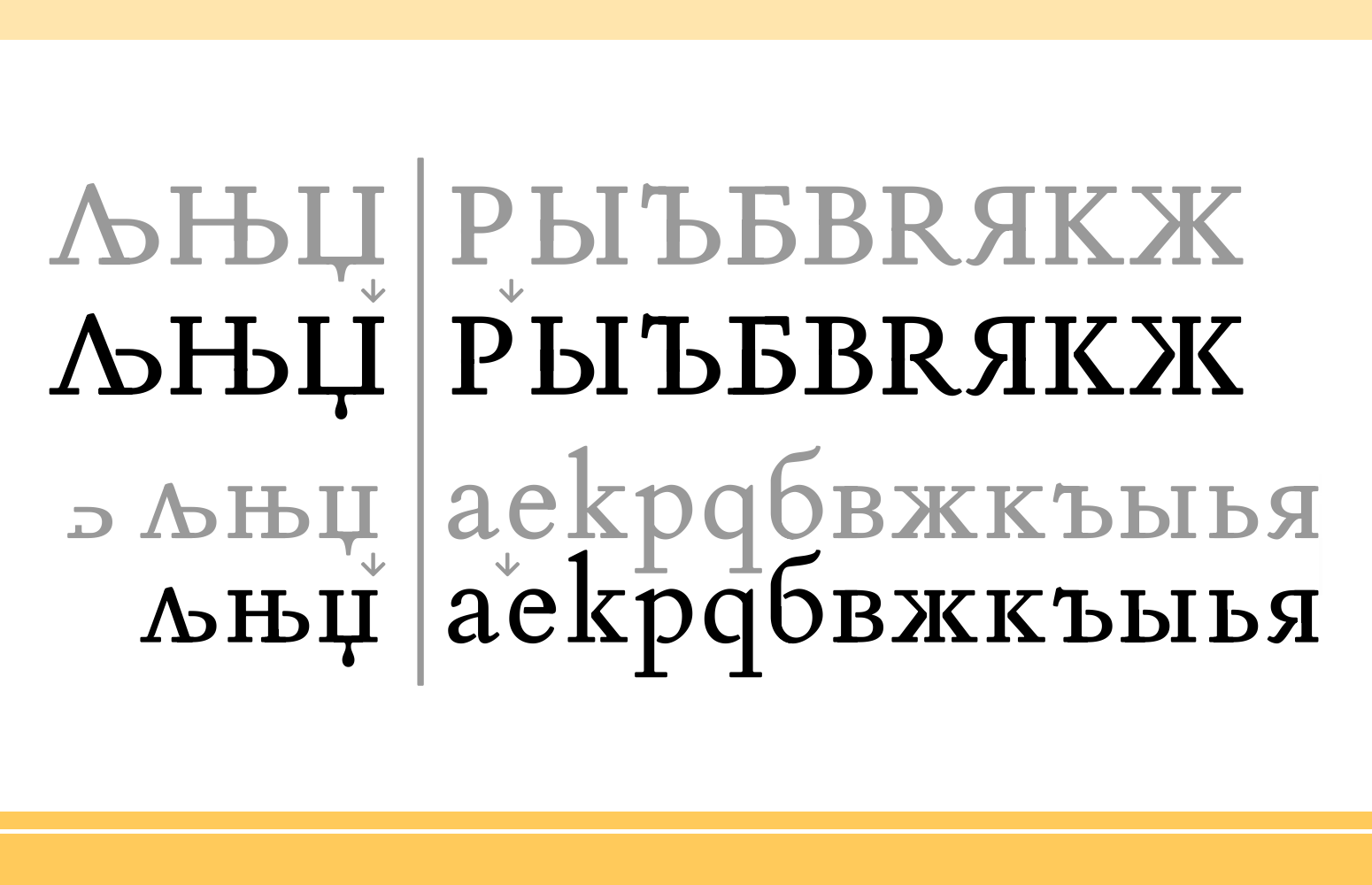
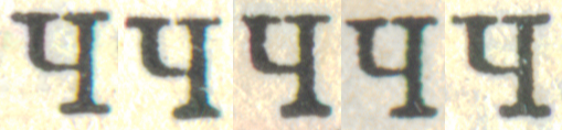
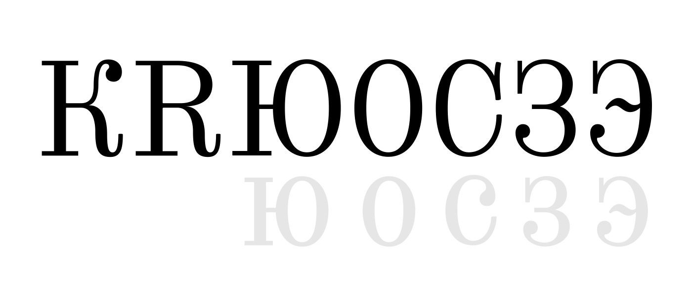
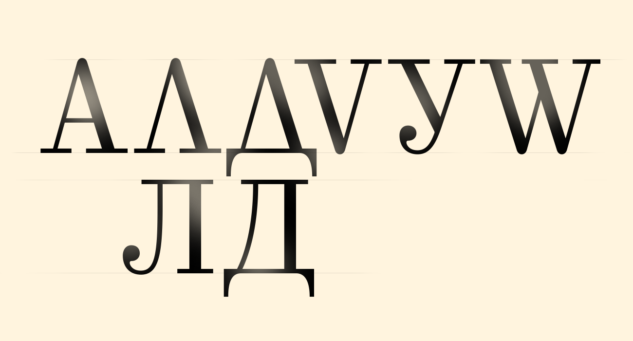
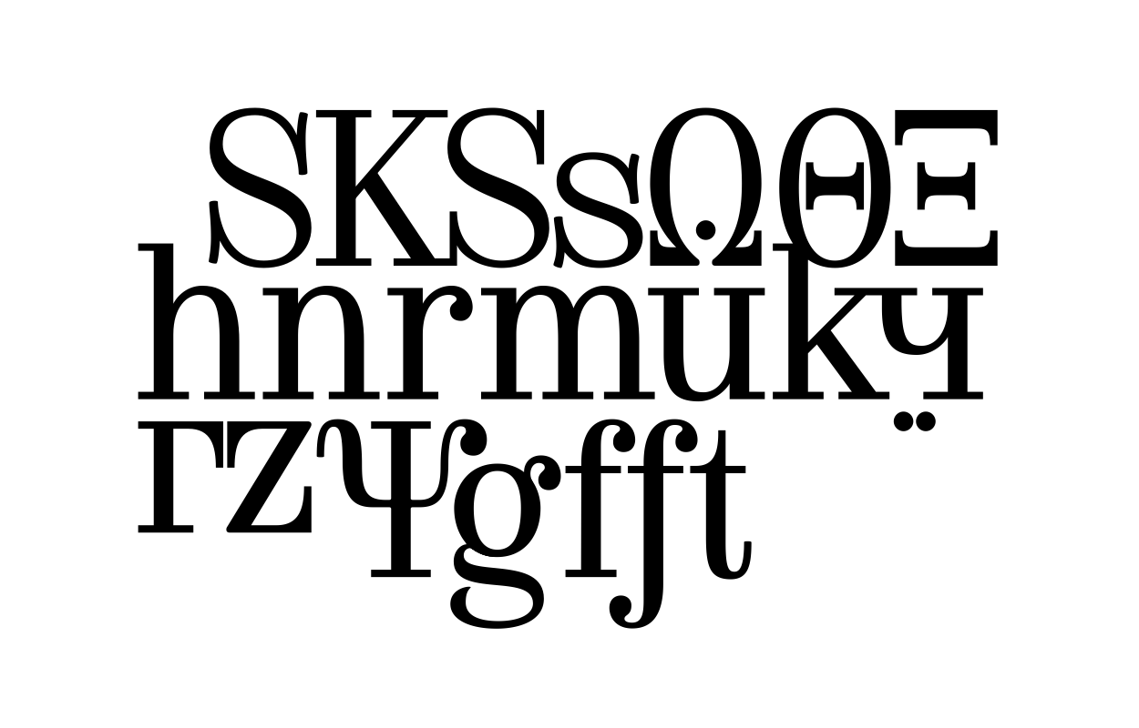
Selectric CenturySerif — Didone — Scotch Modern Latin + Cyrillic + Greek 900+ glyphs 29 Oct – 27 Nov 2019  Selectric Century at FontSpring Century Bold, also known as Schoolbook, was one of the main book typefaces in the 20th century in the USSR: «Гарнитура Школьная». The perfect choice as a main bookface because of its classical shapes, elegancy and perfect readability. After Linn Boyd Benton's and Morris Fuller Benton's 1894 lower contrast version of Scotch Modern, Didone. The part of the large project on revival and further development (by drawing many additional glyphs) of the 20th century’s typewriters’ fonts. And especially the most famous, versatile and beautiful typewriter: IBM Selectric’s golfball fonts, lost for the civilization for many decades after ‘80s, not being created since then in digital vector form. This new sub-project started in July 2018 for the restoration of the most beautiful classical typefaces, used during the 20th century on the extremely rare now IBM Selectric Composer typewriters / desktop publishing systems. Together with Nick Hamze and the Right Reverend Theodore Munk, the collectors of old typewriters. IBM showed the perfect taste by developing these best historical book typefaces of the human civilization for typewriters. So people could type then using both the real book faces, and the famous classical ones. 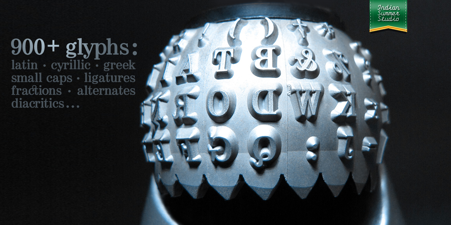 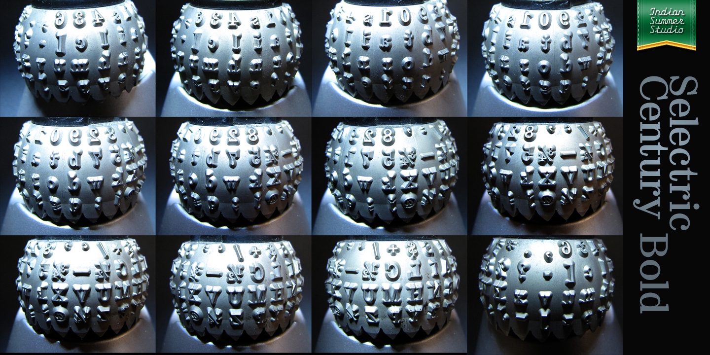 | |||||||||||
26 Jan '19 |
161
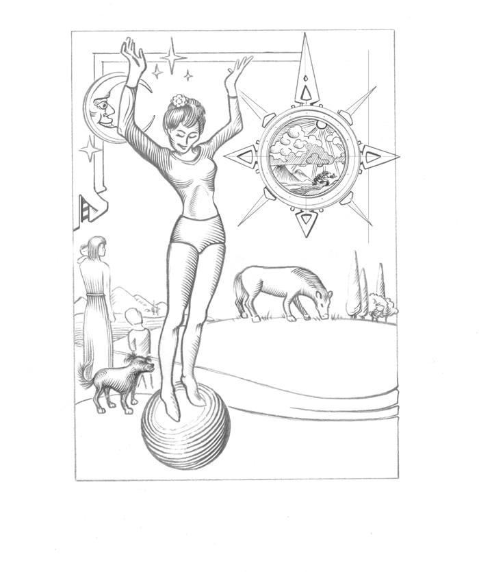
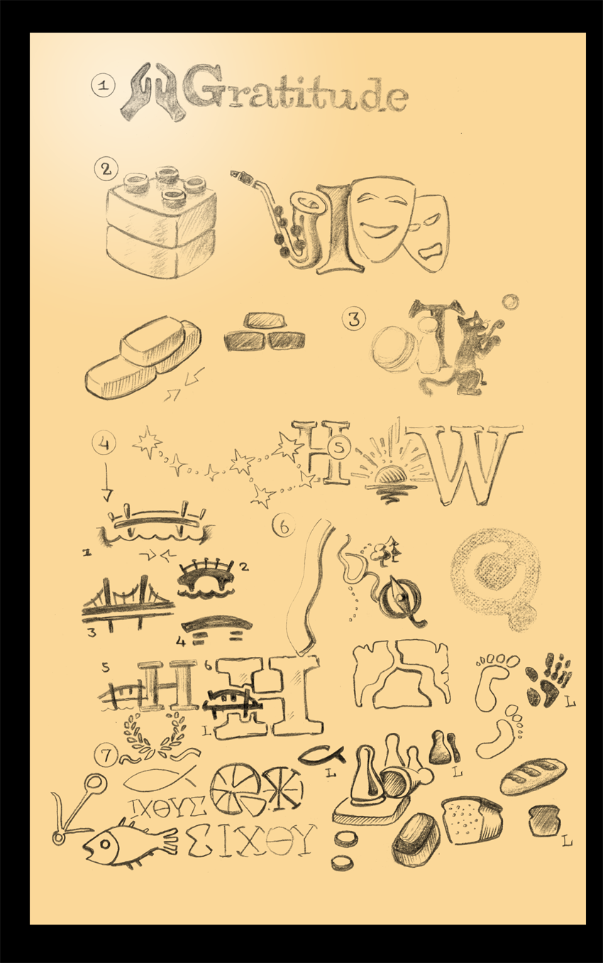
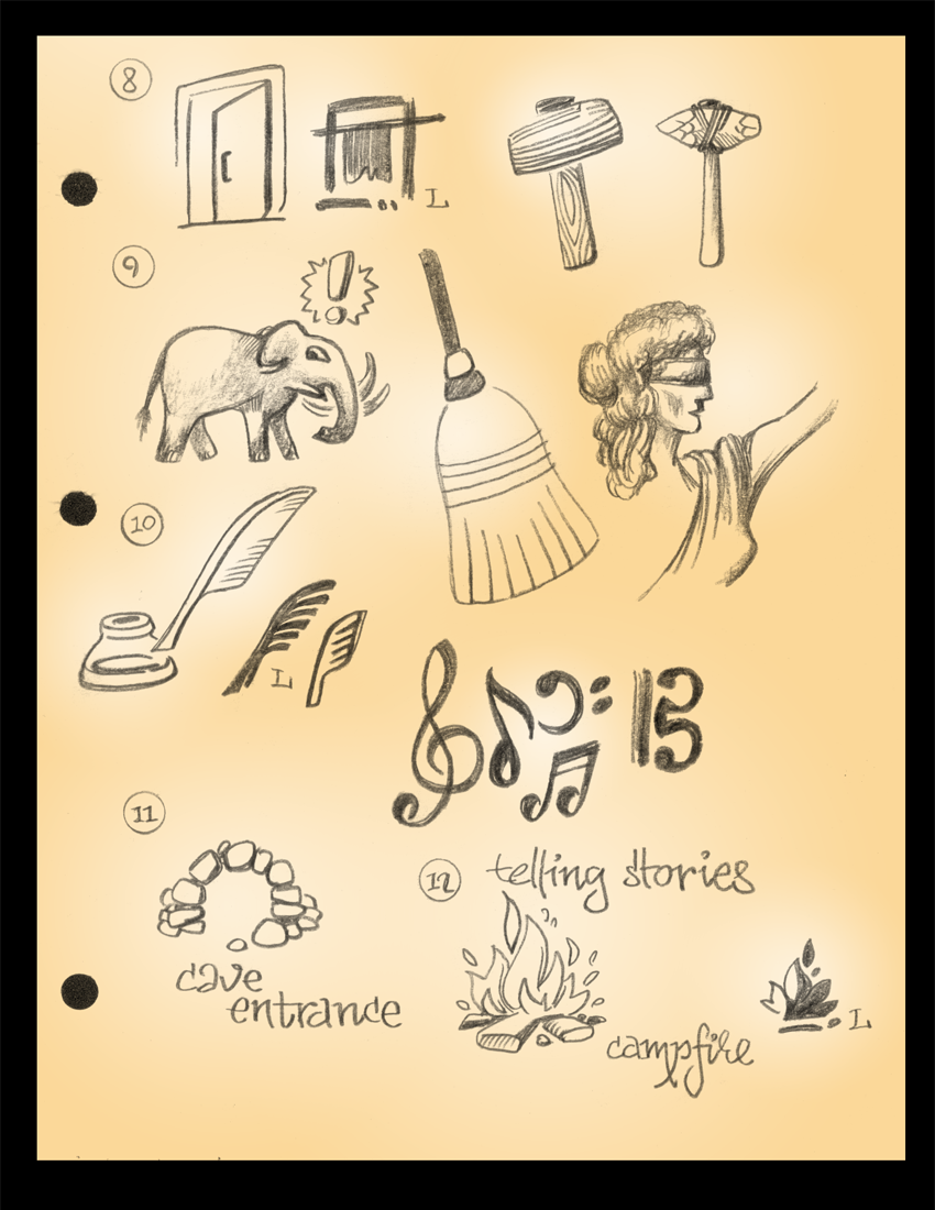
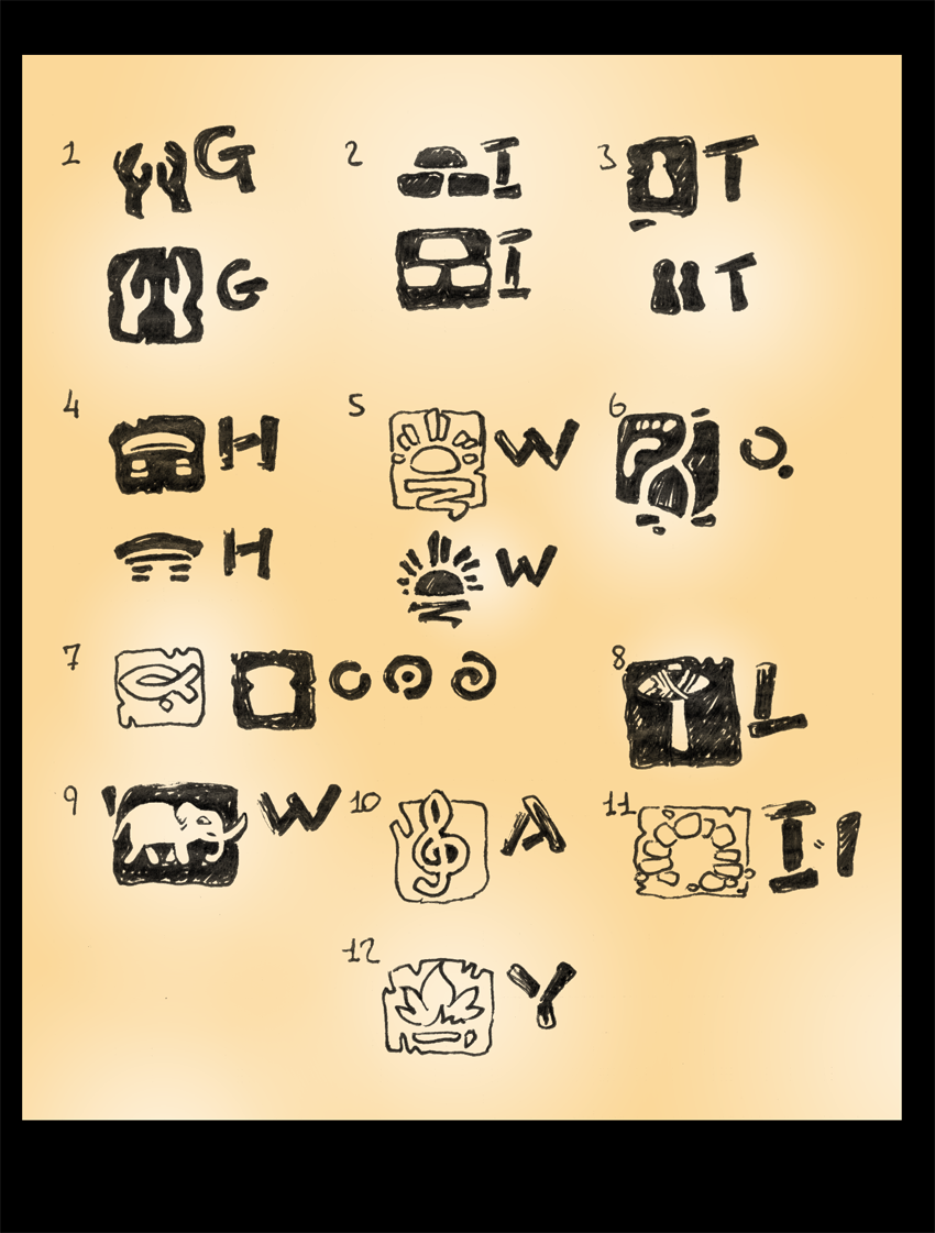
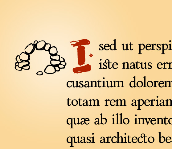
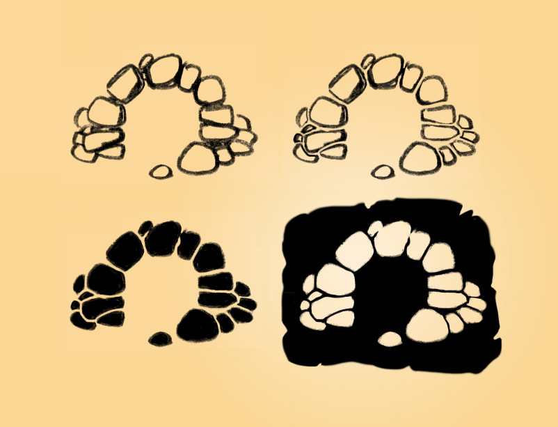
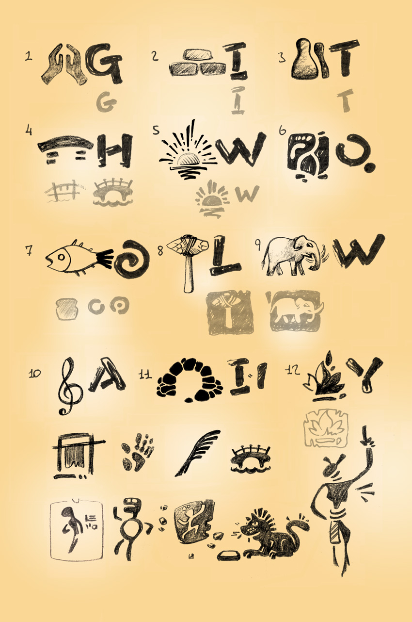
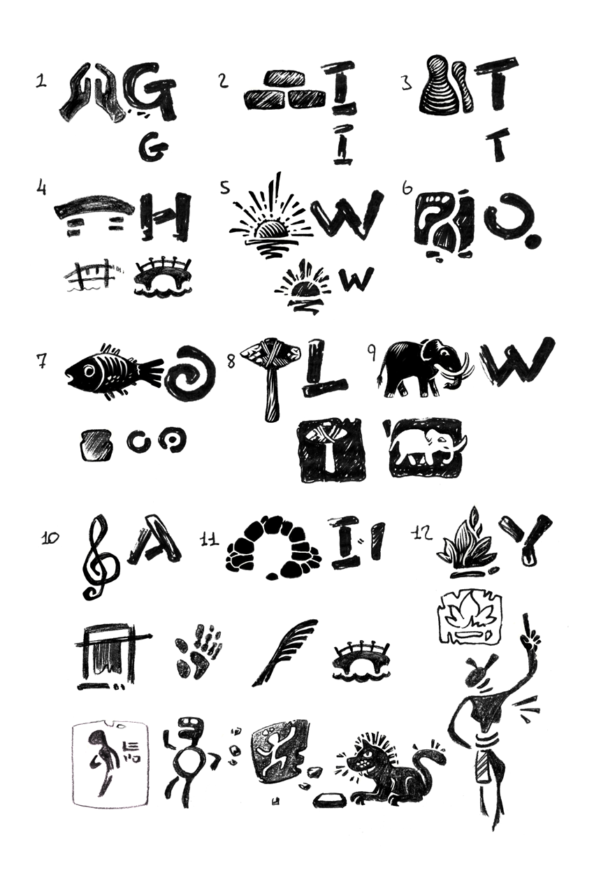
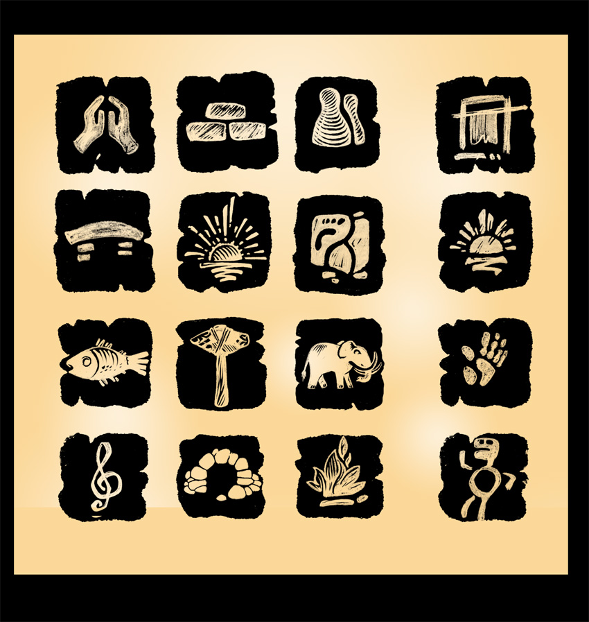
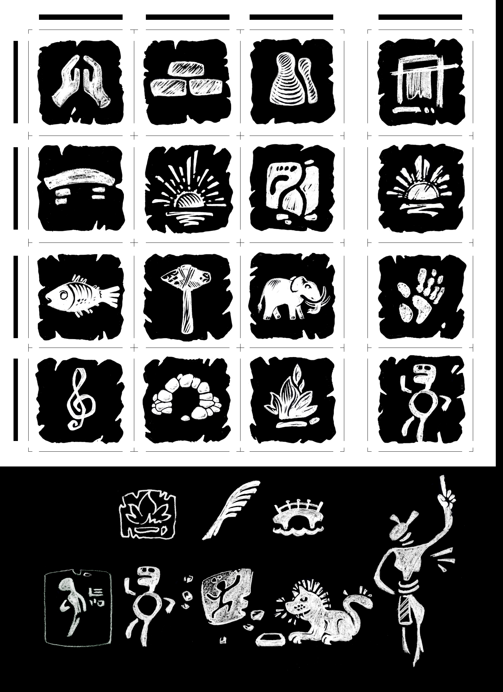
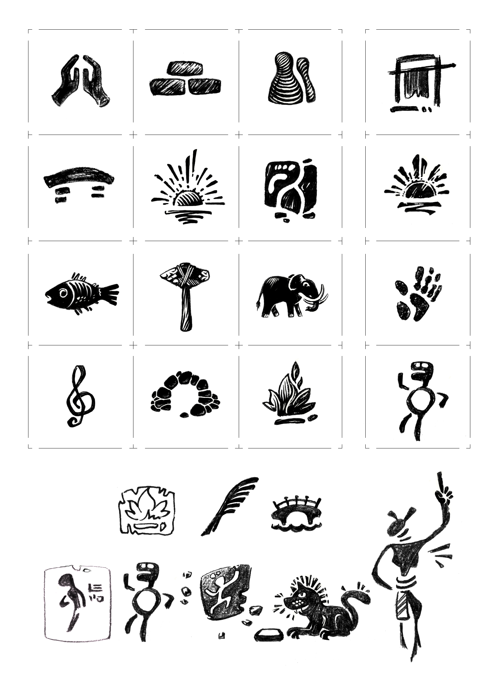
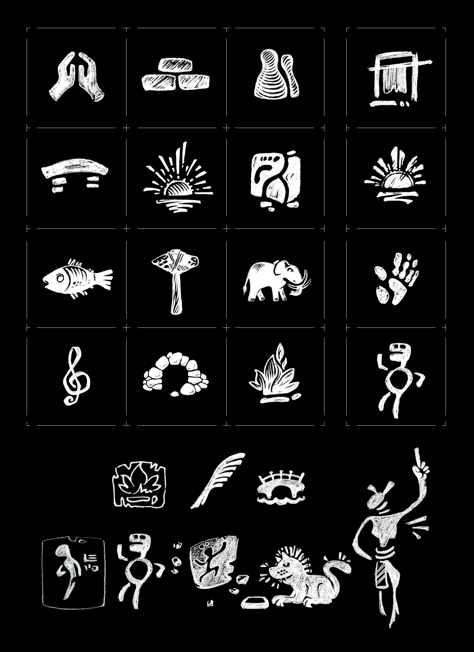
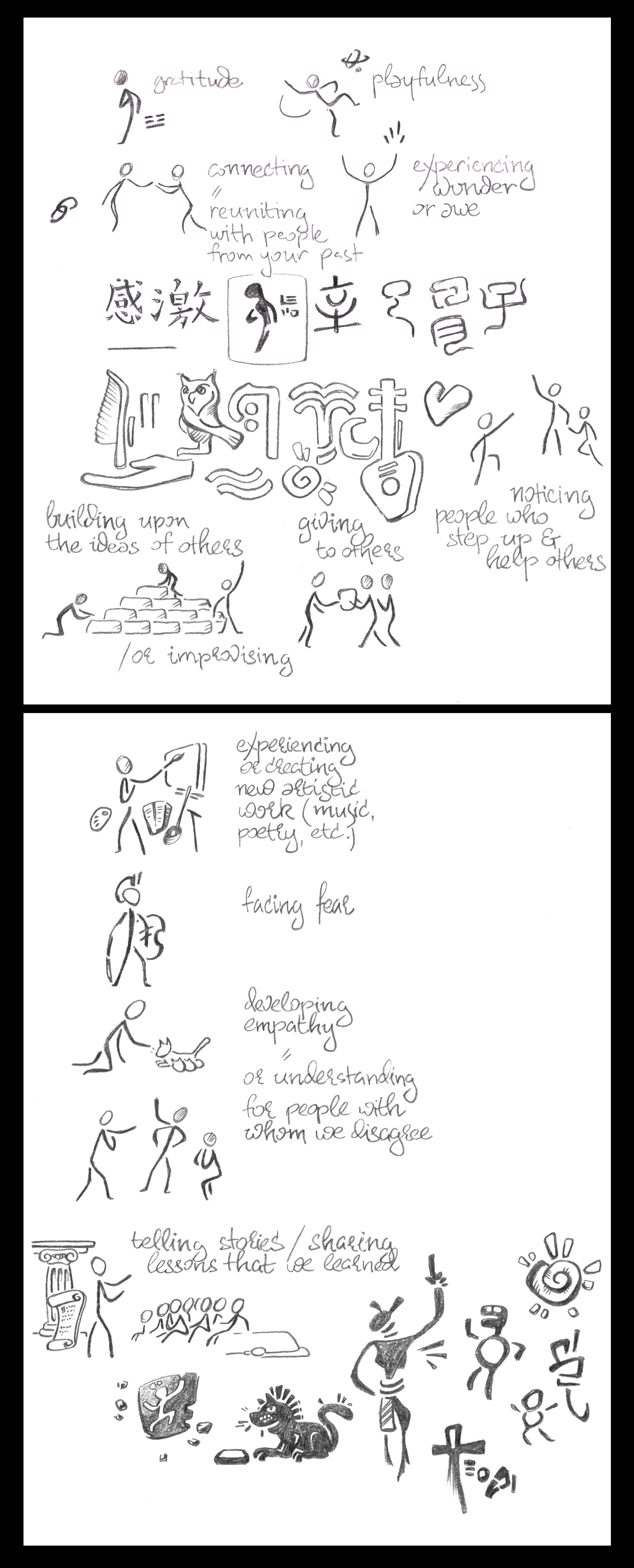
Stone Age · Cave ArtYesterday's completion for last January's work on book illustrations and hand-drawn initials. Latin + Cyrillic 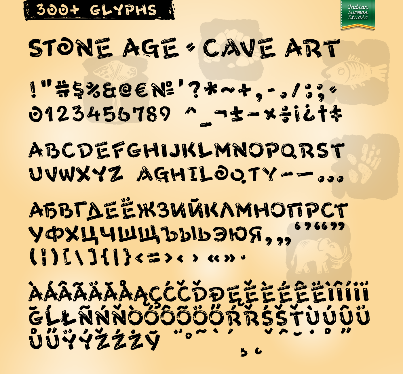
26 Jan 2019, 26 Nov 2019 | |||||||||||
18 MAY '17 |
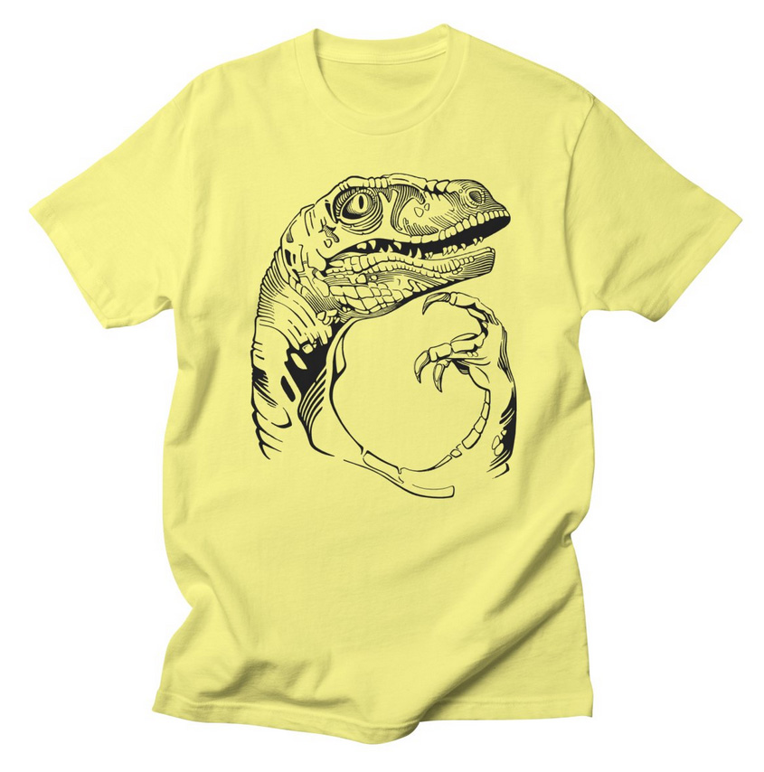
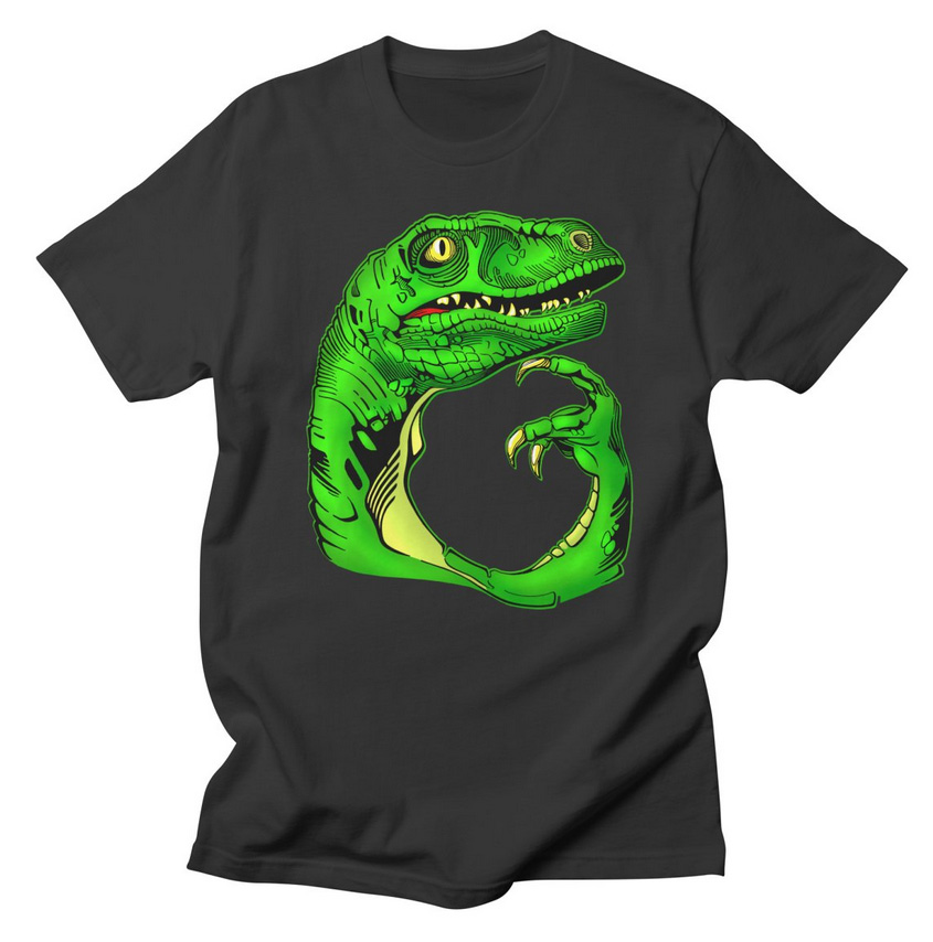
131
Philosoraptor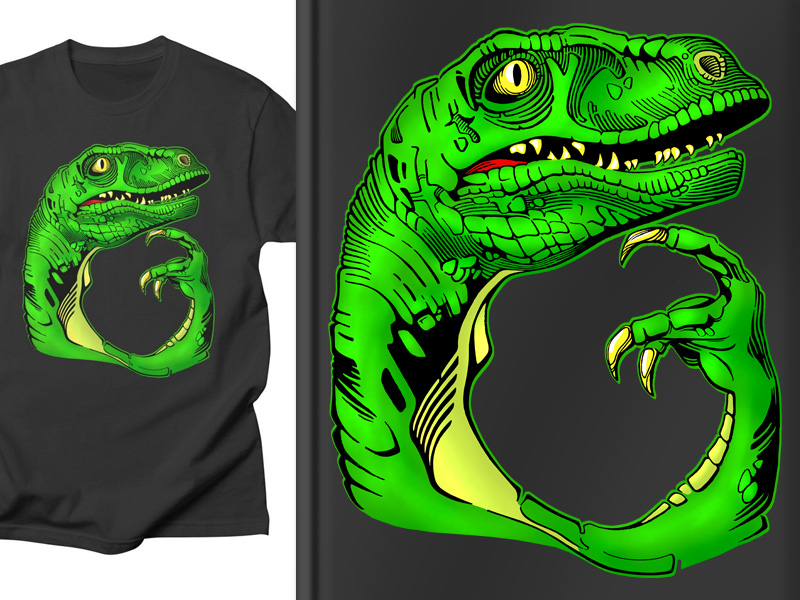
18 May 2017, 15 Aug 2019 | |||||||||||
4 FEB '19 |
164
 | |||||||||||
31 JAN '19 |
163
Oriental Kaishu font2005, 2015, 2019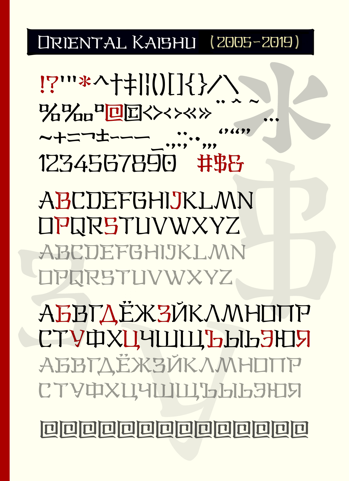 2019 year's version for the 2005 year's font. | |||||||||||
27 OCT '18 |
160
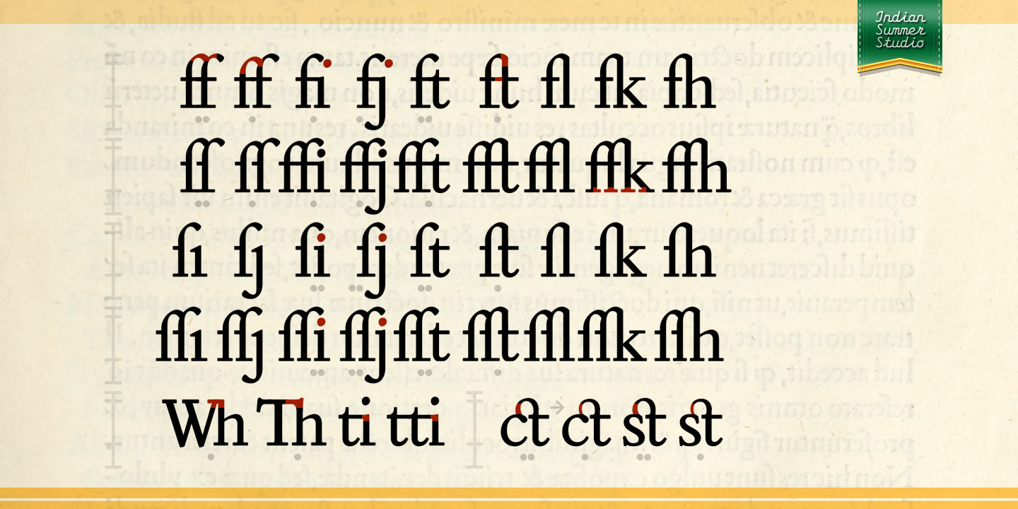
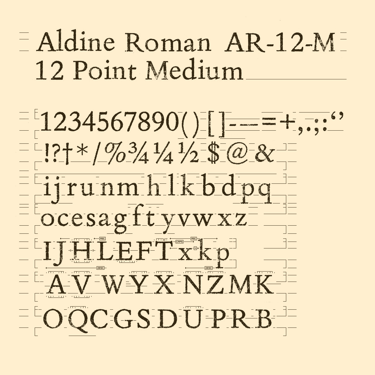
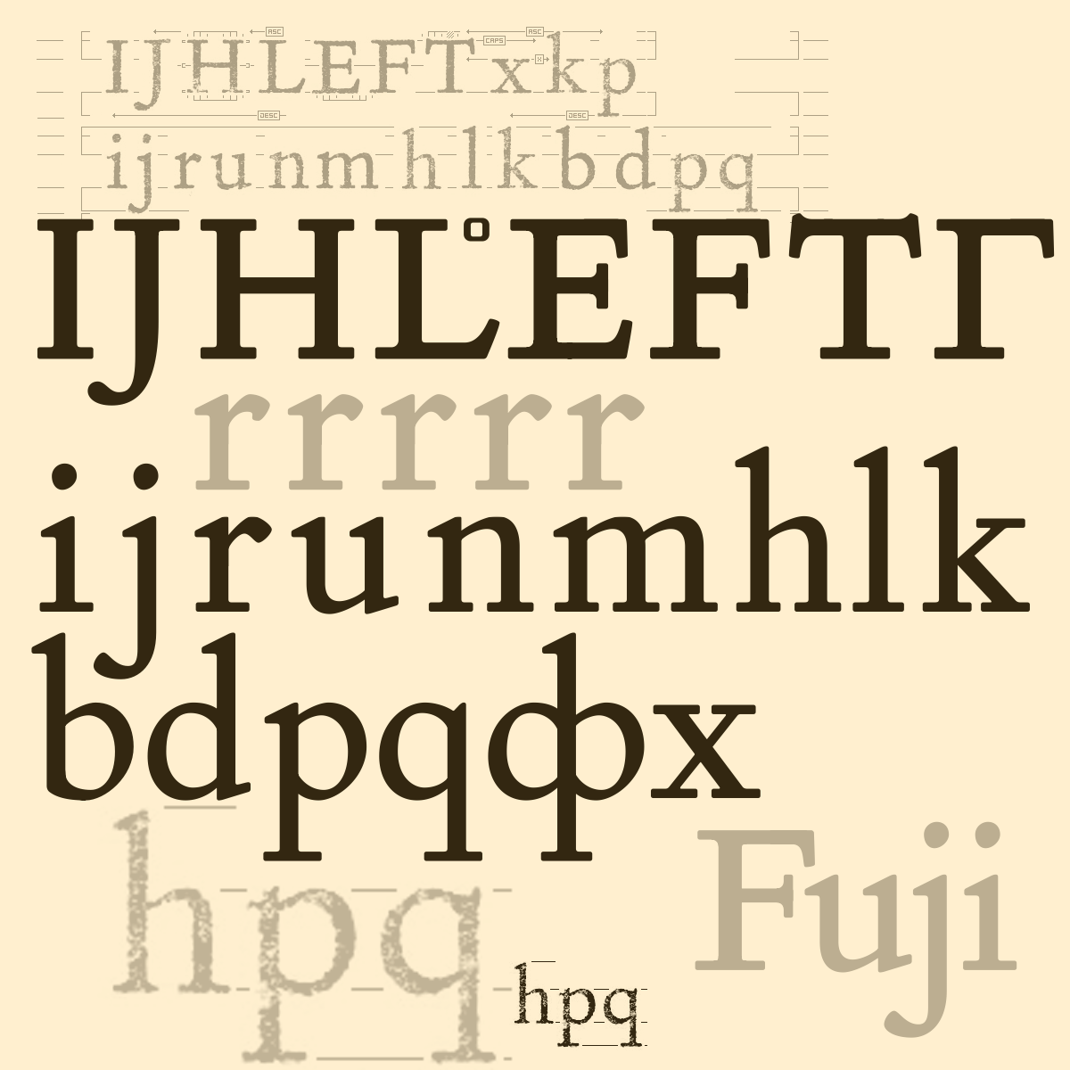
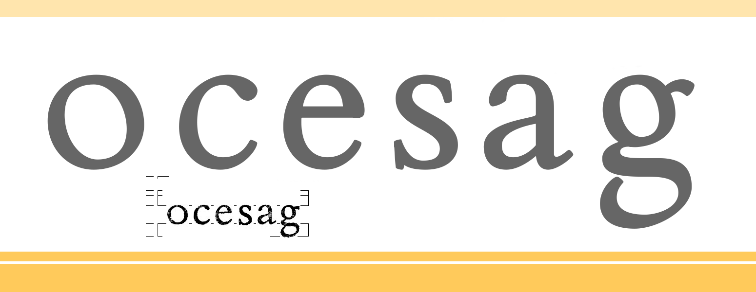
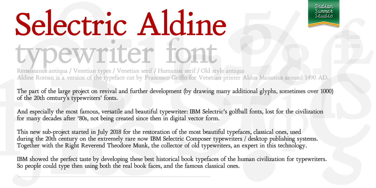
Aldus New Roman, 2018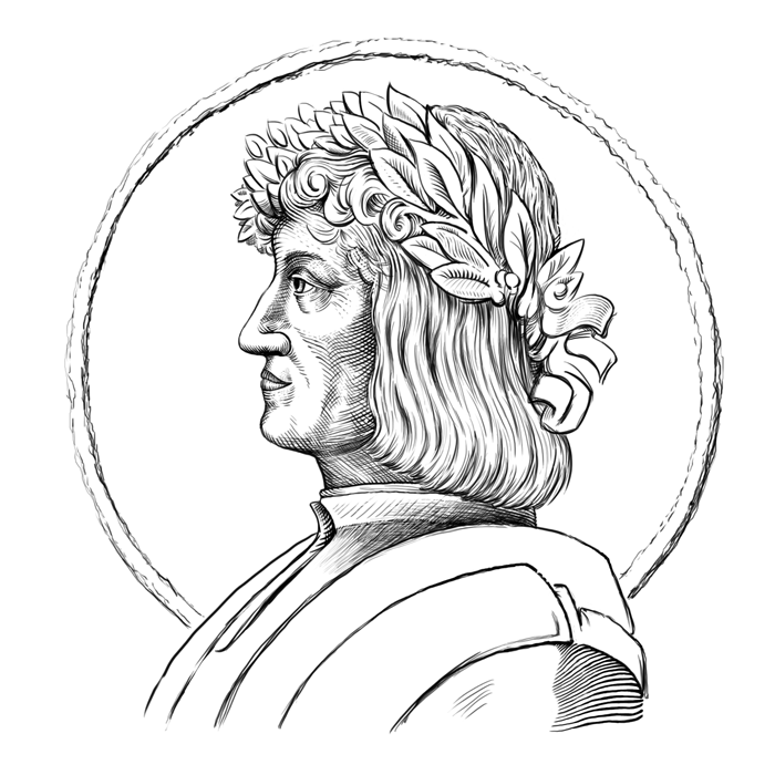 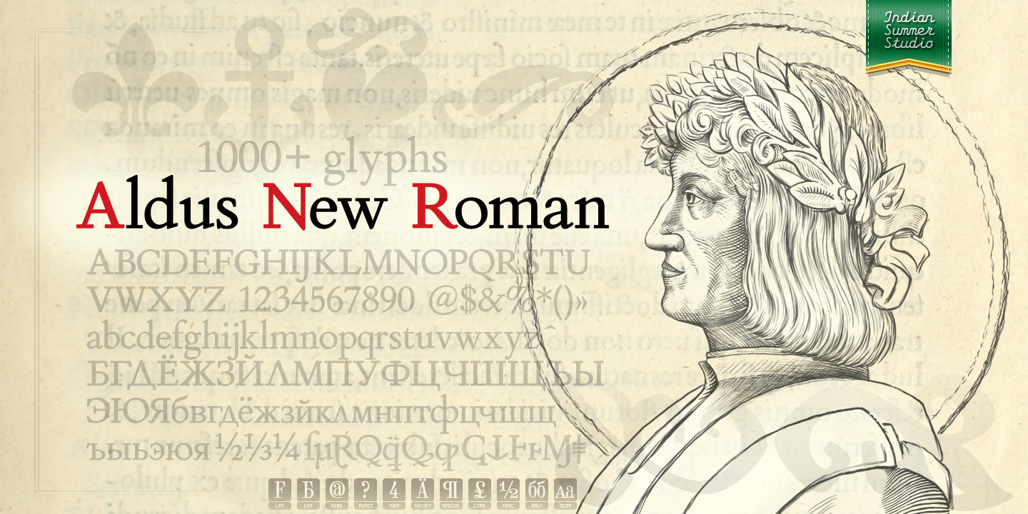  For the cover of 'Aldus New Roman', an equalized version of 'Selectric Aldine' I intended then to publish also. Triple pun here: #1 Aldine Roman type; #2 Since it is equalized, modernized version — the parallel to the Times New Roman; #3 He called himself Aldus Pius Manutius Romanus — he was a new Roman during his Renaissance times. That's why I replaced his usual bulky Renaissance cap with an elegant Ancient Roman laurel wreath. | |||||||||||
4 SEP '18 |
158
Selectric Aldine, 2018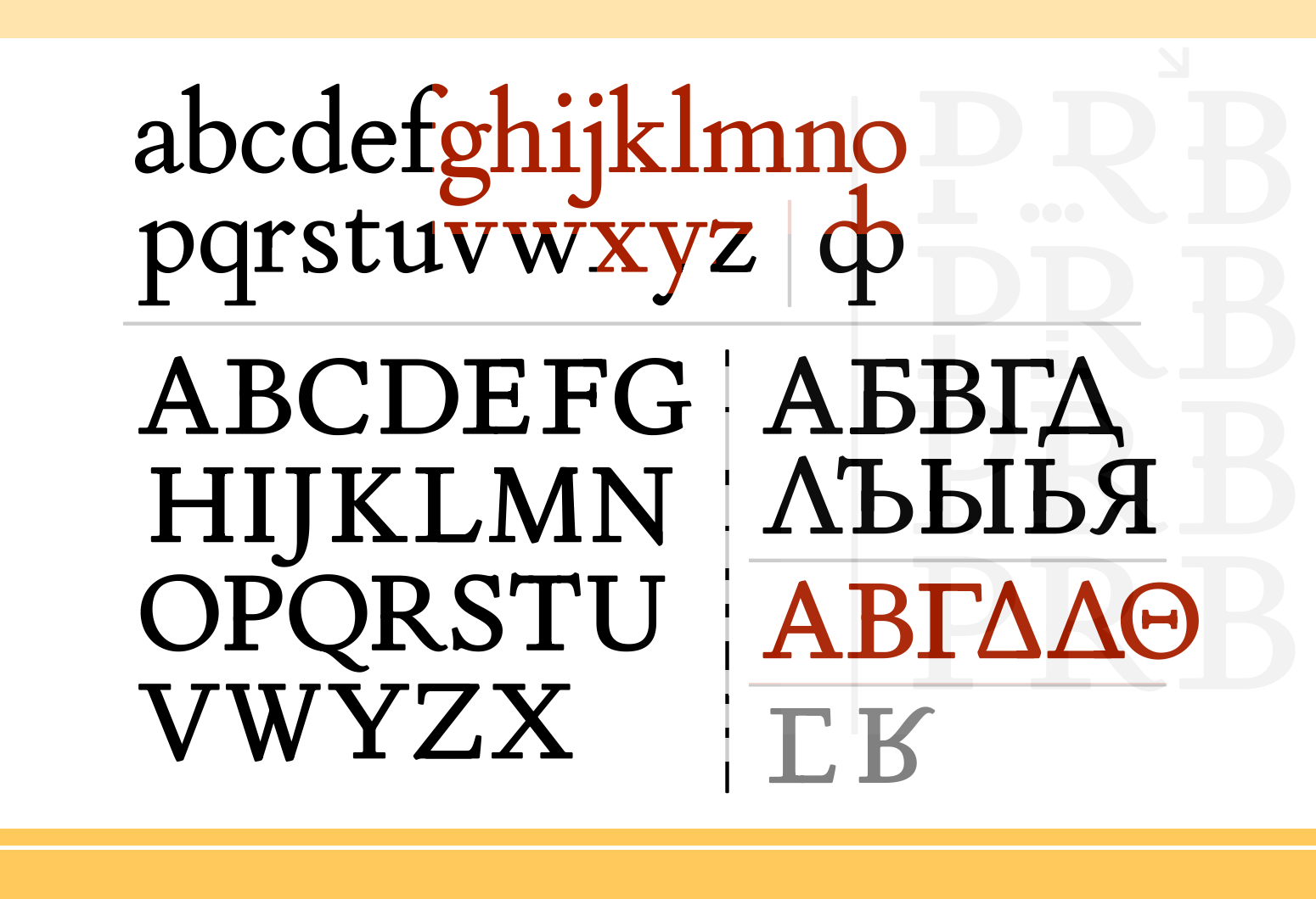  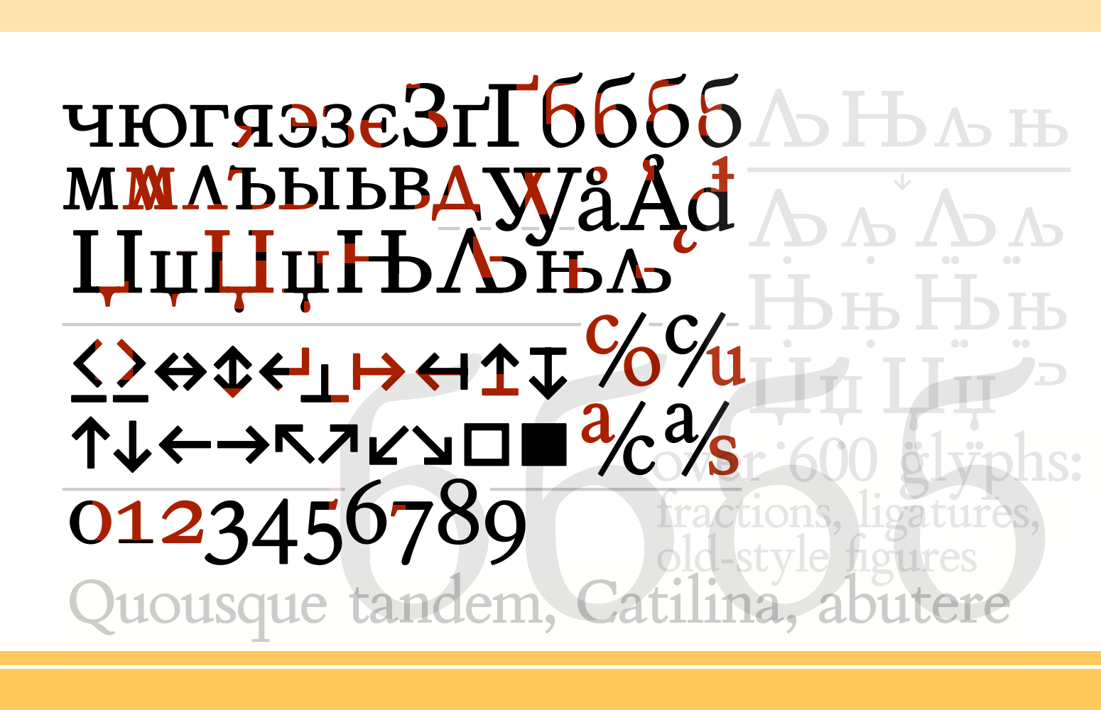  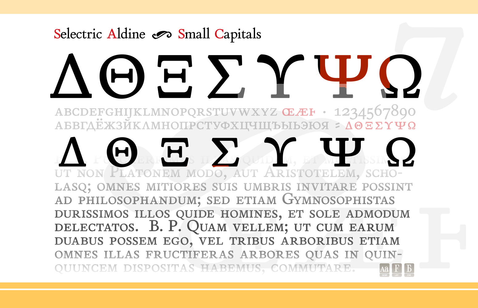
Renaissance antiqua Intentionally not the original Griffo / Aldus / Bembo. | |||||||||||
18 JUN '18 |
154
 | |||||||||||
12 JUN '18 |
155
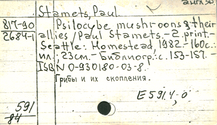
Library handDisjoined hand(since ca. 1887 and before ?)
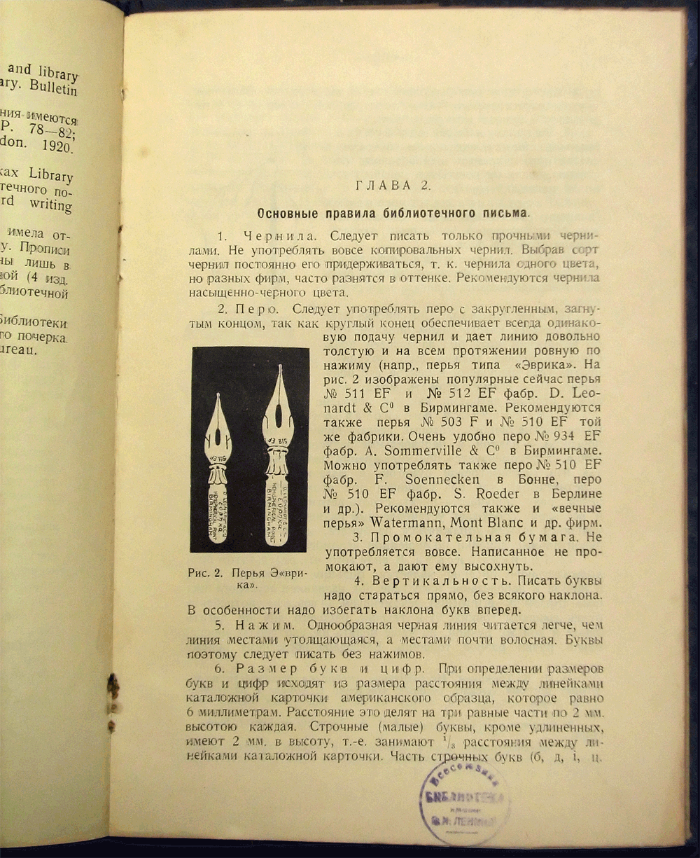
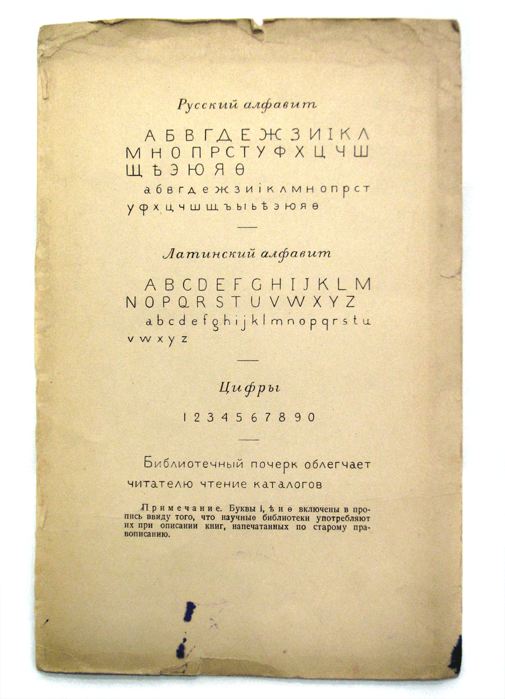
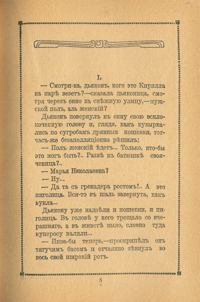
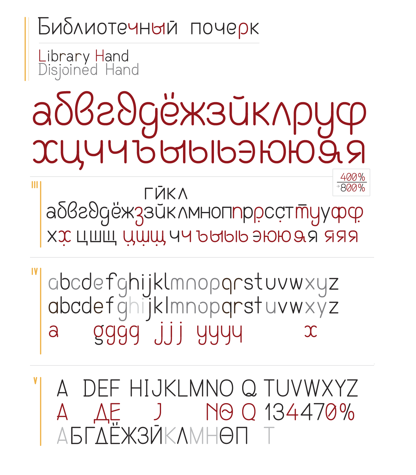 Впервые обратил внимание на отличный почерк карточек в каталоге Ленинки лет 10 назад. Сфотографировал в свою коллекцию всевозможных старых шрифтов доцифровой эпохи, спросил хранителей, кто у них так мастерски, каллиграфически, выразительно писал. — «Это библиотечный почерк». Стал искать информацию в интернете. В то время её не было вовсе. И вот со временем нашёл и отсылку к иностранным источникам явления, и правильный термин: 'Library hand', и, вдруг, первые издания (1927, 1931, 1933, 1937, 1946, 1956) основного руководства по нему, издававшегося как раз Ленинкой, где я впервые обратил на него внимание. После дополнил материалы сотнями фотографий различных карточек, заполненных всевозможными версиями этого почерка, выполненных разными библиотекарями, начиная с дореволюционных времён; многие из этих карточек ныне уничтожены, удалось спасти лишь скромную часть, несколько ящиков бумажного каталога над мраморной лестницей. Следует отметить, что кроме многих интересных вариаций почерков, эти карточки хранят и немало образцов старых пишущих машинок, в том числе редких довоенных и трофейных, с латинскими шрифтами. Также уничтоженных за последние полвека. Вчера начал пробную перерисовку рекомендованных образцов библиотечного почерка (советских и американских) пером указанного типа и тушью, и оцифровку. Не воспроизвожу образцы строго, находя в них места, которые возможно улучшить с точки зрения удобства письма, эргономики дукта, а также эстетически; более того, следуя вот уже более чем вековой практике применения библиотечного почерка, когда каждый автор исполняет его в собственной неповторимой манере, привнося свой стиль. «С библиотечным почерком впервые ознакомили русских библиотекарей в 1914 г. библиотечные курсы Университета Шанявского, от которых ведёт своё начало Институт Библиотековедения Публичной Библиотеки Союза ССР им. В. И. Ленина. С тех пор библиотечный почерк не переставал нами пропагандироваться и в 1925 году Институтом были изданы прописи русского и иностранного почерка на карточках по образцу и с соблюдением всех правил, выработанных старейшей американской библиотечной школой в Олбени.» [Москва, Российская государственная библиотека, 1927] John Cotton Dana — A Library Primer (1899) The Varieties and Complexities of American Handwriting and Penmanship: Library Hand Sarah Bliss: A Study of Handwriting in Libraries «Library hand. Intertwined among these dates and styles is also the emergence of "library hand," a style first discussed theoretically in 1885 by the American Library Association and later voted upon and promoted by the Cooperation Committee. The first approved styles of it were printed on page 271 of Library Notes, Volume 1, No. 4 by Melvil Dewey in March 1887...» Pen, Ink, Keys, and Cards: Some Reflexions on Library Technology | |||||||||||
4 JUN '18 |
153
 | |||||||||||
24 APR '18 |
150
Dodo project, codename Hiawatha, 2018 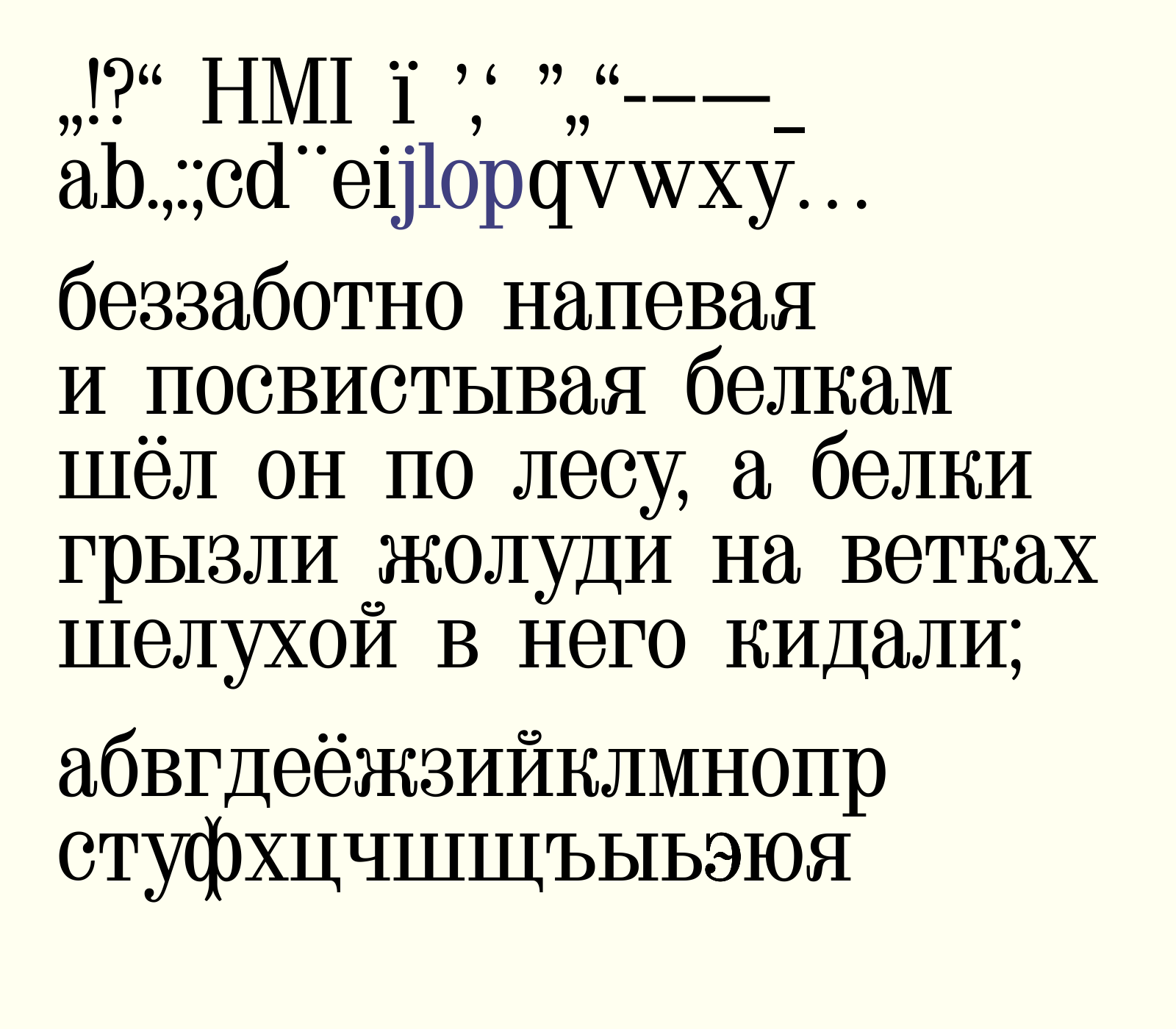 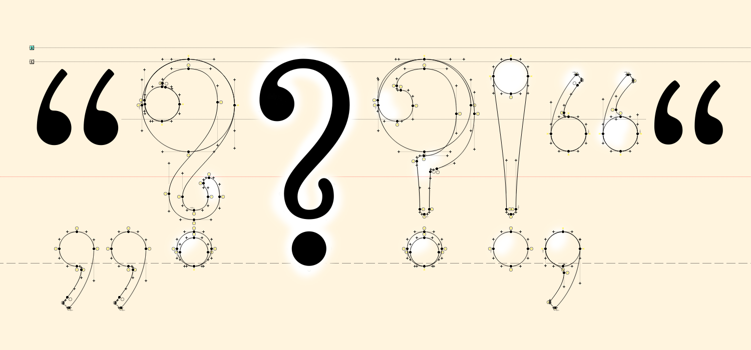 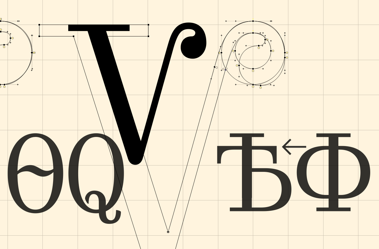 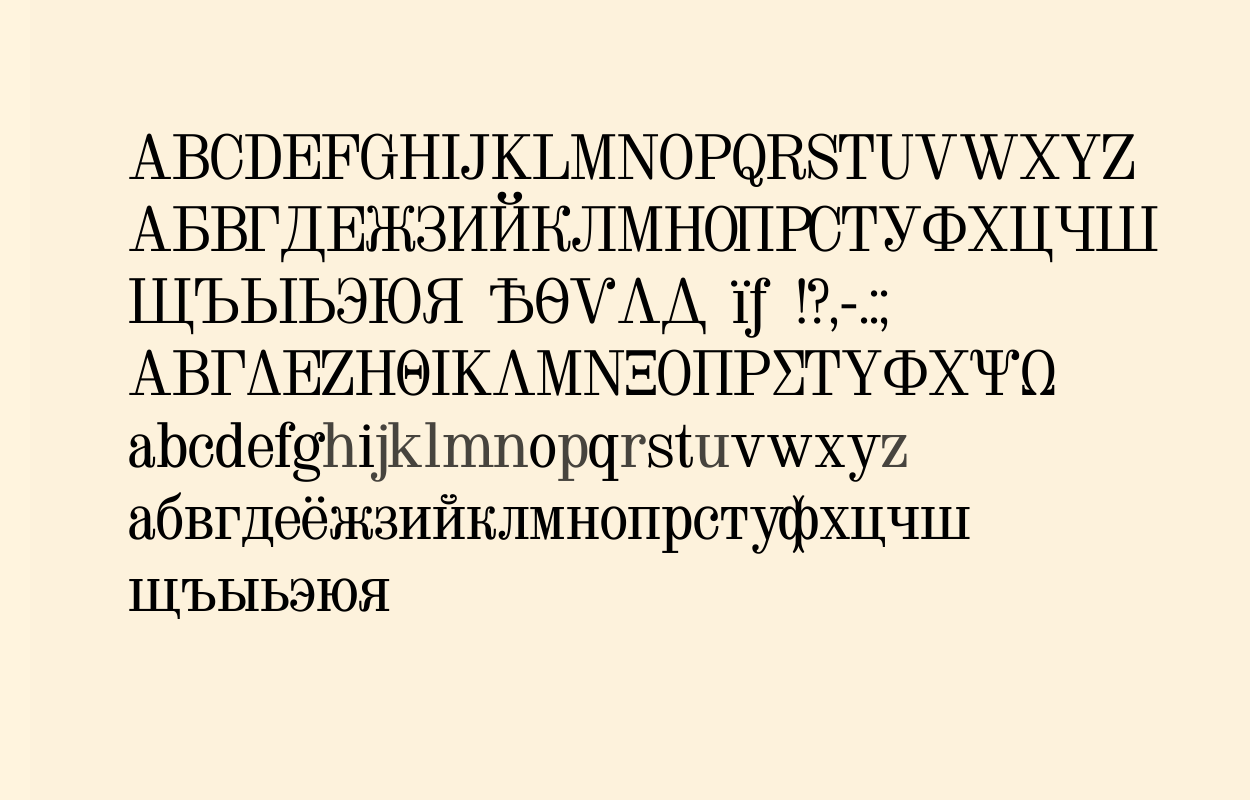 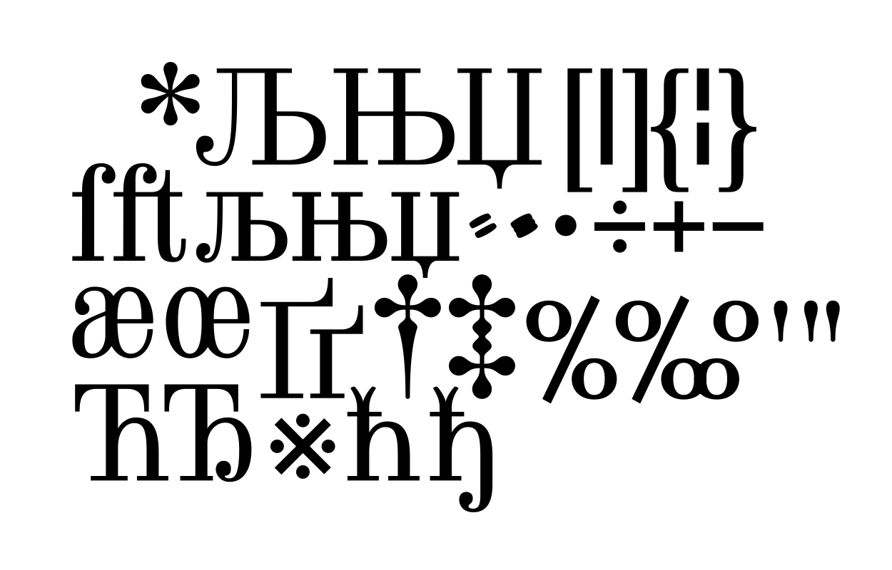 | |||||||||||
1 JAN '16 |
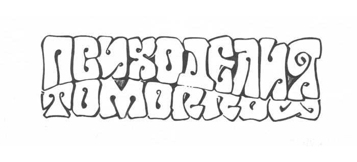
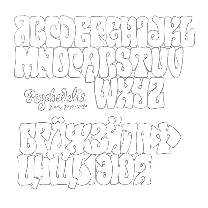
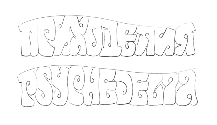
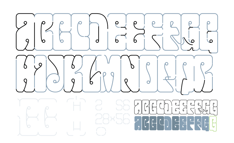
103
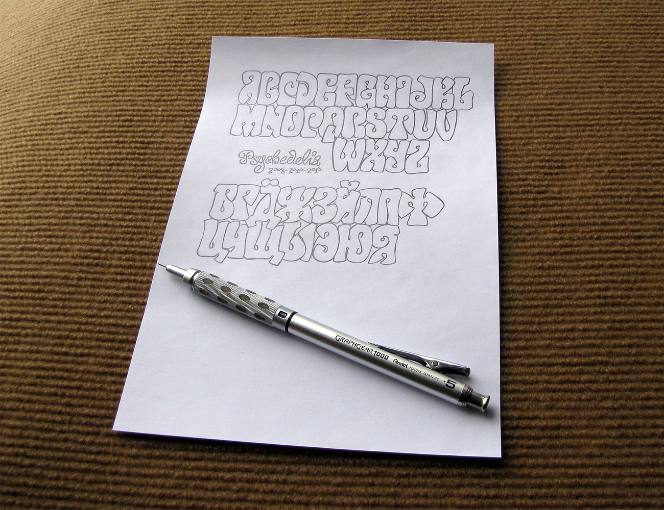
Psychedelia typeface, 2008–2010–2016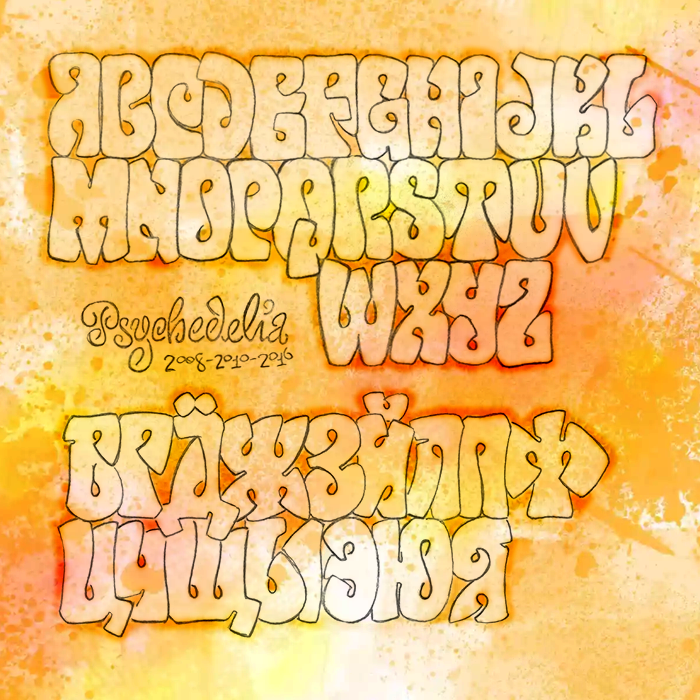  | |||||||||||
1 APR '18 |
147
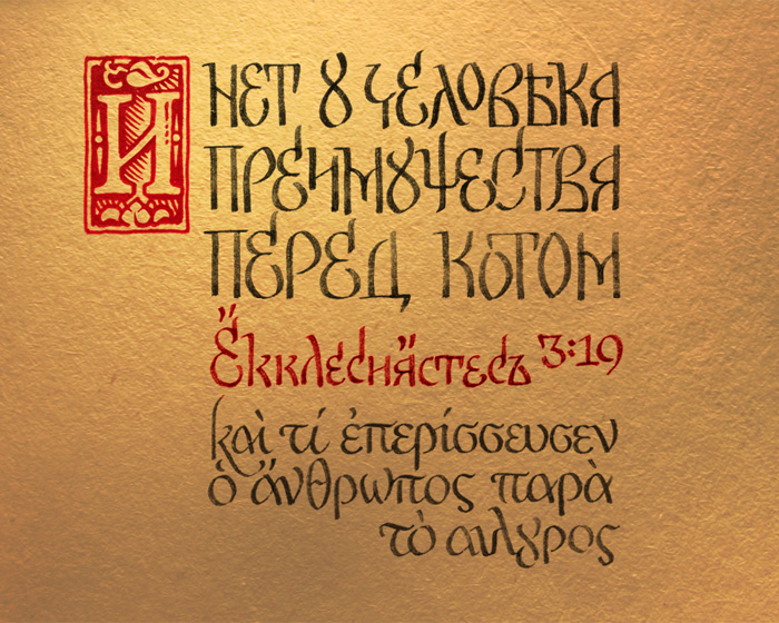 After Franciscus Scorina's Ecclesiastes (1518). 'And man has no advantage over cat.' — Ecclesiastes 3:19. For what happens to the sons of men also happens to animals; one thing befalls them: as one dies, so dies the other. Surely, they all have one breath; man has no advantage over animals. Who knows if the spirit of the sons of men goes upward, and if the spirit of the animals goes down to the earth? The translation is modern — to not to confuse people at the streets (this design is intended for t-shirts), but after the official Russian Bible (and Latin). Greek is from the Septuaginta. Scorina's typeface used as the basis for the calligraphic style, without an intention to repeat his glyphs precisely, as is. Some old-style letters added deliberately to keep the Zeitgeist: «Ѣ» «Я» «OY ligature» «old-style N» «Ч» «Щ» «...стесъ» instead of «ст», etc. And, as you can see, there is a serious difference (logically fully contrary) in the King James Version & the NKJV here at the most significant part: 'Who knoweth the spirit of man that goeth vpward; and the spirit of the beast that goeth downeward to the earth?' Old Church Slavonic is: «и что излишше имать человѣкъ паче скота? ничтоже». And Scorina's own translation was different (yes, he translated the Old Testament himself then), page 13: NB l'accent grave instead of breve in his «й» — extremely significant for the modern typographers who lost the knowledge that in Russian «кратка» can have not only the usual crescent shape, and had it often before 1990s. | |||||||||||
16 MAR '18 |
146
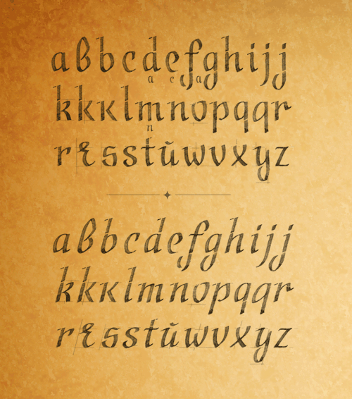 Recently sharpened another fountain pen to excel the Pilot Parallel Pen 1.5 mm (a real disaster, as for me). And, as a result, in the process of honing it (where is my diamond whetstone? diamond files are not that precise) decided that I like the appearance, and perhaps it is time to make a typeface from it. | |||||||||||
30 MAY '18 |
144
 | |||||||||||
10 FEB '18 |
143
 | |||||||||||
4 JAN '18 |
141
 Calligraphy, dip pen, broad nib, Chinese ink, 6× zoom. Lowercase are 5 mm, 14 points tall. Latin and Cyrillic are not that different, isn't it? | |||||||||||
14 SEP '17 |
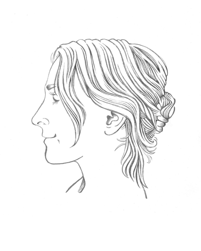
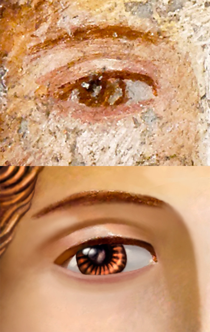
138
Молодая женщина со стилусом и планшетом. Эскиз.55–79 гг н.э., Помпеи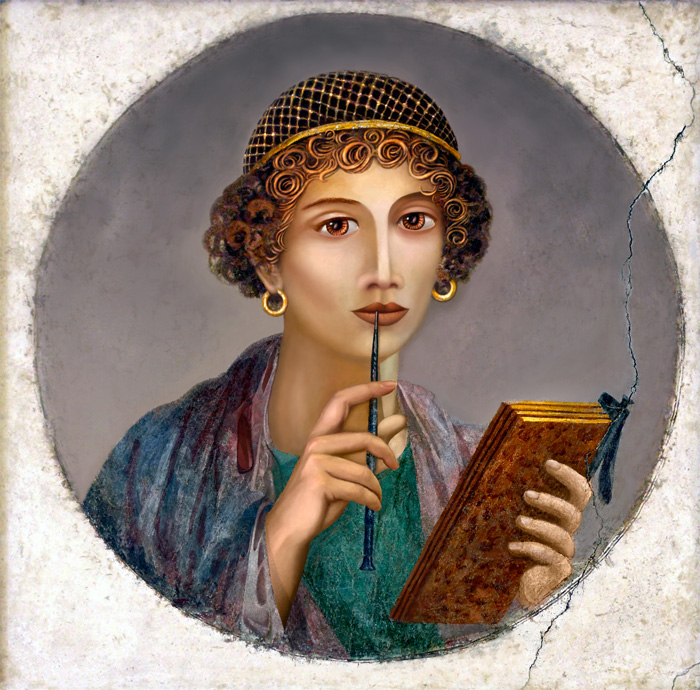 Также известная как «Сапфо». По фреске из Помпей, обнаруженной при раскопках в 1760 году. «Он был в Мизене {Misenum, основная ВМБ Рима близ Неаполя, основана Октавианом}, где командовал флотом. За девять дней до сентябрьских календ появилась туча, необычайная и по своей величине и по внешнему виду. Перед тем он, погревшись на солнце, принял ванну, после чего наслаждался, отдыхая и занимаясь. Он тотчас поднялся, потребовал сандалии, взошел на возвышенное место, откуда лучше всего можно было наблюдать это явление. Мой дядя, как ученый-исследователь, решил, что ему важно ознакомиться с таким важным явлением с более близкого места. Он велит спустить квадриремы, садится на одну из них сам, с тем чтобы подать помощь многим жителям, густо заселившим это очаровательное место. Он спешит туда, откуда бегут другие. Прямым путем, никуда не сворачивая, он стремится в это опасное место, до такой степени чуждый страха, что все изменения этого страшного явления, как только он их замечал, тотчас же диктовал и сам записывал свои наблюдения. Уже на корабли падал пепел, более густой и более горячий по мере того, как приближались; уже падали куски пемзы и черные, обожженные и потрескавшиеся от силы огня камни. Море внезапно обмелело, и берега стали недоступны, загроможденные обломками горы. Поколебавшись, не повернуть ли ему назад, — да и кормчий советовал это сделать, — он тотчас приказывает ему: «Смелым счастье — покров и защита {Энний, «Макробий», VI, 1, 62.}: правь к Помпониану»... Плиний Младший — Тациту. | |||||||||||
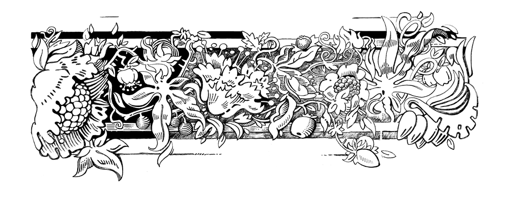
29 AUG '17 |
137
Политипажтиснение книжной обложкирастительный орнамент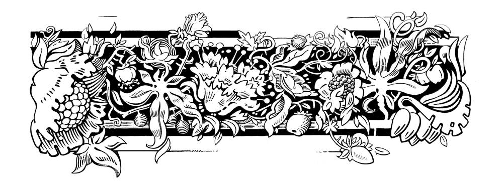 Графическое исследование манеры растительного орнамента европейского политипажа XIX века. Свободная перерисовка с дополнениями, без строгого следования оригиналу, но с соблюдением его общей композиции и стилистики. Карандаш, эскиз. 1:1. 240×100 мм. | |||||||||||
19 JUL '17 |
136
Agency Capshistorical display type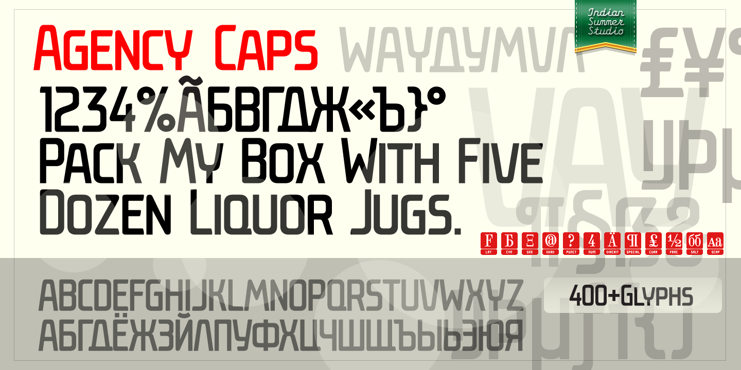 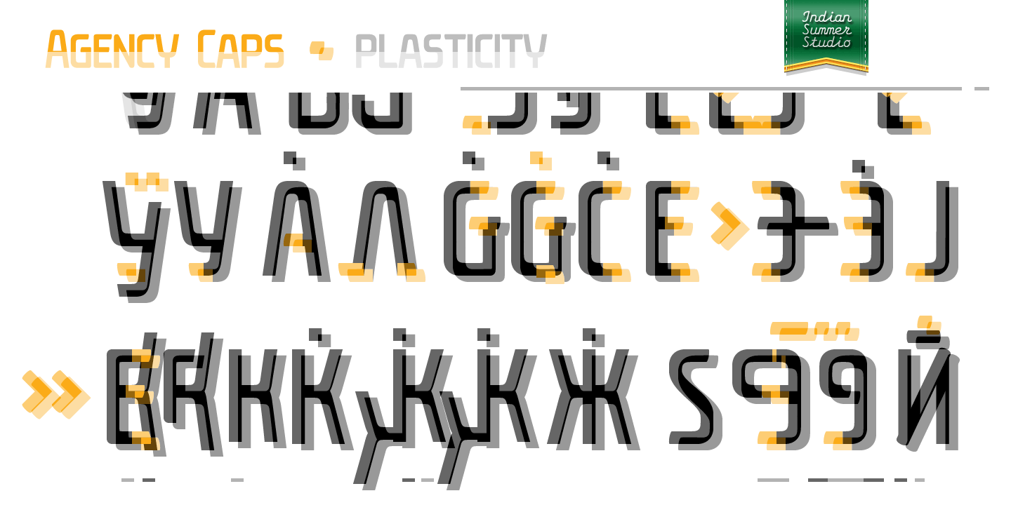 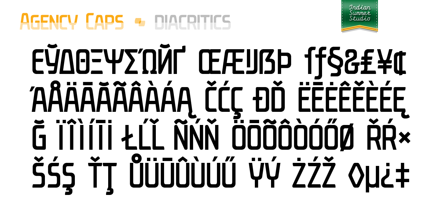   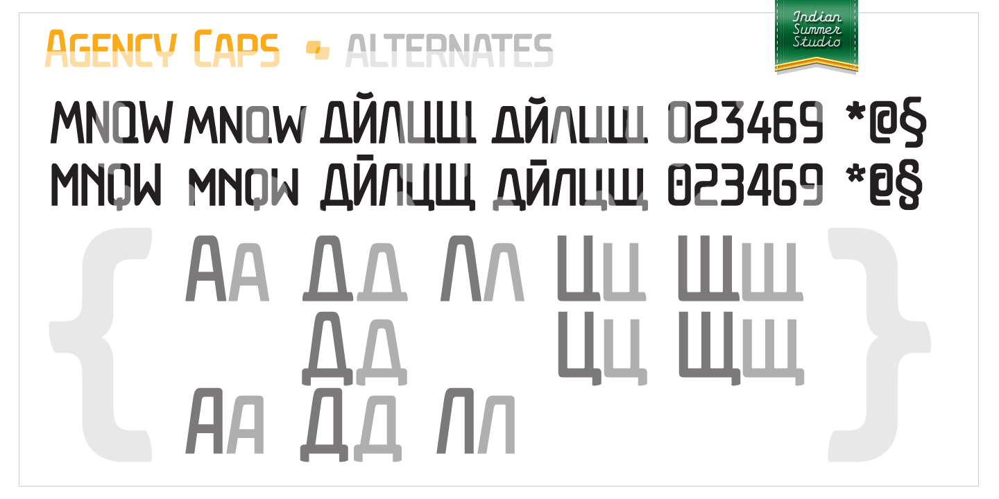 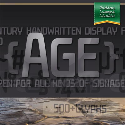 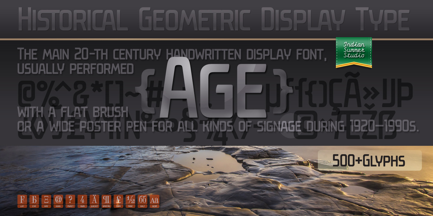 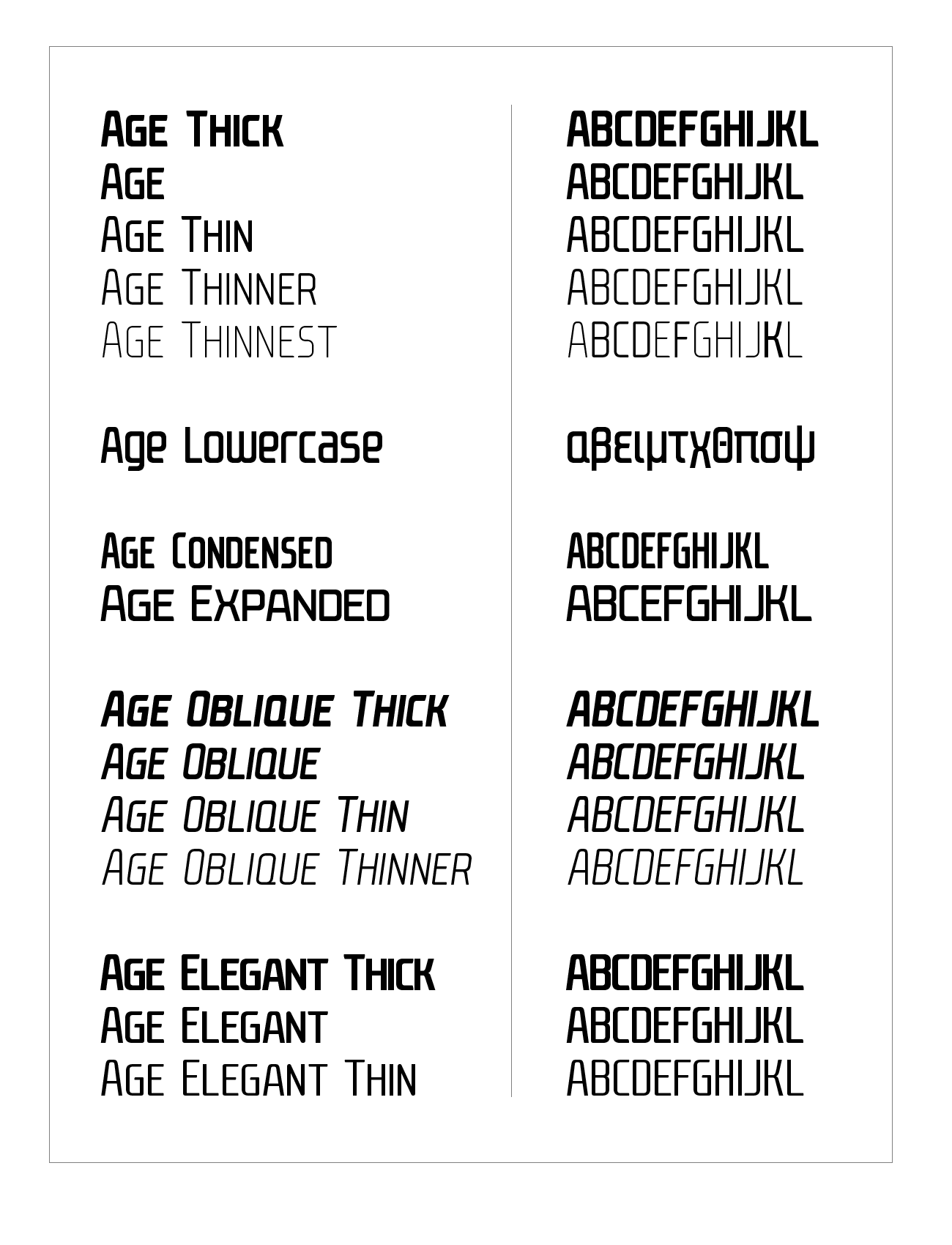 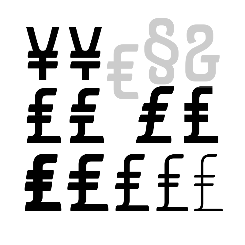 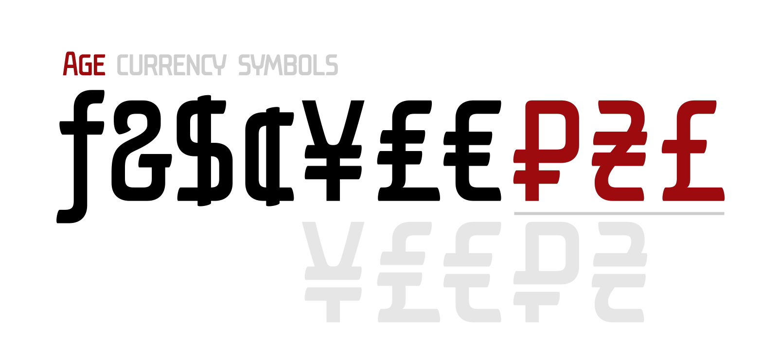 | |||||||||||
18 MAY '17 |
131
Philosoraptor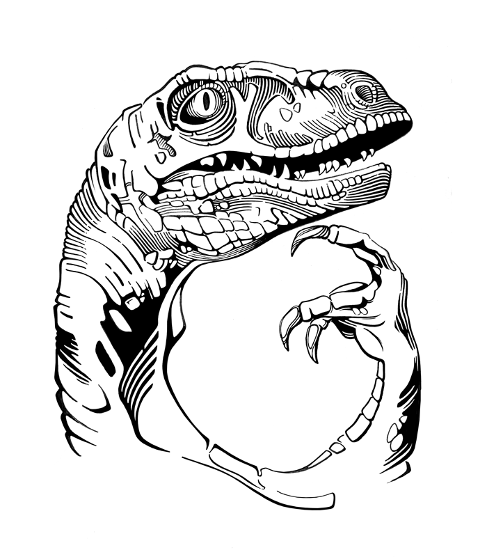 60×80 cm 300 dpi | |||||||||||
7 JUN '17 |
130
 | |||||||||||
9 APR '17 |
129
 | |||||||||||
4 MAR '17 |
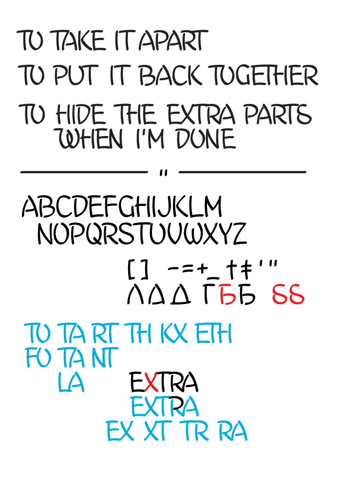
127
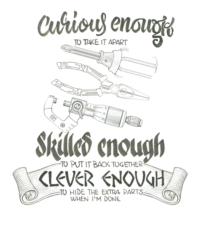
Mechanical engineer's t-shirtFirst pencil sketchesCurious enough to take it apart. 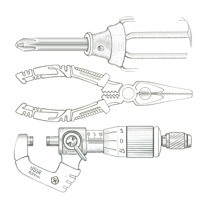 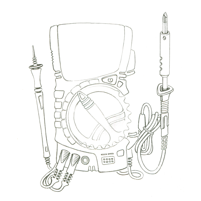 There is a detachable double test leads holder at the rear right side, keeping both probes in place with their needles looking up and covered. Just put the needle into the upper sheath and then press the bottom part against elastic plastic latch below to fix it. | |||||||||||
27 FEB '17 |
126
 | |||||||||||
26 FEB '17 |
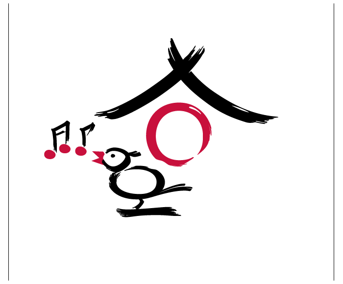
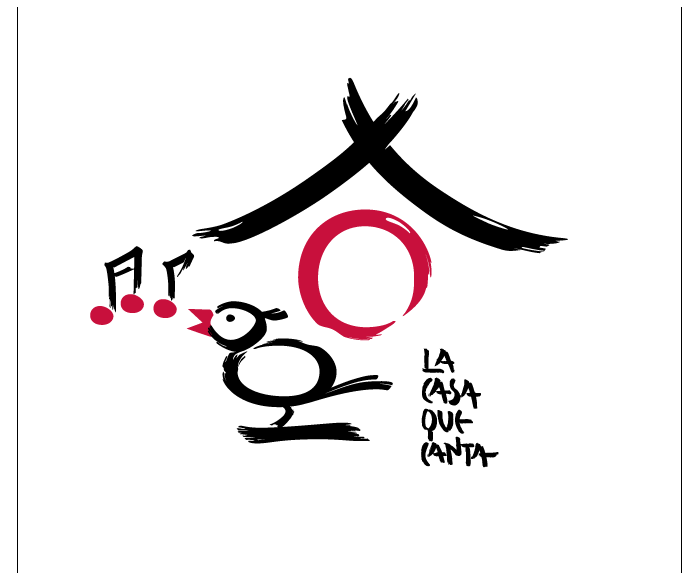
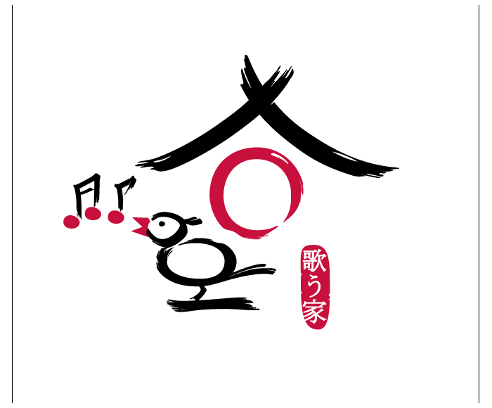
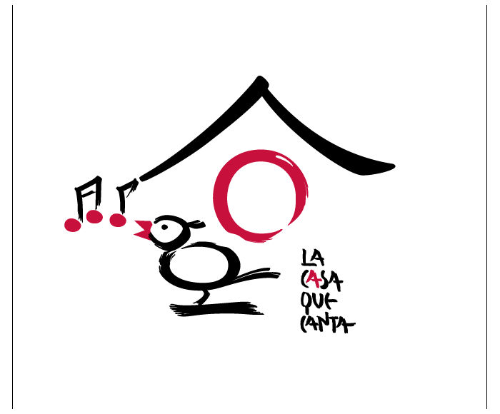
125
La casa que cantaLogo in the style of Japanese calligraphy | |||||||||||
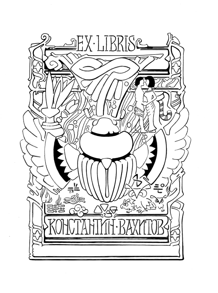
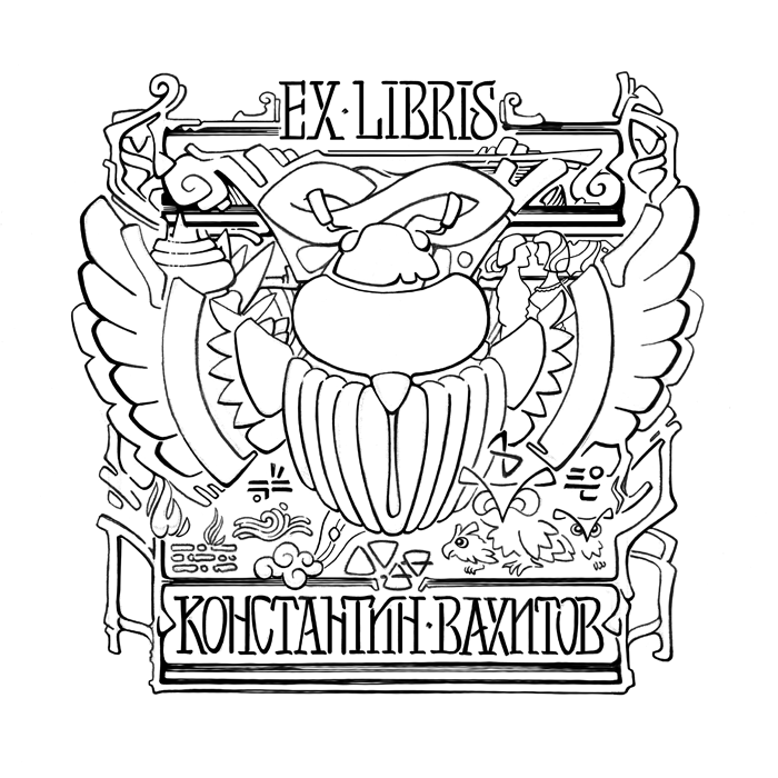
6 FEB '17 |
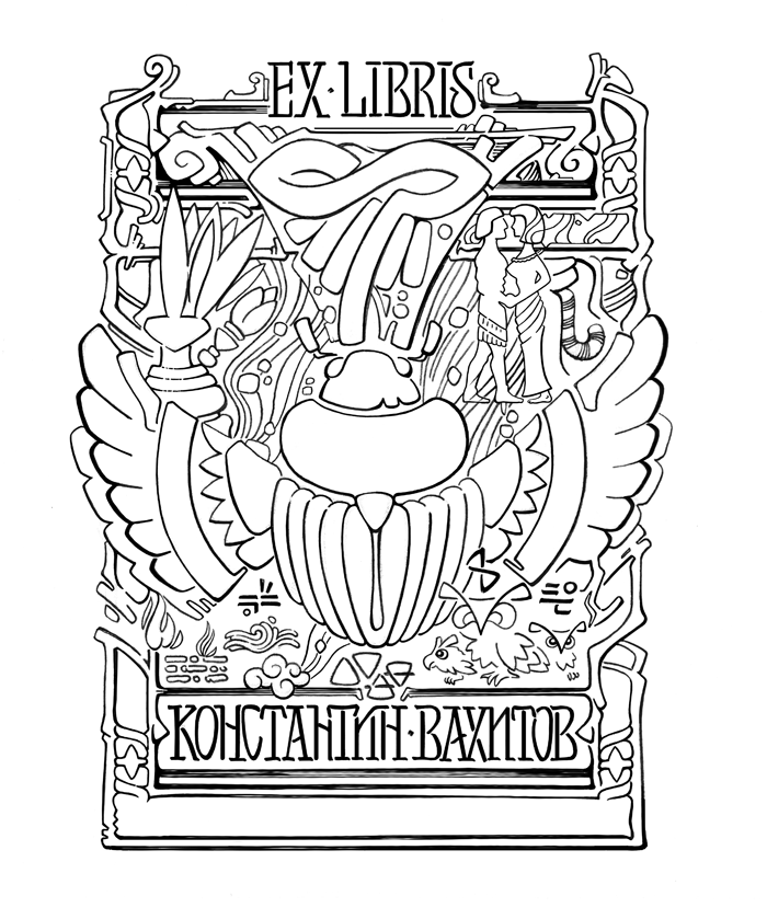
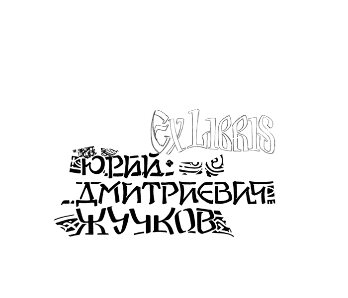
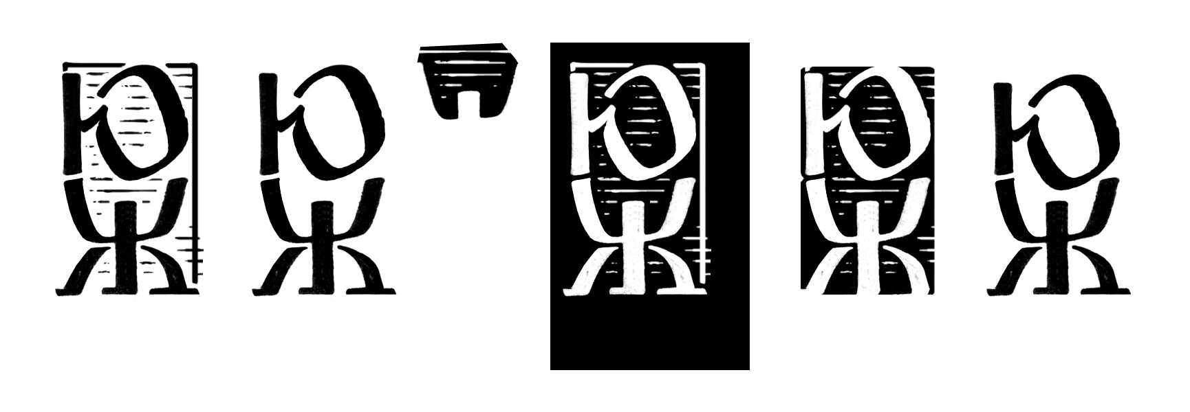
124
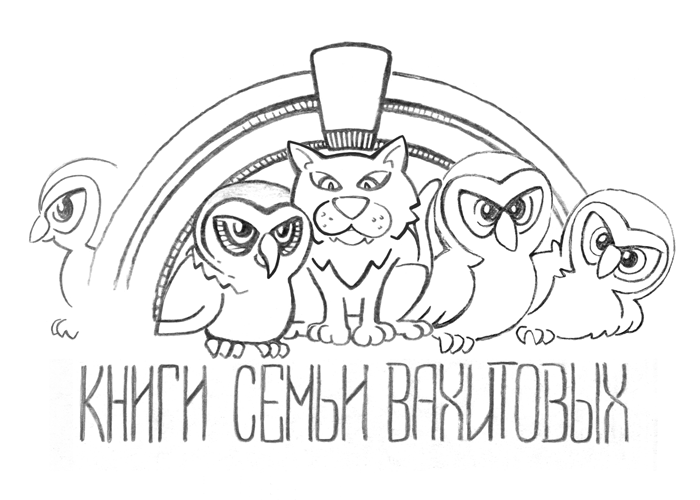
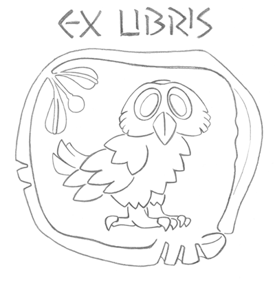
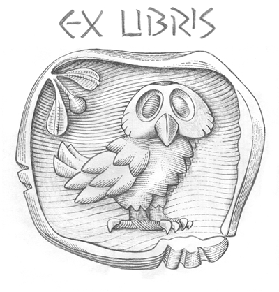
Ex libris 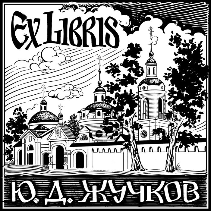 | |||||||||||
21 NOV '16 |
123
 | |||||||||||
22 DEC '16 |
122
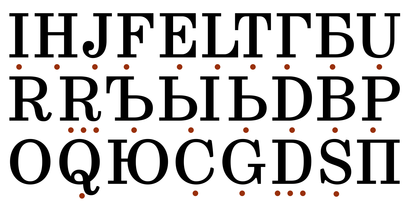
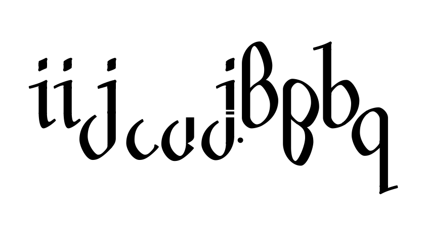
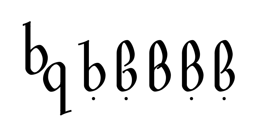
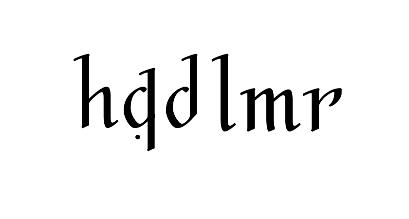
 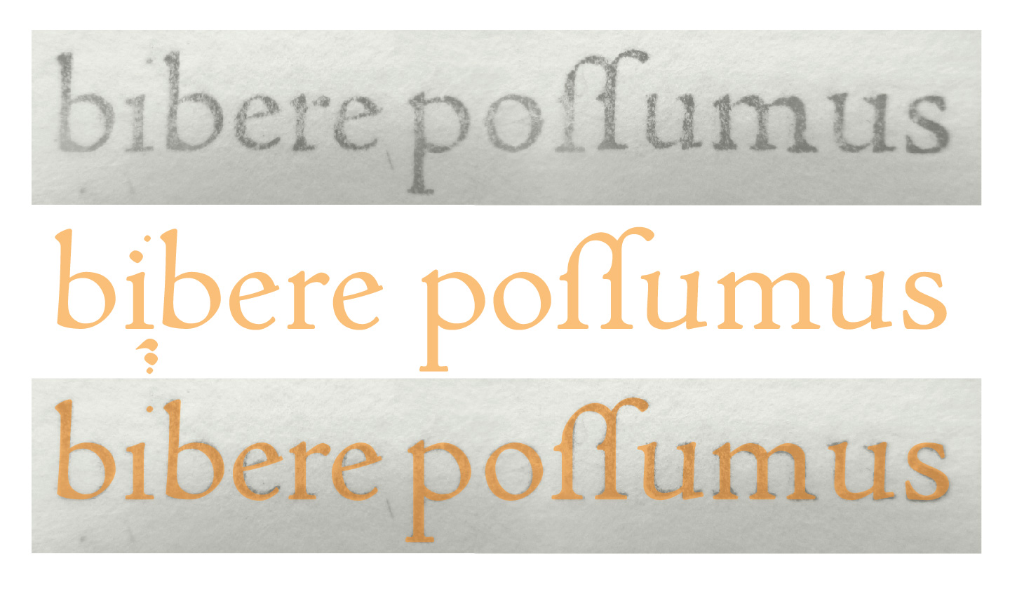 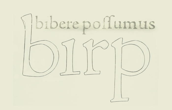 Not a typeface yet — just my study. My algorithm yesterday: 1. Select letter 2. Look through some pages for the better prints (pages are significantly different) 3. Compare 2-4 specimen for the chosen letter 4. Follow its ideal average path in my sketchbook with a pencil — as if I draw it using FontLab: segment by segment (concavity, inclination) (you can see these intentional separations in first 'b') 5. Put some notes on this letter aside, textual & graphical... Every curve here is upon the exact printed letter, as is. Considering, there are no two completely equal printed letters, and can not exist. And even in those upper serifs we can see on the single page both concave, convex and straight specimen (as I suggest, different punches were used for the same letter). And this is Eusebius itself — the best possible Jenson's masterpiece. E. g. in his Plutarchus, I saw recently in comparision, there are not that crisp letters.  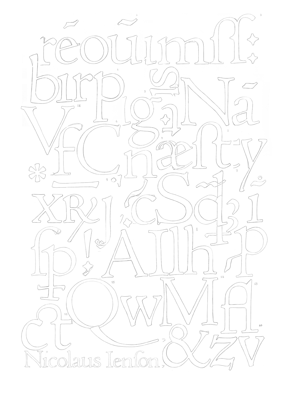 | |||||||||||
2 DEC '16 |
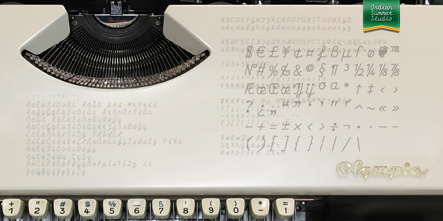
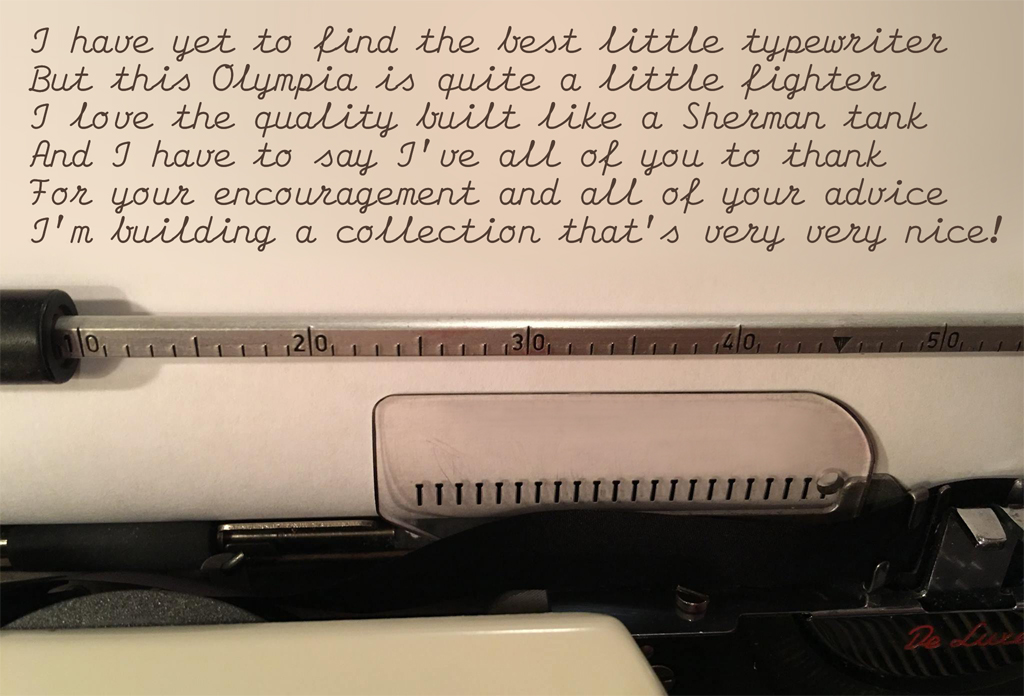
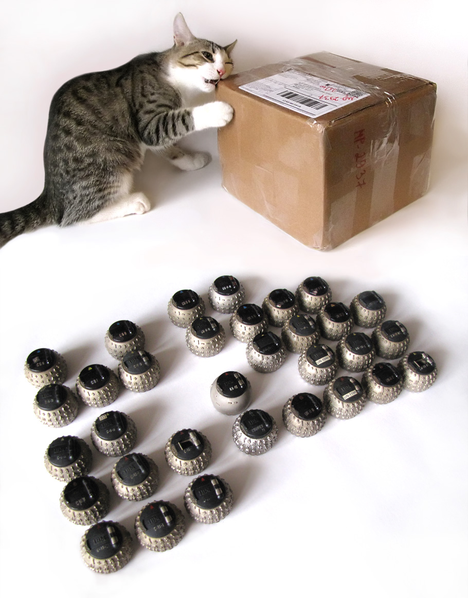
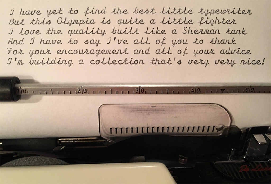
121
Olympia SF De Luxe (1966)
| |||||||||||
 | ||||||||||||


|
|
|||

|
|||

|
|||

|
|||
|
|||